Data visualisation is meant to take something complex and make it simple and easy to understand. When I saw this in a blog recently, I immediately thought “Hey, that’s what Clarus do!”
Interest piqued, I’ve begun delving into the fast-evolving field. As a Swaps-trader for over ten years, this aspect of the industry pretty much passed me by. But looking at some of the industry content that is produced makes me realise:
- Our blogs at Clarus tend to take large data-sets and simplify them.
- As an industry, the Swaps market is probably guilty of making a relatively simple subject ever more complex and harder to understand.
Cue introspection. Are my blogs stuck in the 1990s, like a Portlandia extra? I was reassured when I learnt that the godfather of data visualisation, Edward Tufte, is a huge fan of Swiss maps. So now my weekends spent hiking can count as work!
Taking the obvious and obfuscating the message
Fortunately, our beautiful apps at Clarus follow the principles of good design. So I can always stick to screen-shots in the future to tell my story.
However, the point of these blogs is to extract a story (or explain new ideas) that are encapsulated within our data, but that are not made explicit through our current apps. So rather than give-up, let’s look at a recent blog and improve it using the science of data visualisation.
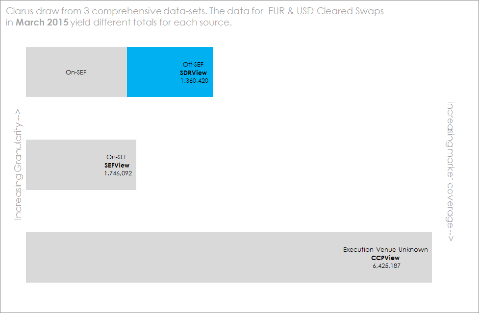
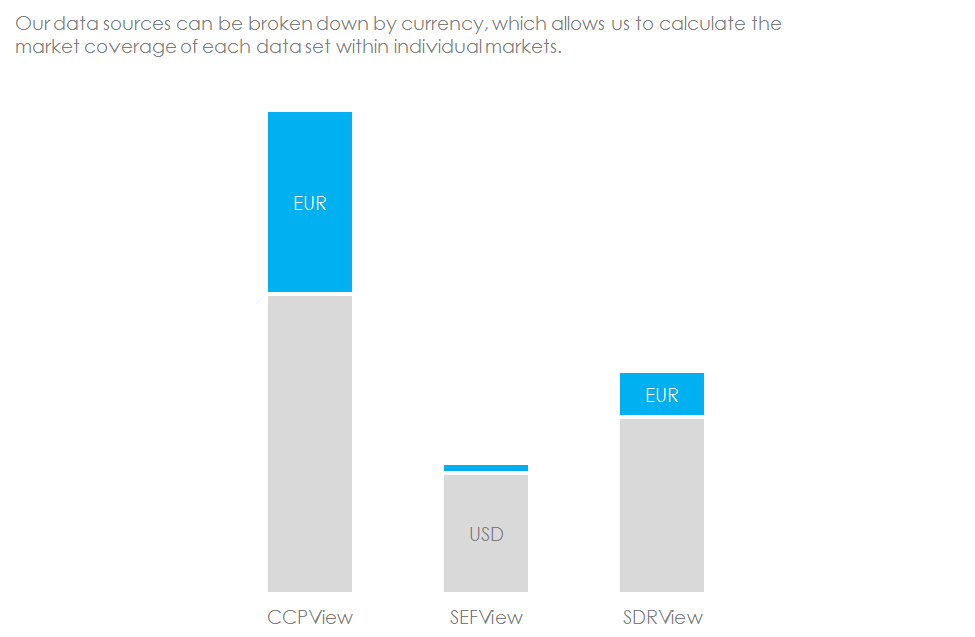
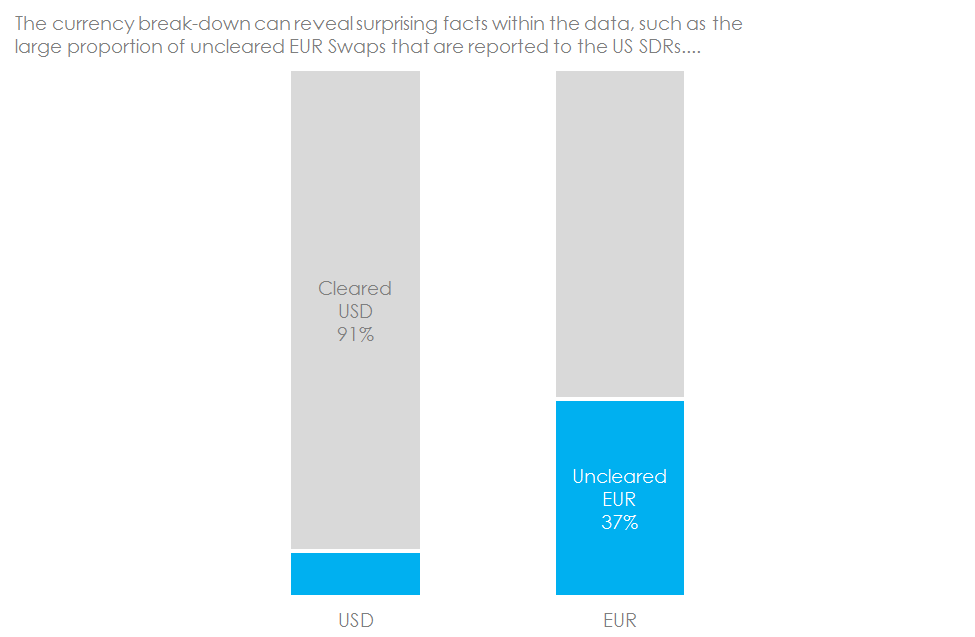
Last week I took 1033 words to explain what proportion of the market we see in the US SDRs. Because this is such a key concept, this is a great blog to repeat. So let’s see what this would look like in my new Edward Tufte world.
Information Can Be Beautiful
Summary
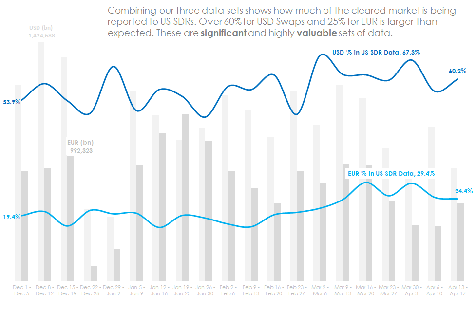
Data visualisation techniques are becoming ever more important to the Swaps market as data sources get larger and more diverse. It is now possible to interrogate trade-by-trade data for a huge proportion of the swaps markets, particularly in USD and EUR swaps. This data maybe unwieldy, but using the right tools it can be simplified and explained.
We’d love to hear your feedback on our two different approaches to communicating the same key message. Whilst I’m not sure this week’s blog would pass all of Edward Tufte’s criteria for truly beautiful information, I hope it’s a step in the right direction!
Update
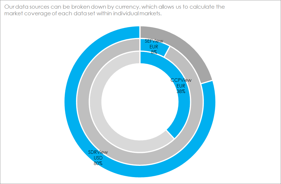
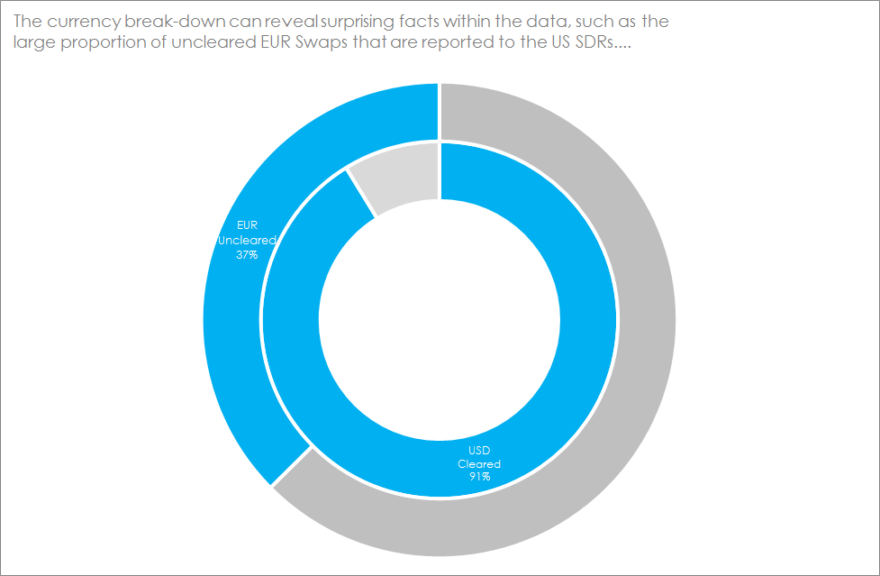
It was suggested (by more than one person!) that I missed a key element of Tufte’s approach with the middle two charts. The way I think in pie-chart terms turns out not to be very intuitive! In particular, the nesting of multiple angles can be confusing, especially when I’m trying to convey only two or three numbers. This is a great chance to show how the same message can be conveyed in a much clearer format with some time and effort – so I’ve created new versions of charts two and three:
Clarity is key to our message, therefore our data visualisation will continue to improve.
Why do you need big swirly circles to convey three figures? What is wrong with three figures, or a simple bar chart? How does any kind of circular chart encoding data values as angles “make it simple and easy to understand”?
This style of doughnut, ( = pie-with-a-hole-in) charts are increasingly prevalent, and decreasingly useful.
Useful feedback! My original idea was to use multiple pie charts, as that is how I personally visualise the data. I guess given they are also circles and also involve angles they wouldn’t have helped either. I’ll update as bar charts – shouldn’t take long.