We have all heard the adage “a picture is worth a thousand words”, well today I am going to postulate that “a chart is worth a hundred words or more” and also “a chart is a hundred times quicker in conveying key information”.
A few weeks ago, we released our SDR View, which while great in the aggregate information it showed, it did so using tables of numbers. Each day I found myself looking at the grid of numbers to establish and re-check a few simple observations. The first being the percentage of cleared trades vs bi-lateral trades in usd, eur, jpy & gbp, which I would do by scrolling to each in turn, reading each gross notional and doing a rough mental calculation of the percentage. I would guess 60-120 seconds later, I would be satisfied and move on.
Well today we have released a new version of this page, as below.
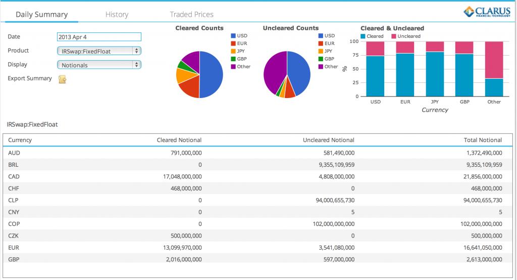
I now look at the chart on the top right and in a few seconds can register the cleared percentage in each currency. Which is great as saves me time, allows me to check that the figures are as I expect and move on to something new and interesting.
Which these days happens to be the prices of Cleared and Un-Cleared Swaps traded each day and the number of trades and gross notional in each tenor, which in our prior SDR View was available in two tables. Again lots of scrolling and mental agility, perhaps even export to excel before I was done with that. Now we have the following.
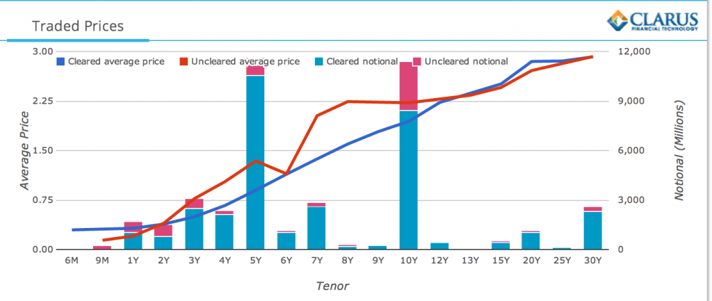
All the information I want presented in colors, lines and bars. What more could I want?
Wait there is more and it is a big one; “the quality of data”.
So those kinks in the Uncleared curve are a warning sign of something wrong in the data or in our business logic in deriving value from the data. I can now find them quicker and investigate.
So less words, less time, more quality.
And that is without mentioning our new drill-down feature. So click on a number and you get the list of trades that make up this number. Super. And a breadcrumb to navigate back. I know not a feature of the chart, but we had to do something to improve use of the grid to keep up with the charts.
Back to the main message.
A lesson re-learned many a time, “a picture is worth a thousand words”.
One thought on “Is a Chart worth a hundred words or more?”
Comments are closed.