Clarus data shows that the average tick size in USD Swaps is increasing. We show evidence that this widening tick size is a feature across all maturities. The data suggests that the amount of liquidity has stayed constant in the market, whilst the cost of liquidity is increasing.
This trend has been in place since the beginning of 2014 and may be accelerating now due to the widening CME-LCH Basis.
History, and lots of it
Within our SDRView products, we now have a thorough history that allows us to look at a considerable number of time-series. This allows us to identify trends in the data that have not been apparent before. We also back-date our data enrichment, yielding a much more transparent data-set to interrogate.
Bloomberg Tickers
One such example is our adoption of the Bloomberg Open Symbology. Quite simply, whenever a trade hits the SDR we now map that to the corresponding Bloomberg ticker. When looking at historical data, this therefore allows us to readily compare like swaps with like.
Tick Sizes
With this in mind, I decided to have a look at the average tick size in USD Swaps. The tick size I define as:
The price change in a given swap between two consecutive trades.
This can be considered as the maximum bid-offer spread that may be captured by a market-maker. Or the degree of aggression needed to trade if you are a price-taker. Equally, if swaps were truly a continuous market, then we would expect this to average out at somewhere between 0.5 and one times the typical bid/offer spread in an order book. Overall, I thought it was a surprisingly simple statistic that would give us a good flavour of how markets are evolving.
The Scariest Chart of 2015 so far?
Apologies for the click-bait title, I know it’s not our style. But when I started the analysis for this blog, I was truly amazed by the trend shown in the chart below.
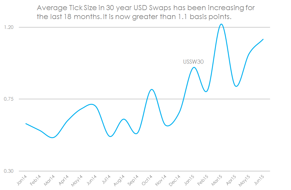
To clarify what the data shows:
- I look at all Outright On-SEF USD Swaps each month.
- I then look at the absolute change in price between two time-consecutive swaps of identical Bloomberg ticker. The above chart is for the “USSW30” ticker, representing a 30 year USD Swap vs 3m Libor with Fixed Rate paid on a Semi-Annual 30/360 basis.
- I take the average “tick size” per calendar month to create the above time-series.
- I’ve repeated the analysis for 2 year swaps (USSW2), 5 year swaps (USSW5), 10 year swaps (USSW10) and 30 year swaps (USSW30). In addition, I’ve looked at all matching tickers and averaged their price moves.
- Every single time-series shows the same gradual widening in average tick size.
Originally, I was comparing a few sample weeks for 10 year swaps, and I saw an increase from 0.17bp in January 2014 up to 0.54bp in July 2015, with the intervening weeks seemingly confirming a gradual widening trend. So I then got worried about sampling bias, not having enough data etc etc. So I repeated for 2015, which confirmed the findings again, until we have this blog. I’ve now analysed every month and every swap maturity since January 2014!
The same chart for 10 year Swaps
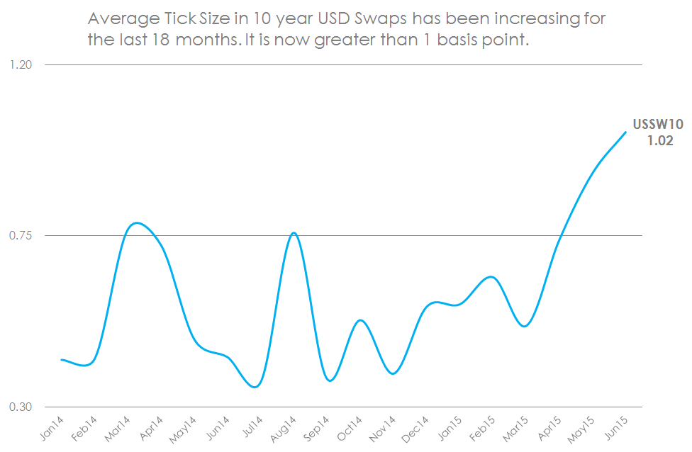
As we know from our previous analyses, 5 year and 10 year swaps trade far more frequently than any other maturity. So these really are the bell-weather of the USD Swaps market. And we see the same trend in 10 years (shown above) and 5 years – always towards an increasing price gap between the previous trade and the next one.
The ISDA Report on Liquidity
I was reminded of the ISDA review of their Swapsinfo data for 2014, in which ISDA observed:
“Over the course of 2014, total swap data repository (SDR)-reported
average daily trade counts increased while notional volumes decreased,
suggesting more frequent trading in smaller sizes is taking place. This
inverse relationship was observed in both swap execution facility (SEF) and
over-the-counter (OTC) trading.”
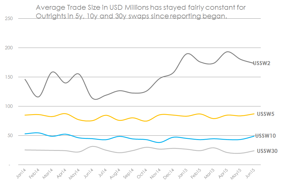
Our enriched data allows us to take a more granular approach to trade counts and sizes. When we do this, it shows a slightly different trend. Swaps of matching Bloomberg tickers, traded as Outrights on-SEF, show a pretty stable average trade-size:
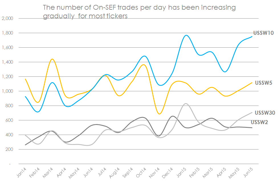
Although we do agree with ISDA’s finding that, generally speaking, trade numbers are increasing over time:
So what does all of this mean?
Liquidity, Liquidity, Liquidity
To my mind, this all relates back to liquidity in the markets and how easy it is to trade a market standard structure. A few conclusions from this data:
- There has not been a decrease in the amount of market liquidity. This is confirmed by a near-constant market standard size that has been trading more frequently each day.
- The increase in tick size, however, represents an increase in the COST of this liquidity. This could be due to increased volatility.
- Or it may be due to a decrease in the number of market-makers willing to execute “at mid”. This suggests that market-makers are more protective over their bid-offer spreads under current market conditions.
And, of course, this data raises some questions:
- Is the increase in tick size, particularly for 10 year and 30 year maturities, due to the emergence of the CME-LCH Basis in USD Swaps? We do not know where the swap is cleared from the SDR data, therefore a wider basis may lead to a larger tick value.
- Will the widening CME-LCH Basis result in a higher trade count per day? Assuming the basis does not impact customer demand, there may be more hedging activity required.
- What will bring a halt to the trend for increasing tick sizes?
On the subject of the CME-LCH Basis, our data suggests that the average tick size started to increase before the CCP basis “blow-out” in April, but that this new pricing differential may have accelerated the trend. There is therefore scope for further analysis on this data.
Summary
- Clarus enrich swaps in the SDR with Bloomberg tickers. This enables us to measure the average tick-size between consecutive swaps that are identical.
- There is a clear trend of increasing tick sizes since 2014 for all tickers (i.e. maturities).
- The number of trades per day has been increasing, whilst average trade size has been virtually constant since 2014.
- This suggests that the amount of liquidity in the market has stayed constant, but the cost of liquidity is increasing.
- The increase in average tick sizes has picked-up lately. This could be due to the widening CCP Basis.
- This is a key market development that we will continue to monitor.
“Yes”