- We analyse Liquidity using our Price Dispersion Index
- We find that liquidity conditions have worsened for 10 year USD swaps
- The analysis quantifies liquidity using price and volume
- We conclude that illiquidity begets illiquidity
 Liquidity often feels ephemeral and fleeting when you’re trying to transact. To counteract this, it is beneficial to quantify liquidity conditions, taking the subjectivity out of something that feels difficult to define.
Our lead chart this week therefore measures liquidity in USD Swaps. As you can see in the chart to the right, the Index reading is currently at the highs and has been increasing. The elevated level of this index shows a lack of liquidity in USD swap markets right now. Read on for an explanation.
Daily Liquidity
The measure of liquidity that we prefer is a Price Dispersion Index, as we have explored in several previous blogs. Motivated by research from the Bank of England in terms of SEF liquidity, we now measure liquidity on a daily basis (and in real-time via our API).
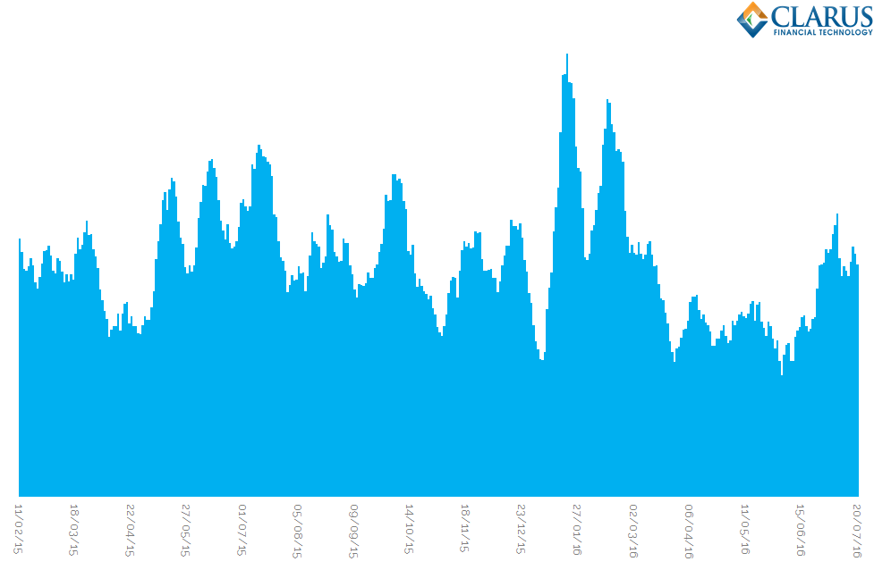
Looking at the daily time-series of liquidity conditions in 10 year USD Swaps shows why liquidity can feel so fleeting:
Showing;
- A volume-weighted price dispersion index for spot starting, 10 year USD swaps.
- We calculate the index value on a daily basis for all 10 year swaps traded on an outright basis since 2015.
- A higher value of the index represents worse liquidity conditions than a lower value (i.e. increasing values = bad, decreasing values = good).
- It would be fun to label the peaks with market events. For now, let’s just say that the latest peak is 24th June 2016 as the Brexit referendum results were being digested. This gives the index some immediate credibility!
The Maths
We’ve defined the equations used before for this index, but here is a quick refresher for those interested. Our choice of liquidity measure is a volume weighted price dispersion index:
\( \tag {1} DispVW_{i,t} = \sqrt{\sum\limits_{k=1}^{N_{i,t}}\frac{Vlm_{k,i,t}}{Vlm_{i,t}}(\frac {P_{k,i,t}-\bar{P_{i,t}}}{\bar{P_{i,t}}})^2}\)
where;
\(N_{i,t}\) is the total number of trades executed for contract i on day t, e.g. how many 10y trades occurred on the 24th of June 2016?
\(P_{k,i,t}\) is the execution price of transaction k, i.e. the price of a particular 10y trade on the 24th June 2016.
\( \bar{P_{i,t}}\) is the average execution price on contract i and day t, e.g. what was the average price of all 10y trades done on 24th June 2016.
\( Vlm_{k,i,t}\) is the volume of transaction k e.g. the size of the 10 year trade we are looking at on 24th June and
\(Vlm_{i,t}=\sum_{k}Vlm_{k,i,t}\) is the total volume for contract i on day t. e.g. the total volume of 10 years traded on the 24th June.
Deciphering the Values
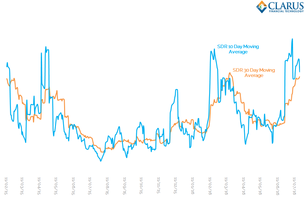
It might look like a meaningless time-series at first, but the problem of deciphering a pattern from the noise is nothing new for financial markets. Let’s use the most simple of techniques – a moving average (or two) to get some meaning from the data:
Showing;
- We are plotting the same data as on the previous chart, but this time we average over 10-day (in blue) and 30-day (in orange) trading periods.
- This time-series makes sense of the noise. We see that over longer time-periods liquidity conditions are actually fairly stable.
- The shorter periodicity of the 10-day period illustrates the “shocks” that the market experiences in liquidity. These tend to be event-specific – such as the latest Brexit shock.
- The orange line, which is a longer periodicity of 30 days, shows that liquidity conditions actually take a long-time to transition from lows to highs.
This last point can be attributed to two effects:
- Liquidity shocks, when they do happen, are very large. Therefore, on days when liquidity is poor, it is exceptionally poor compared to other days (i.e. we see a very high index reading). The inclusion of this single day within the time-series therefore has a large effect on the average for 30 more days.
- Similar liquidity conditions tend to cluster together. Therefore, if we experience a good liquidity day, it is more likely to be followed by another good liquidity day. This suggests that liquidity begets liquidity (and illiquidity begets illiquidity).
With further index design, we could negate effect number 1 using a kind of volatility scaling within the 30 day averaging period – similar to how Clearing Houses apply a smoothing co-efficient to returns.
It is effect number (2) that seems most relevant to markets.
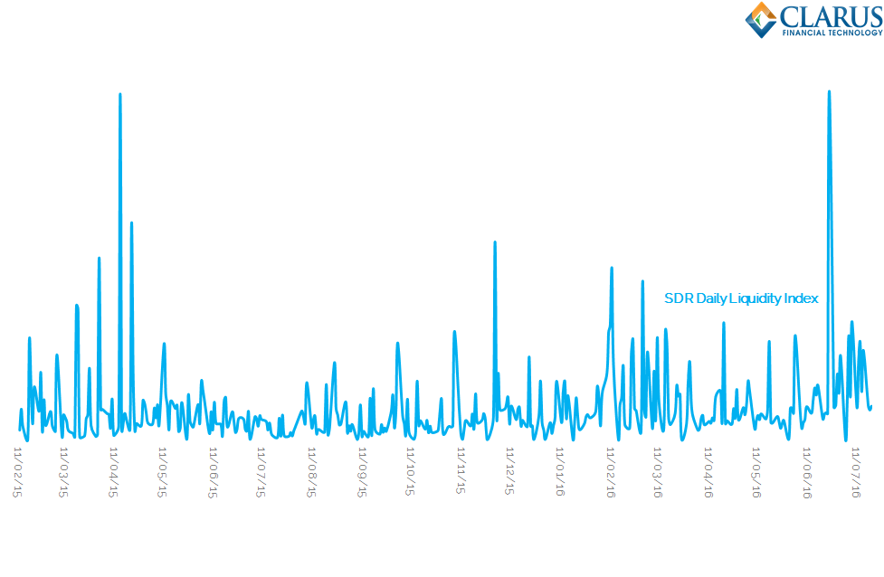
 At first, I thought this was maybe related to volumes – despite the volume weighted nature of this index, do we simply see larger price dispersion as more trades and of larger size go through the market? However, a cursory glance at daily 10 year volumes shows this not to be the case (chart on the right). And the R-squared coefficient is less than 1% between the index values and volumes, showing no correlation between the two at all.
However, effect number (2) could be caused by an increase in the CME-LCH basis spread. Recall that we are looking at the price dispersion from an average price. SDR records are not marked-up with the DCO of the swap. We have previously explored identifying the CCP of trades from the SDR, but this particular piece of analysis does not account for it. An increase in the CCP basis will therefore lead to an increase in the price dispersion index. Filtering out these trades would improve the index.
Having said that, if the index were solely related to the CCP Basis, we would expect some type of relationship between volumes and the index level. We do not see this.
Conclusions
My main conclusions are as follows:
- The index reading is at the highs, suggesting liquidity is impaired.
- The index has been steadily increasing since the Brexit result.
- This is worth monitoring. Whilst liquidity shocks stay in the index for a while, the index is currently increasing even from high levels.
- If 2015 is any guide, “Summer” markets will start to hit shortly when liquidity is in short supply anyway. We may see the same slow grind higher in the index this year, representing a further reduction in liquidity.
- The Index has a couple of limitations – such as the inclusion of CME-cleared trades. We need to continue to refine the methodology.
We’ll continue to monitor this over the coming weeks.