- We follow-up on a recent Bank of England study on the Swaps market.
- The Bank report finds that SEF trading has increased liquidity and decreased trading costs.
- Clarus data backs these findings up with 2016 data…
- …and shows that liquidity is much greater On-SEF than Off-SEF.
- This is an important and rigorous measurement of liquidity in today’s markets.
Following Up
As promised at the start of this month, we’re going to crunch some numbers related to the Staff Working Paper No.580 from the Bank of England. For some background, check out our first blog, which had these key take-aways:
- Our Clarus data is consistent with theBoE research concerning;
- Total traded volumes
- Dealer-Client volumes
- Fraction of on-SEF trading
- And our data across SDRView, SEFView and CCPView clearly agrees that the US trading mandate has not been enforced in markets that are dominated by non-US counterparties, such as the EUR-denominated swap market.
Today, we take a look at the framework used to quantitatively assess liquidity in swaps markets.
Liquidity Variables
The Bank of England use three Liquidity Variables. There are two price-dispersion measures, which they use as a proxy for execution costs. The final one is a Price Impact measure. Handily, we can replicate all of these using Clarus data. As with the first blog, the main point will be to bring their figures up to date, instead of relying on a data-set from 2014.
Remember Tick Sizes?
Regular readers will recall one of our top blogs of last year – Is this the scariest chart in 2015 for swap markets? We found that the average tick size in USD swaps is increasing. The framework that the BoE use to assess liquidity is similar in concept to this measure as well.
The first equation that the BoE paper cites looks at the dispersion per day of the transaction price relative to the average price on that day. This is volume weighted, and uses the square of the difference to the average price – hence arriving at a price dispersion measure on a volume weighted basis:
\( \tag {1} DispVW_{i,t} = \sqrt{\sum\limits_{k=1}^{N_{i,t}}\frac{Vlm_{k,i,t}}{Vlm_{i,t}}(\frac {P_{k,i,t}-\bar{P_{i,t}}}{\bar{P_{i,t}}})^2}\)where;
\(N_{i,t}\) is the total number of trades executed for contract i on day t, e.g. how many 5y trades occurred on the 8th of January 2016?
\(P_{k,i,t}\) is the execution price of transaction k, i.e. the price of a particular 5y trade on the 8th January 2016.
\( \bar{P_{i,t}}\) is the average execution price on contract i and day t, e.g. what was the average price of all 5y trades done on 8th January 2016.
\( Vlm_{k,i,t}\) is the volume of transaction k e.g. the size of the 5 year trade we are looking at on 8th January and
\(Vlm_{i,t}=\sum_{k}Vlm_{k,i,t}\) is the total volume for contract i on day t. e.g. the total volume of 5 years traded on the 8th January.
Using Clarus Data
So, I went off and calculated this measure using Clarus data for every trade in my sample. Remember that we can easily run queries by Tenor, which makes interrogating the SDR data much much easier for data analysis such as this. For example, from SDRView Researcher, we can see the distribution of price forming, spot starting USD trades in 2016:
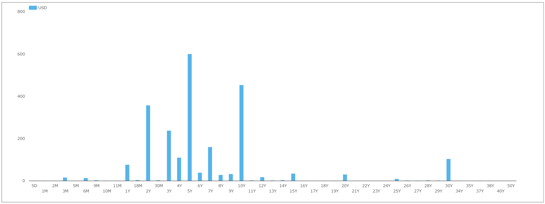
My sample data consisted of spot-starting, USD Swaps across the major tenors of 2Y, 5Y, and 10Y. And of course, we look at only price forming transactions – therefore excluding any trades from compression, roll activity or list trading. I looked at all trades done so far in 2016, and also compared those with the same period in 2015.
Clarus Results
Happily, our number crunching backs up the BoE staff report, as well as making a compelling case for transacting on-SEF in 2016.
On-SEF vs Off-SEF
In 2016, we see a marked difference in the Price Dispersion measures for trades transacted On-SEF versus those transacted Off-SEF. For example, in 10Y swaps, which were the most active in our sample period, we see the following time-series of daily Price Dispersion measures:
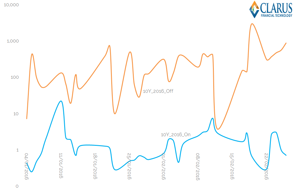
Breaking down the calculations used for that chart, we;
- Calculate the daily values of equation (1) for all spot-starting, price forming 10Y USD swaps traded in 2016.
- We separate the time-series into On and Off-SEF trades.
- Consistent with having individual pools of liquidity per venue, we calculate separate average prices each day for the On- and Off-SEF liquidity pools.
- We volume weight the square of the differences between each trade’s price and the venue’s average price for that day.
The resulting chart is plotted on a logarithmic scale. This is because the differences in Price Dispersion are so great between each time-series. Roughly speaking, we see that off-SEF trades have a price dispersion approximately two orders of magnitude greater than on-SEF trades.
Similar charts are seen for both the 2Y and 5Y time-series of data.
It is important to note that the off-SEF data-set is smaller than that used for on-SEF trades. Therefore, any “off-market” trade has a greater impact on the average and a greater impact on price dispersion – particularly if it is a large trade. We also know from experience that off-SEF data is not quite as clean – I have cleaned some trades with obviously missing fees for example. But we keep this impact to a minimum in our Clarus data set by using only price-forming trades for this analysis.
What Does it Mean?
To my mind, this is an extremely important chart. Not only does it back up the BoE study, it is done with timely, up to date data.
Whilst the BoE staff stated that their Price Dispersion metrics reduced after the introduction of SEF trading, we can see that the sheer difference between the two venues under current market conditions is a telling case for transacting on-SEF right now.
We can also compare current market conditions to those back in 2015 for the same time period. For example, the time series of this analysis for 5y and 10y swaps is below:
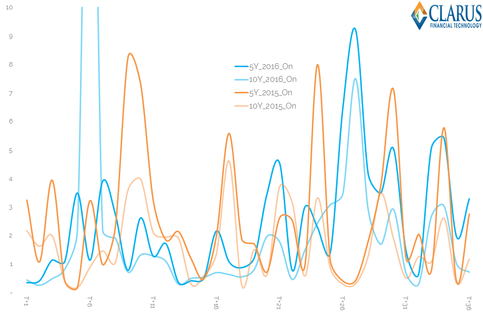
Showing;
- Daily values of equation (1) for 10y and 5y USD Swaps traded on-SEF during 2015 and for the same trading days in 2016.
- Obviously picking out a pattern is difficult amongst that jumble of lines!
- But note that the scale is linear. We do not have to revert to a logarithmic scale to fit all the data…
- …this at least highlights the homogeneity of these data sets.
- Generally speaking, the darker coloured lines, which are for 2016 trades, are a little higher than the lighter lines. On average, Price Dispersion has been higher during 2016 than 2015.
This last point is an important one. The BoE staff report includes “a vector of market-wide controls” that allows them to make valid comparisons between two different points in time – potentially correcting for increased financial market volatility. But it also highlights that liquidity conditions continue to evolve and are far from static!
And What is Next?
This is just the first of three liquidity variables that the BoE calculated. Over time, we will also plough through the analysis of the remaining two equations:
\( \tag {2} DispJNS_{i,t} = \sqrt{\sum\limits_{k=1}^{N_{i,t}}\frac{Vlm_{k,i,t}}{Vlm_{i,t}}(\frac {P_{k,i,t}-m_{i,t}}{m_{i,t}})^2}\)where;
\(m_{i,t}\) is the end-of-day mid-quote for contract i on day t,
and
\( \tag {3} Amihud_{i,t} = \frac {1}{T}\sum\limits_{j=0}^{T-1}\frac{\mid{R_{i,t-j}}\mid}{Vlm_{i,t-j}} \)where;
\(Vlm_{i,t}\) is the total volume traded for contract i on day t, and
\(\mid{R_{i,t-j}}\mid\) is the daily return of contract i on day t.
But that will be the subject of future blogs.
In Summary
- A rigorous, based-in-academic-rigour measurement of liquidity in Swaps markets is important
- It allows us to fairly compare liquidity across venues…
- …showing that liquidity is greatest on-SEF under current market conditions.
- These liquidity measures are flexible, and can be applied to different data-sets – not just the publicly available SDR data, but also to SEF-specific data for example.
- Using the SDR data allows us to paint a fair picture as to the state of market-wide liquidity conditions right now….
- …and also how these have changed over time.