Clarus tools help our users monitor liquidity risk across Swaps markets. In this blog, we quantify how much risk has traded this year across a broad range of swap subtypes, and across venues. We show how our clients can use SDRView to stay on top of the risks they are running.
Liquidity Concerns
According to Bloomberg this week, there are three words that count in the bond markets – liquidity, liquidity, liquidity. It’s been a common refrain from all market participants – and not just this year!
So let’s see how Swap market liquidity has developed over the course of this year. We have looked at this in the past and it proved to be a popular blog.
Swap Subtypes
The first concept is to break the USD swaps market down into component instruments – IMM, MAC, Spot and Forwards. We can then compare their comparative volumes and look at On-SEF vs Off-SEF percentages. The graph below displays the total DV01 traded as the size of the bubble, and the X- and Y- co-ordinates define the percentages traded On- and Off-SEF respectively.
First Year-To-Date for USD Swaps:
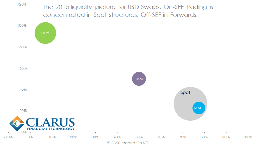
These figures exclude all compression/list trading, all Spreadovers and all other Package trades. We’ll come back to those further down in the blog. These are the headline figures for what we term price-forming trades – those trades done on a standalone basis.
- 2015 YTD has seen over $3 billion in DV01 trade!
- 58% of this risk has been traded via Spot starting swaps; 24% as Forward starting swaps and the remainder evenly split between IMM and MAC.
- 55% of outright risk has been traded On-SEF, mainly Spot and MAC swaps.
- Forwards are traded mostly off-SEF; IMM swaps have an exact 50/50 split between venues.
Is there anything trending?
So those are the numbers YTD. Have we seen any particular trends within the different structures over the course of the year?
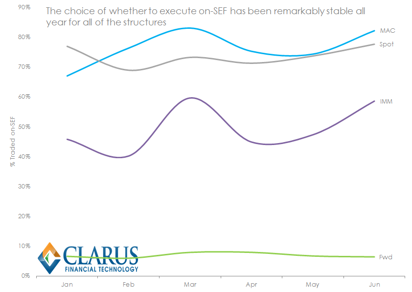 As the chart says, stability has been the theme:
- Spot starting swaps saw 77% of risk trade on-SEF in January; 78% in June and 77% on a year-to-date basis.
- IMM and MAC swaps see more variation, driven by the roll of positions in the March and June quarterly cycles.
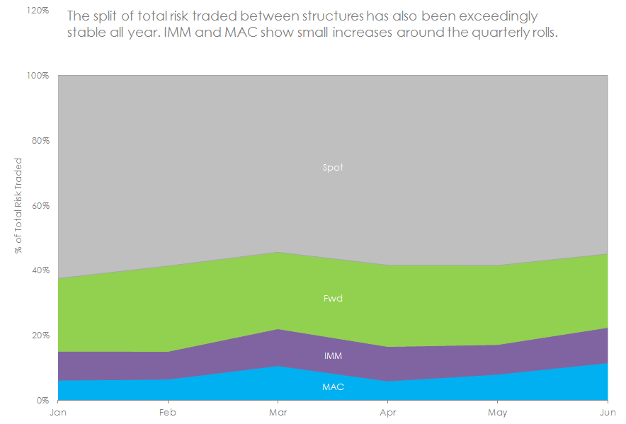
Finally for vanilla USD swaps, I’ll just flash this last chart up. If nothing else, it proves that the data is not masking any sinister underlying trends!
 What About Liquidity in Package Trades?
We have the history of our Package trades going back to at least the beginning of 2015 in SDR Res. This allows us to analyse these Packages separately to the outrights and effectively treat them as a parallel asset class. Therefore, what can we see in terms of their liquidity picture in 2015?
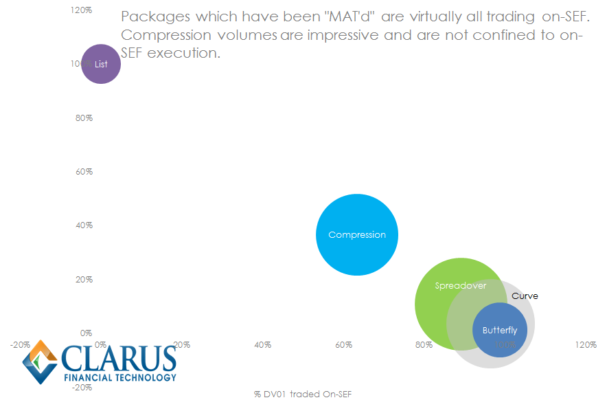
A quick caveat before I dig into this data. Our identification algorithm is sensitive to time-stamps. Therefore the better the quality of data, the better our chances of correctly identifying curve trades, butterflies etc. Electronically executed trades naturally offer a better data-source.
With that stated, here is what the data shows:
- Spreadovers have accounted for $985m of risk executed in 2015. As a standalone trade type, these are second only to spot starting swaps (at $1.8b YTD).
- Curve trades run Spreadovers very close at $908m, making them the third largest standalone trade type.
- We have a lot of respect for the innovation in workflows and electronic channels that have enabled Compression to blossom in the new SEF world. These innovations have been rewarded with a big chunk of the IRS pie. 25% of Package trades can be identified as one type of Compression or another.
- Whilst most Compression is done on-SEF, around 25% is executed off-SEF. Remember these are defined as backward or forward starting Clearable packages executed concurrently.
- We see no evidence in the data of Spreadovers, Curve or Butterfly packages being systematically executed off-SEF.
And interestingly, when we turn our eye to the time-series data, we can see that Spreadovers, Compression and Butterflies are the stories to follow in 2H 2015:
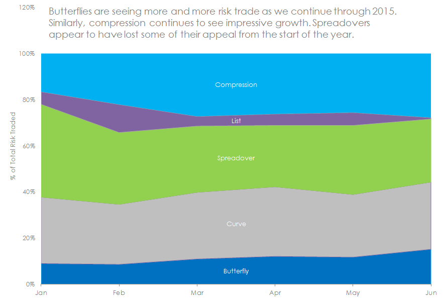
What is it with Butterfly trades recently? I’ll leave that to users of Clarus to drill-down into.
The Liquidity Picture
I know this has been a chart heavy week, but I just want to leave one more Clarus chart here. The split by trade type for June 2015 is highly representative of the Year to Date:
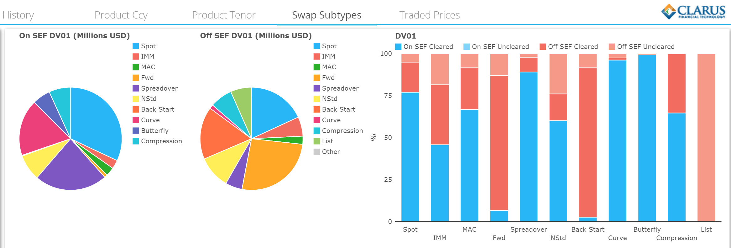
This snapshot of the market captures the true complexity of the liquidity picture across the swaps market.
Whether it is a vanilla trade or a package you are about to execute, it’s important to know and understand the liquidity risks you are running. Clarus provide the tools to identify, monitor and quantify that risk.