Curve and Fly trading looks like a simple old game – existing trades are ripped-up and replaced with spot-starting hedges. So why don’t people do that across the Bloomberg SEF?
Curve and Fly Trades
Today, we indulge in a little bit of data mining for our recently launched Curve and Fly feature. This is a fascinating area of the market, and whilst it’s always easy to get lost in the detail, we’ll try to keep to the bigger picture. I’ll use the concept of “Liquidity” that we introduced in January, looking at where swap types such as spot, IMM or MAC trade. Now that we have industrialised the analysis of Curve and Fly trades, I can now run the same analysis for these packages. The results, as ever, are a surprise at first.
Data for Week-Ending 20th Feb
First off, let’s look at what traded last week:
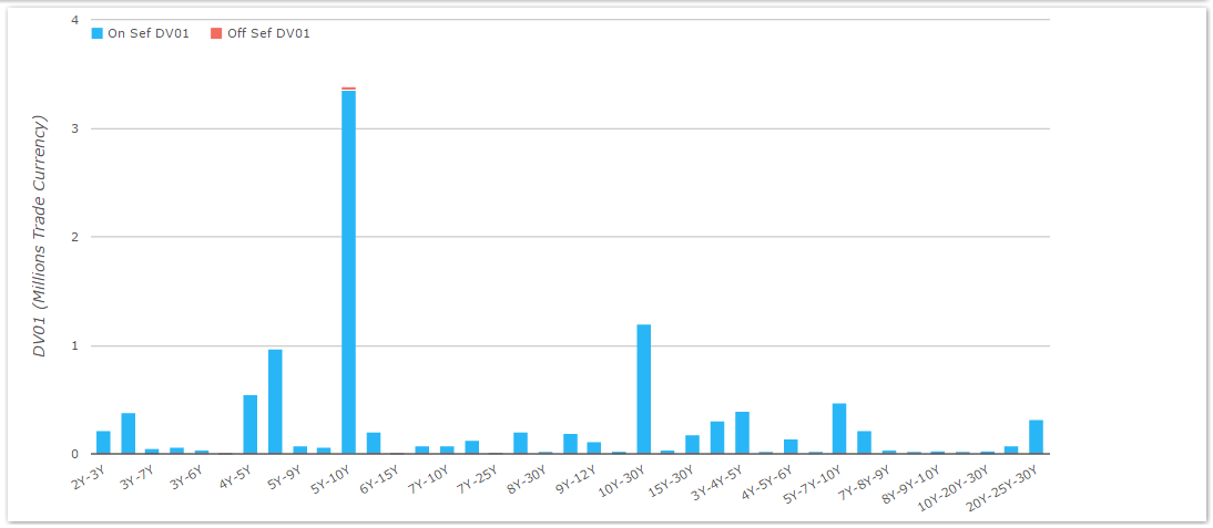
On the face of it, nothing really leaps out here. The chart looks broadly similar to the ones I presented last week for 2015 YTD:
- 5y10y dwarves all other Curve trading by size
- 5y7y10y is the most commonly traded butterfly
- 10y30y has been particularly active this month
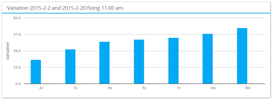
On the third point, the long-end continues to see the largest market moves which seems to be driving these volumes. During the month of February, 30 year swap rates are higher by over 42bp according to SDRFix:
What did I Spot in the data…?
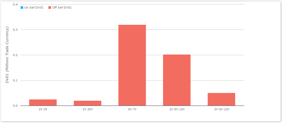
It would be a pretty dull blog this week if that was it (okay, a duller blog…). But here’s something interesting – our Curve and Fly identification algo also picks up the IMM, Fwd and Back-Start packages that are reported to the SDRs. And guess what? Just as with Swaps, the trade type dictates whether we see the trades happening On- or Off-SEF. For example, have a look at the (small) number of Forward Curve trades that were reported – all Off-SEF:
Therefore, just as we did for outright swaps, we can compare liquidity by (effectively) the start-date of the swaps:
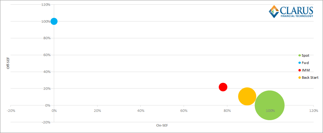
The main conclusions we can draw from this chart are:
- Spot-starting packages were the most traded, with over $10m in DV01 trading.
- Second place went to Back-Starting Swaps, which saw $3.9m in DV01.
- Almost 100% of Spot-starting packages were identified as being on-SEF.
- 100% of Forward starting packages were off-SEF.
Taking a mile-high view, this is broadly consistent with what we saw with Liquidity in USD Swaps (back-starting swaps aside). Forwards just don’t trade on-SEF, whilst the execution mandate has been successful in moving spot-starting swaps on-SEF. IMM structures sit somewhere in the middle. However, I was initially surprised that Back Start swaps saw so many Curve and Fly trades – accounting for around 25% of the total risk traded.
Rather than being a reflection on our identification process (which will continue to evolve), I think this is probably a fair reflection of how markets now trade. It is inherently cheaper to terminate an existing position than to execute a spot-starting proxy hedge when exiting a position.
Mind the gap…
But wait – these packages could also form part of a compression/compaction run, and represent a small portion of a close-to-delta-neutral portfolio that is being reduced.
The beauty of the data is that now we can actually test the likelihood that these packages were part of compression runs. My theory goes thus:
“If these packages are part of a compression run, you would expect them to be from market participants “tidying up” a portfolio – and therefore be full of 1-year gap spreads that do not trade frequently and have a low beta risk profile.”
Therefore, I put this hypothesis to the test! I looked at the volumes traded for a given “maturity gap” between two legs of a Curve trade – so for example, a 5y10y is a five year gap, whilst a 2y10y is an eight-year gap.
Unfortunately for the above hypothesis, when we compare the spot-starting and back-starting data, we actually see remarkably similar profiles:
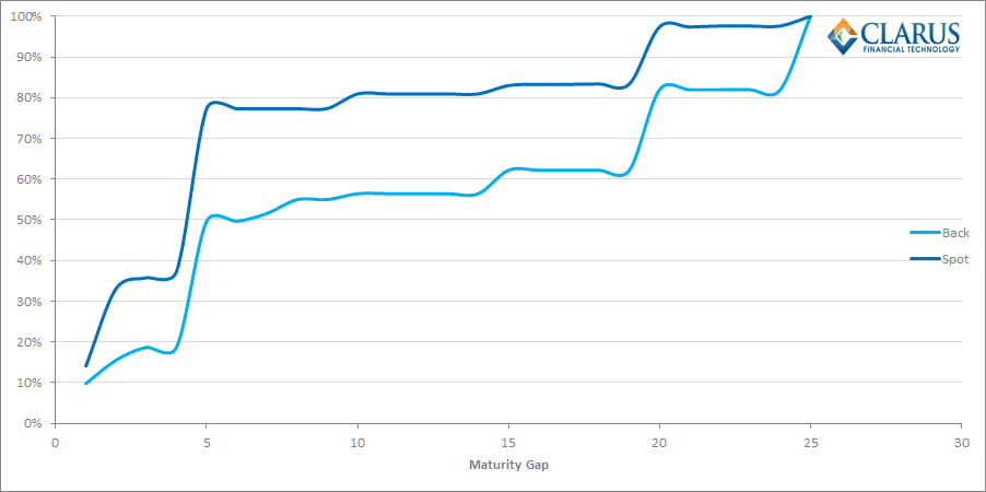
Indeed, the chart shows that back-starting swaps identified as part of a spread actually have a larger maturity gap between the legs than the spot starting equivalent – the light blue line doesn’t “catch-up” with the dark blue line until we hit a maturity gap of 25 years. Unfortunately for me, their similarity effectively knocks my previous hypothesis on the head. Such is the scientific method!
A simple conclusion…
To my mind, this means that there is a simple reconciliation to be made between what we see in the back-starting packages and what we see in spot starting space. In essence, the back-starting swaps are being “hedged” with spot-starting structures. We hence see very similar profiles for what has traded between the two.
It’s therefore left for me to suggest that the reason most of these non-mandated packages are traded on-SEF is probably down to the sheer convenience and utility of using the “list” trading functionality offered by some platforms.
Some platforms, but not others….
Speaking of convenience…BSEF enjoys a 30% market-share within Curve and Fly trades – broadly in line with their overall market-share. However, we cannot identify any Back-Start Curve or Fly trades on BSEF – which is a big surprise. We know they offer “compression” therefore I always assumed they also allow users to request seasoned swap termination prices on BSEF. The data suggests not. Is this functionality therefore “cuter” than it sounds and hence better suited to niche players? Answers in the comments section below please!