- We use a recent Bank of England study to navigate Clarus data on the Swaps market.
- The Bank report looks at the impact of SEF trading on Rates markets…
- …showing that liquidity has increased and trading costs decreased.
- We bring the findings up to date, including API calls to replicate the study for our subscribers.
Staff Research
Staff Working Paper No.580 from the Bank of England has a rather catchy title:
Centralized trading, transparency and interest rate swap market liquidity: evidence from the implementation of the Dodd-Frank Act
I’m not convinced that would quite work as a blog title here at Clarus, but it still hits the right buttons with us – transparency, liquidity and centralized trading are all covered extensively here on the blog and via our products.
We’re genuinely happy that these themes are also at the heart of Bank of England research. It’s always nice to know that we’re not alone!
As the report has been picked up by a few media outlets and been widely read, I figured it was time to explain what aspects of the report we can reproduce using Clarus data.
The Data
It’s important to understand the data that the BoE used versus what is available to the general public. In this case, the BoE used data from LCH (albeit fairly old data):
We obtain the reports of all new trades that were cleared by LCH between January 1, 2013 and September 15, 2014.
The Bank also used the DTCC SDR data to “complement” this data – i.e. to include any swaps that weren’t cleared at LCH. This allows the BoE to create a data-set very similar to the Clarus data, but also including counterparty information for LCH trades.
Given this, I thought it would be a worthwhile blog to use the BoE report as a guide to Clarus. Most of the data we can reproduce using our different products. Seeing as a regulator finds this kind of thing interesting, the Street should also know where to get these numbers from!
I’ve also included the API calls to these queries below. So if you were so inclined, you can copy and paste these 4 or 5 API calls and recreate the whole Bank of England report in a spreadsheet. Which updates. Real-time research anyone?
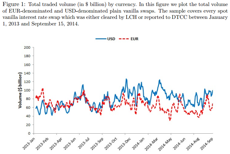
Figure 1 – Total Traded Volume
I’ll work through the BoE report in chronological order throughout the blog, so head on over here to see the report itself (charts start on page 25). Therefore, starting with Figure 1:
Showing;
- On the left, the BoE chart. On the right, the Clarus chart.
- Clarus numbers are from CCPView.
- Clarus numbers bring the time-series up-to-date to 2016.
- Bank of England numbers are as per the caption;
Figure 1: Total traded volume (in $ billion) by currency. In this figure we plot the total volume of EUR-denominated and USD-denominated plain vanilla swaps. The sample covers every spot vanilla interest rate swap which was either cleared by LCH or reported to DTCC between January 1, 2013 and September 15, 2014.
A few points I want to cover about this chart;
- Broadly speaking, we see a similar evolution of volumes.
- Clarus data is up-to-date 🙂
- The Clarus data covers a much wider set of trades, as we do not filter by only spot starting swaps.
- The BoE numbers must have some kind of filter attached to them, as neither currency series has a near-zero value. Obviously, we get the odd USD Swap reported on US-holidays (and similar for EUR), so the Clarus time-series has more “spikes” to zero.
- The BoE numbers go all the way back to 1st January 2013. Our Clarus data-set, for LCH, goes back to middle 2014.
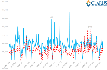
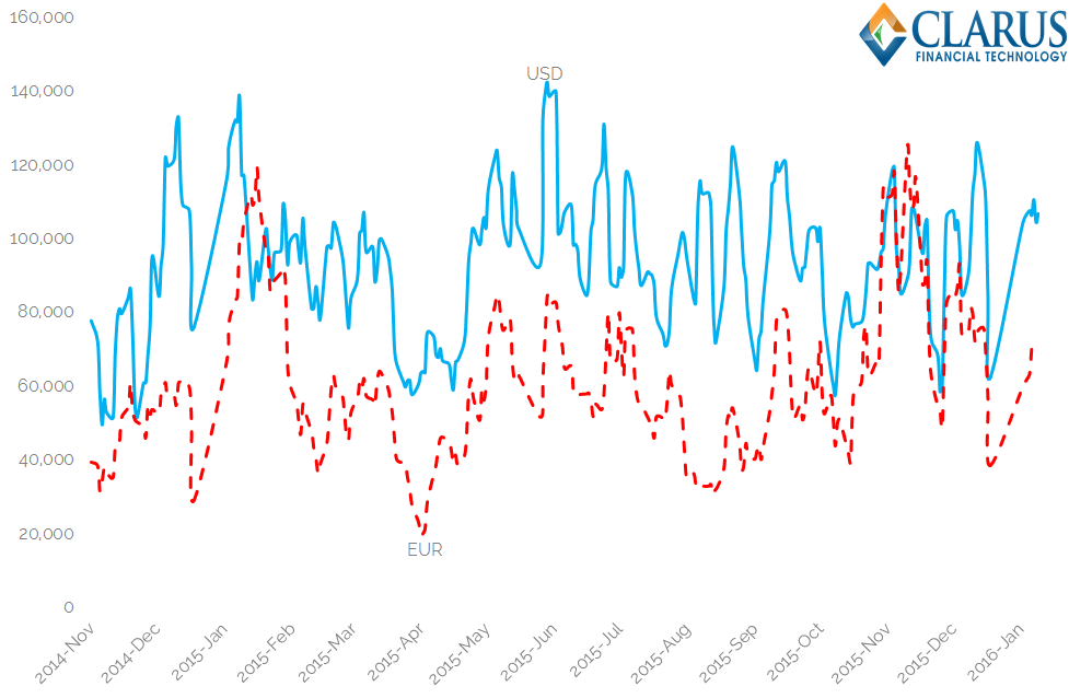
Within the Clarus world, we can combine SDRView and CCPView results to closely replicate the BoE data-set. Using SDRView, we know the split between spot-starting swaps and other structures. This time-series also illustrates just how large the Clarus data-set is now becoming:

(API Call: http://sdrview.clarusft.com/rest/api/v2/…..Requires a valid Clarus API key).
Showing;
- For all USD Swaps reported to the DTCC, the split by trade type – back-starting, forward-starting, IMM-dated, MAC, non-standard or spot-starting.
- The time-series above is a daily split, in percentage terms. This time-series goes all the way back to the start of DTCC trade reporting in 2012.
- On average, spot-starting is the largest trade type, accounting for over half of all trades.
Applying this split of spot-starting trades to our CCPView data-set allows us to more closely replicate the BoE data. This gives us the below chart, which is very close to the BoE chart, but brought up to date in 2016. I also apply some simple smoothing to eliminate the spikes to zero:
We could refine the above chart even further, by adding any uncleared transactions reported to DTCC to augment the CCPView data, which is for cleared swaps only. But I’ll leave that to anyone motivated enough to do so!
Remember, the point of this blog is just to explain the data we see, not to justify it to the nth degree and bore our readers!
Figure 2 – Dealer/Client Volume
Moving on from total volumes, the BoE also look at Dealer and Client activity.
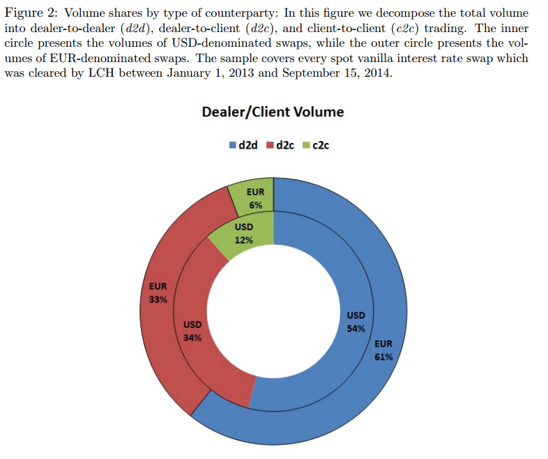
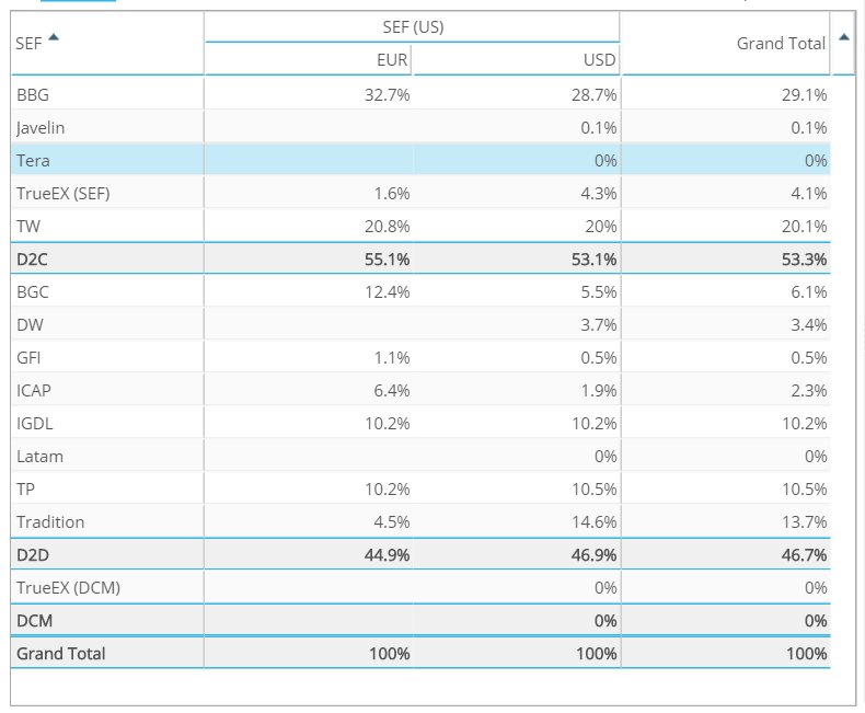
Showing;
- On the left, the BoE chart. On the right, the Clarus data.
- Clarus numbers are from SEFView.
- Bank of England numbers are again for spot-starting swaps only.
Again, a couple of points to make;
- It’s a pretty straight-forward comparison for USD trades.
- The BoE saw a split of 54% as Dealer-to-Dealer business in their data. Clarus data sees a larger percentage of Dealer-to-Client activity, at 53%.
- The differences are fairly obvious. The Clarus numbers are looking at SEF trades only (no other venue information to differentiate between dealers and clients is available). Clarus numbers are also looking at most Swap types, not just spot-starting.
- EUR Swaps are an interesting comparison. The BoE data-set is much larger here, as it relates to all cleared EUR swaps, thanks to the LCH data. The Clarus data is looking at only SEF-trades, therefore a much smaller portion of the market. However, the split by customer type looks to be fairly representative of the market as a whole.
- Again, I have run the Clarus numbers from inception (October 2013) to present-day.
Figure 3 US/Non-US Volume
For now, we cannot run a comparative to this in Clarus. One day, we’ll have meaningful European data, that will allow us to run similar analyses. Roll on that day!
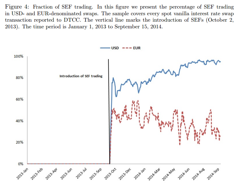
Figure 4 Fraction of SEF Trading
And onto our bread and butter….!
(API Call: http://sdrview.clarusft.com/rest/api/v2/SDRIR.csv?…..)
Showing;
- On the left, the BoE chart. On the right, the Clarus data.
- Clarus numbers are from our SDRView product.
- Both sets of data are for spot-starting swaps only.
- Clarus data is again brought bang up-to-date.
On the data comparisons:
- It’s a pretty straight-forward comparison for all trades. At least at first glance.
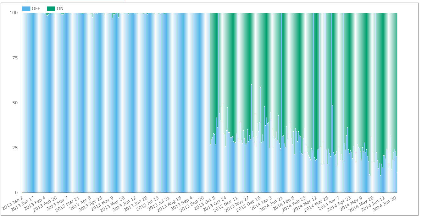
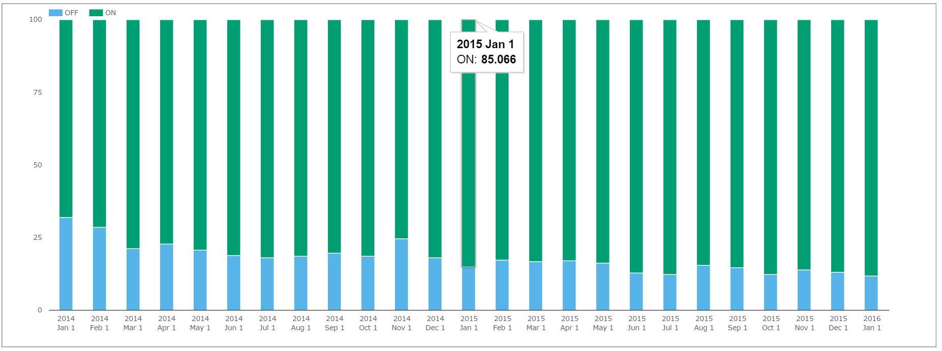
- USD numbers agree, with a steadily increasing proportion of the market trading on-SEF. As regular readers will know from our Monthly Review series, this trend has somewhat plateaued recently. This is shown clearly on a monthly time-series below:
(API Call: http://sdrview.clarusft.com/rest/api/v2/…..)
One caveat to state here is that DTCC numbers are all capped at the block-reporting threshold. This means that total volume traded on-SEFs is actually somewhat larger than reported to the DTCC. A fairer representation, therefore, is to use the USD Swap volume from CCPView and take total USD swap volumes from SEFView.
A EUR Surprise
This is exactly what I did for the EUR market. I chose to do so for EUR because I found the EUR time-series from the BoE a little surprising. It turns out that surprise is due to the details within the data.
The caption to their Figure 3 reads:
Fraction of SEF trading. In this figure we present the percentage of SEF trading in USD- and EUR-denominated swaps. The sample covers every spot vanilla interest rate swap transaction reported to DTCC.
I was surprised to see numbers as high as 40% in the BoE time series for on-SEF EUR swap trading. That number just looks too high.
But the BoE clearly state that they are using the DTCC data here – instead of relying on the LCH figures. Fortunately, Clarus is pretty good at tying up the LCH and DTCC data sources – and only using what is publicly available. Well done us!
 Taking total EUR volumes from CCPView, plus total EUR SEF Volumes from SEFView, gives us the clearest indication of what percentage of the EUR swap market really trades on-SEF.
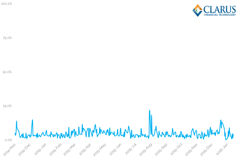
The chart shows a small percentage – averaging just 4% in 2016.
This difference between the Clarus analysis and the BoE time-series doesn’t do anything to refute the BoE’s main conclusion from this chart. They state:
Figure 4 demonstrates that the CFTC does not have the power to enforce the US trading mandate in markets that are dominated by non-US counterparties, for example the EUR-denominated swap market.
We whole-heartedly agree with that conclusion, but we’d just like to point out that the Clarus data lends even more credence to it 🙂
And the Liquidity Stats?
Of course, these charts from the BoE report are mainly background to the market and don’t play too much role in the headlines from the report. As the FT reported:
Study by @bankofengland and @richgpayne finds Dodd-Frank cuts swaps trading costs https://t.co/lX6Pvbuhyr
— Philip Stafford (@staffordphilip) January 18, 2016
Can we reproduce the BoE liquidity and cost analyses? Well, that’s a whole different kettle of fish from navigating the data. From my perspective, the report offers an important framework to measure liquidity – one that we should look to apply to the SDR Data. So don’t be surprised to see some follow-up blogs on that subject!
First, I’m off to read more about price dispersion and Amihud price impacts…..
In Summary
- Clarus data can be used to replicate the findings of a recent BoE report on Swap markets
- Our API calls can quickly replicate such a report
- The BoE report gives us a framework to navigate the different Clarus products…
- …and illustrates the power of Clarus data.