We have started collecting post-trade transparency data for US Treasury trading. I’m sure a lot of market participants have been analysing this data already. Our particular Clarus angle is to compare these UST trading volumes against the rest of the Rates trading landscape – specifically Bond Futures (at CME) and versus cleared Interest Rate Swaps (at LCH and CME).
This blog looks at the 2Y-50Y area of the curve, omitting volumes transacted in US T-Bills, money market futures or FRAs/OIS.
Volume History
We have been collecting cash US Treasury volumes as reported via TRACE into CCPView since March. This means this data is relatively new and novel to us, particularly given the extreme volatility we’ve seen in markets during that period.
Even though it is currently a limited time-series of data, it is still amazing to be able to directly compare the size of cash markets, derivative OTC markets and futures so readily.
Here’s what the data shows so far:

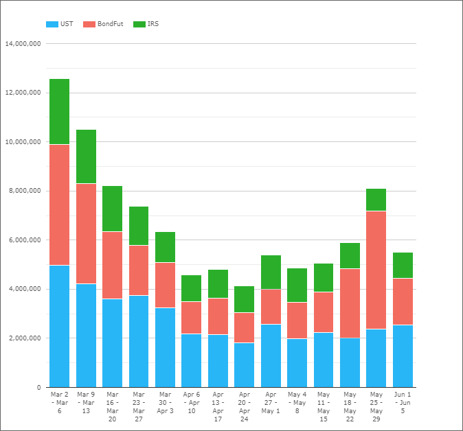
Showing;
- Our first week of data is still the largest on record. A combined $12.5trn of notional equivalent traded in a single week across cash bonds, cleared interest rate swaps (excluding FRAs and OIS) and bond futures (excluding Eurodollar three month STIR contracts).
- This was the only week where trading of cash bonds hit $5trn.
- In terms of bond futures, they saw as much trading activity (also around $5trn) as in a typical roll week (for example, the last week of May).
- The peak in interest rate swap activity resulted in $2.33trn in notional trading.
Assessing the size of the activity spike in the first week of March, we can say that:
- Bond Future activity was 2.5 times the subsequent “average” levels of activity.
- IRS activity was 1.9 times larger.
- UST cash bonds saw 1.8 times more activity than has been normal recently.
Using the same data to look at the split of trading during this week is also interesting:
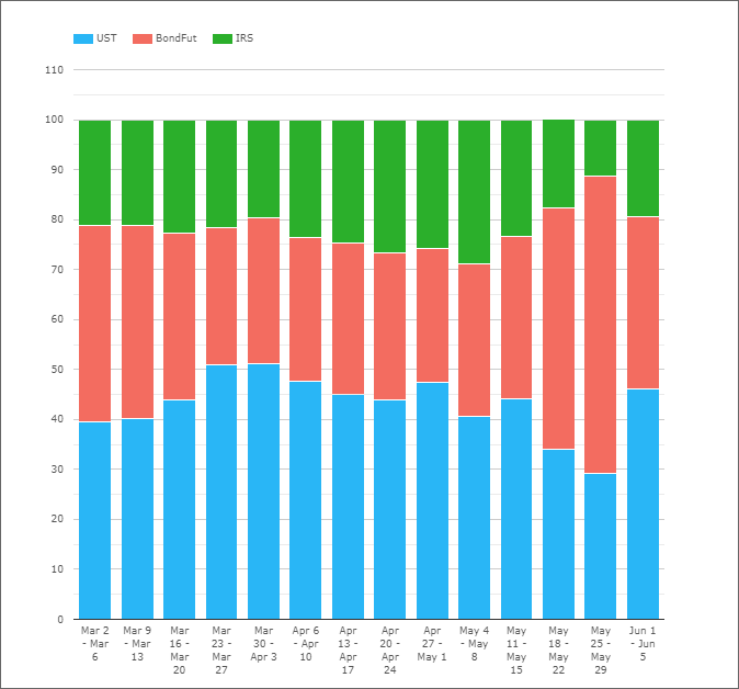
- Bond Futures saw 39% of trading activity. Their average share of activity since has been 32%.
- This 7% jump in trading activity was at the expense of both Interest Rate Swaps and cash bonds (USTs).
- In fact, IRS trading only saw a 2% drop in the share of trading activity.
- Therefore, cash bonds saw the biggest drop – falling from a 44% average to 40%.
What does this tell us? Well, bond futures are more balance-sheet efficient, so maybe less balance-sheet was being put to work harder from a trading perspective? In terms of a “dash for cash” liquidity rush, if people were really just selling whatever they owned, I expected to see a jump in UST trading as this would be the fastest way to raise cash I imagine?
The theory that bond futures vs cheapest-to-deliver basis trades were being unwound may also support the increase in the relative share of bond futures that we saw.
What is An Average Week in USD Rates Trading?
Updating the data in USTs this week, it struck me that the week ending June 12th was pretty much a bang on “average” week in terms of volumes traded. So what does our new “average” look like this side of the March volatility?

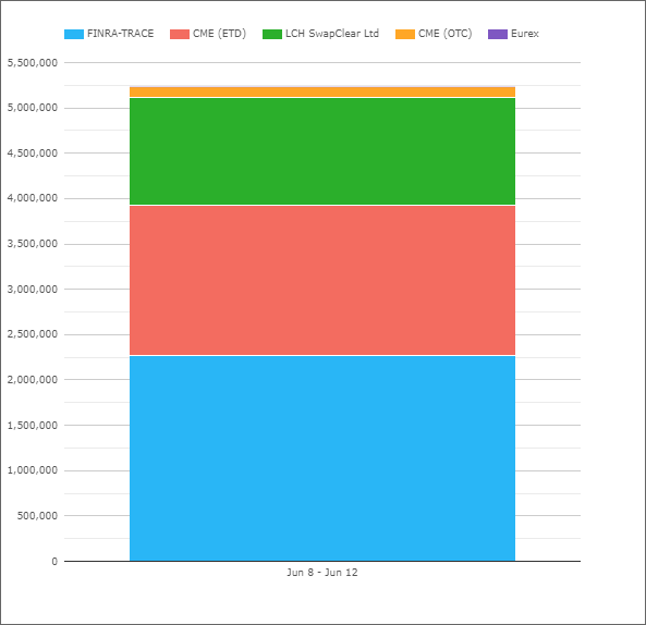
Showing;
- For the past ten weeks, volumes across bonds, futures and swaps has averaged $5.1trn (excluding the week of the futures roll). The week of June 12th saw $5.23trn transacted.
- Bond futures have typically accounted for 33% of volumes. This excludes the period when the June contract was being rolled (last week of May). During this “roll week”, bond futures volumes spiked to account for 59% of volumes.
- That means cash bonds (UST as reported by FINRA-TRACE on the chart) have consistently been the largest volume component of Rates trading. They account for 45% of weekly volumes on average.
- Interest Rate Swaps are therefore the smallest component, accounting for 24% of volumes.
For reference, the week of June 12th alone had a 43%/32%/25% split for bonds/bond futures/swaps, making it very average indeed!
Maturities
Another interesting aspect of the data is to split the volume traded by maturity:
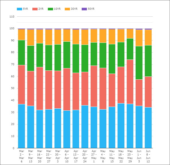
Remember these volumes are across all three asset classes – cash bonds, bond futures and interest rate swaps.
There are a few caveats with this particular data (looking at only maturities classified as 5Y for example, ignoring 7Y etc means we end up excluding around 20% of total volumes in this particular chart. It is also on a notional basis.
With these caveats stated, it is nonetheless notable that:
- 5Y is the most traded maturity, when measured by notional. Of course, the 2Y tenor is competing with eurodollar futures (which are excluded from this chart) for trading activity. We could include these short-dated futures (along with FRAs and OIS) in future analysis.
- Still, the split by maturities is fairly consistent each month. 5Y for example always accounts for around 35% (give or take) of total volume.
- Similarly 2Y has accounted for ~30% of notional each week (although it is in a relatively wide range of 22-37%).
I feel like this data deserves a more thorough investigation, therefore I also took the whole data set and translated into risk-equivalent terms.
DV01 Analysis
It is amazing how different the chart above looks when it is restated into DV01 amounts. This gives a maturity-agnostic measure of the risk traded per tenor:

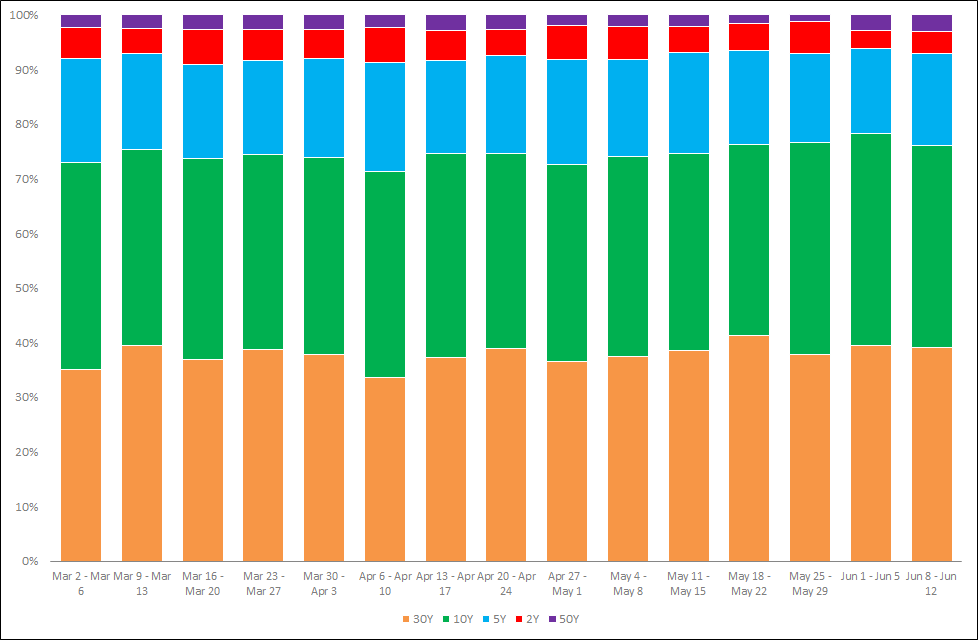
Showing;
- 30Y is actually the tenor with the most amount of risk traded in it. Each week, 38% of risk is transacted in the 30Y bucket.
- 10Y accounts for a similar amount of activity, at 37% of risk.
- 5Y is still a significant chunk, accounting for 18% of risk.
- However, 2Y and 50Y are pretty small, only accounting for 5% and 2% of risk each.
In Summary
- An average week in USD Rates trading sees over $5trn transacted in medium- and long-term products (2Y through to 50Y tenors).
- Cash bonds are the largest component of these volumes, accounting for 45% of notional.
- Bond Futures account for 33%, and Interest Rate Swaps the remainder.
- Looking at the maturity profile, 10Y and 30Y tenors see by far the most amount of risk transacted.
- These two tenors alone account for 65% of activity on a risk-adjusted basis.