- Clarus explores the AUD/USD Cross Currency Swaps market.
- We find that our SDR data covers over 20% of the market – both for dealer-to-dealer and dealer-to-client flows.
- SEF-trading has seen an impressive uptake, with an average daily volume over $500m.
- The off-SEF market remains important – not surprising, given a lack of clearing or execution mandate for this product.
- Even outside SEF trading, the SDR data is a very useful and timely insight into small areas of the market.
AUD Cross Currency Swaps
Time to focus on a smaller market this week. We’re often told that some of the smaller segments of the market are surprisingly well covered in the SDR data. So I took a look at the BIS statistics to see which areas of the market perhaps weren’t so well covered there. Using their natty new Statistics Explorer, I looked at Cross Currency swaps:
The exact query is (freely) accessible here.
Despite using these statistics a fair bit, I was surprised to see that I couldn’t drill down into an AUD/USD time-series.
Fortunately, there is AUD/USD data within the Triennial Survey – but that means that our latest data point is back from 2013. Not quite the real-time transparency Clarus likes in the Swaps markets! Nonetheless, let’s start this blog with that and finish with it later:
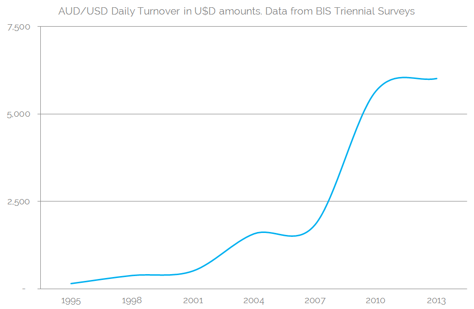
Full data-table here. Table 2.5, “Page 6” as labelled.
Showing:
- Considerable growth in the 2000s in average daily volumes that plateaued between 2010 and 2013, post financial crisis.
- The latest reading suggests that Daily Turnover is approximately $6bn (in USD terms, daily average in April 2013).
- Consistent with the rest of the Cross Currency swaps market, around about 50% of this is between reporting dealers.
- It is not the work of a blog to suggest reasons for the plateau in volumes in recent times. With research we could find many drivers, such as a rate cutting environment in Australia, reduced leverage in the financial system and less interest in esoteric structured notes by Japanese retail investors.
Let’s therefore see what the SDR data shows us about AUD/USD Cross Currency swaps, and bring these data points up to date.
Average Daily Volumes
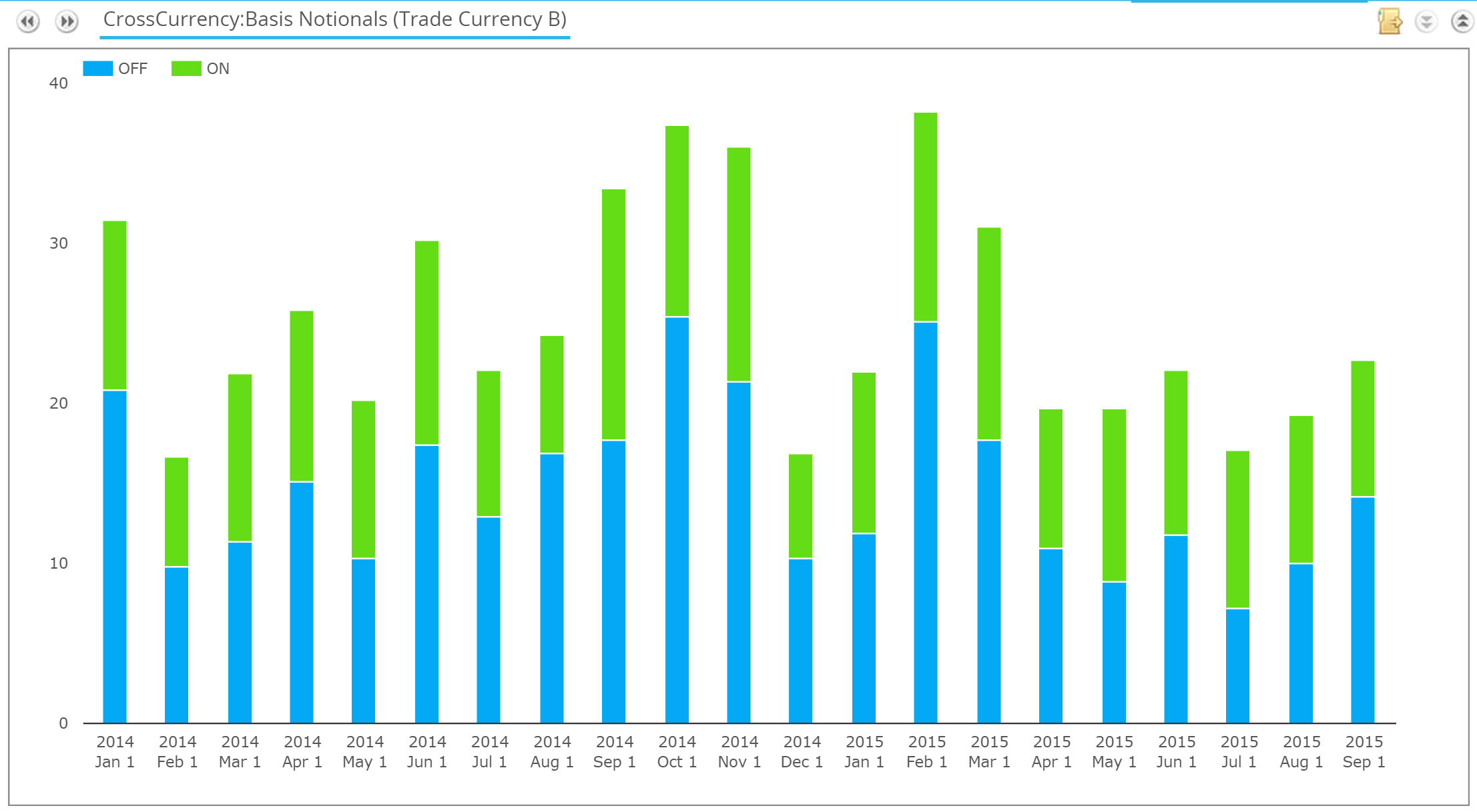
We’ll run virtually all of our SDR data through the SDRView CustomView screen, as it’s the most flexible way to run a variety of queries within our apps now. We can see the actual daily volumes during 2015 here:
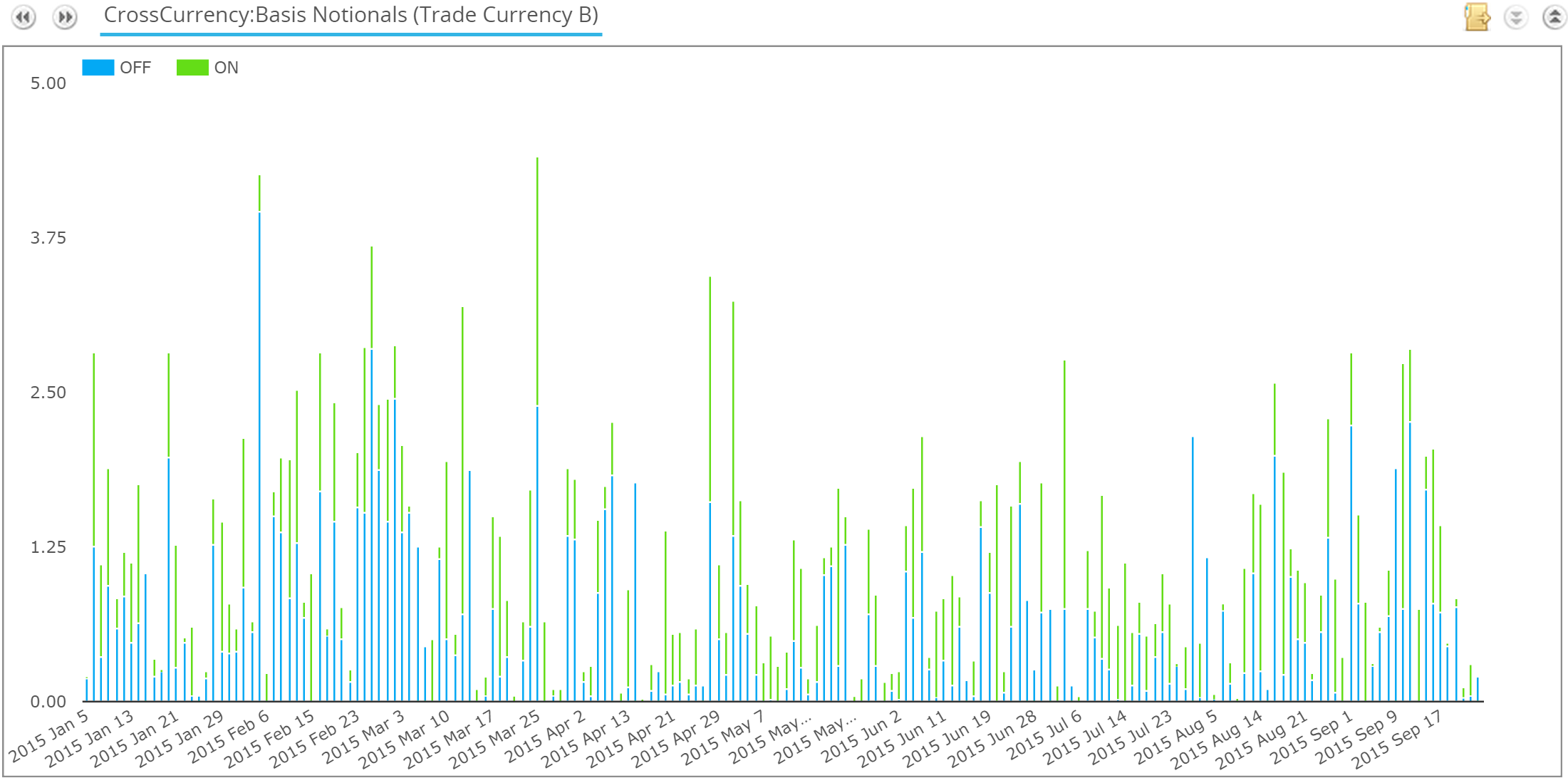
Exporting those to Excel, for 2015 we see:
- Total ADV (Average Daily Volume) of AUD$1.14bn
- ADV off-SEF AUD$632m
- ADV on-SEF AUD$506m
- A maximum daily volume of AUD$4.4bn (with capped notional reporting).
- Volumes in 2015 YTD are pretty much comparable for Jan-Sep of 2014 as well, running at about 95% of last year’s figures.
- ADV during the months of the year do vary, as the time-series for 2014 & 15 shows:
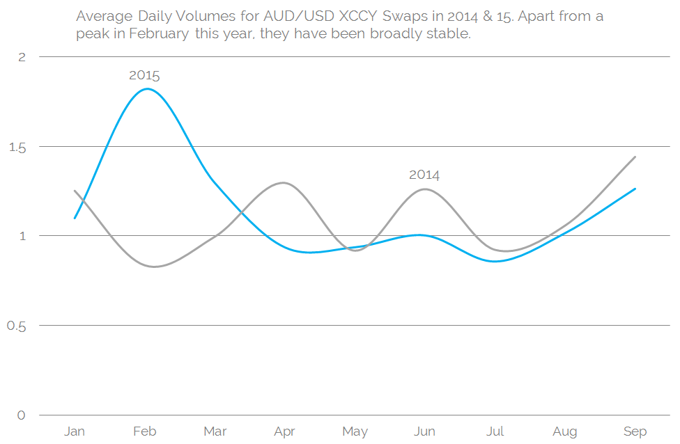
As the chart says, apart from a peak in February of this year, it is surprisingly stable.
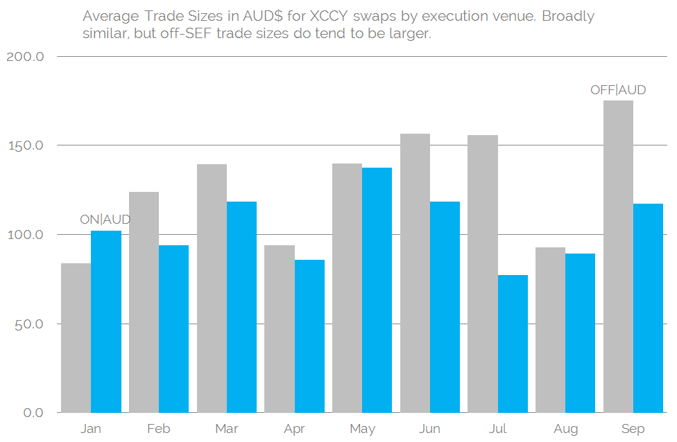
Average Trade Sizes
The below figures should be taken with a pinch of salt. Due to the distorting nature of capped notionals, we can only get a rough idea of average trade sizes.
This year, those figures have varied a fair bit. This probably represents the fact that this is a flow-driven market, therefore the exact tenor being traded may vary considerably as different tenor bonds are issued (for example, the Apple Kangaroo issue in August). The chart below shows the variation by month. It is worth noting that the YTD average trade size has been AUD115m:
Trade Volume and Price by Tenor
As we said, this variation in average trade size will be, to some extent, down to a change in tenor profile as different flows are hedged through the market. All we have to do is look at the past 60 days in SDRView Pro to see that there is trading across the whole curve:
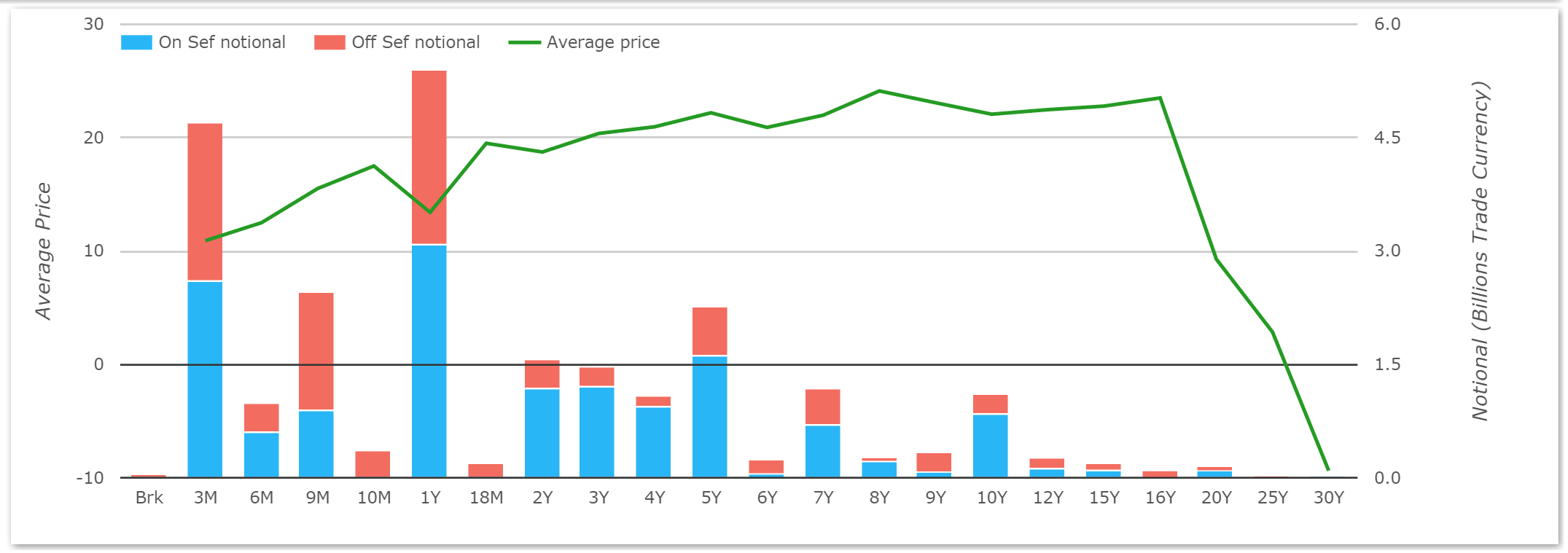
Showing volume wise:
- Trades from 3 months to 30 years
- Concentrated volumes in the 3m, 1 year and 5 year, with other maturities of interest the 7y and 10 year buckets.
And price wise:
- The basis vs USD is generally positive
- But there is some real price discovery to be done around 30y AUD/USD basis. According to SDR records, there has only been one spot-starting 30y trade in the past two months – and records suggest a -9.375bp coupon. Compare that with a print of +3 in 25 years (from both SEFView and SDRView) and that is quite an inversion! I’m not betting that coupon is correct, but there does some to be illiquidity (and possible receiving pressure) at that 30 year point!
Execution Venues
We can see from SDRView that there is a large proportion of the AUD/USD XCCY swaps market traded on-SEF. This has been the case all the way back to 2014:
And if we look at those same figures in percentage terms for the same periods in 2014 and 15, we can see again that this has been very stable:
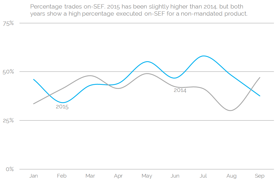
Showing:
- On average, 45% of capped notionals have traded on-SEF since the beginning of 2014.
- For a non-mandated product (neither Currency nor product type have an execution mandate in any jurisdiction) this is an impressively high number.
In reality, the numbers are probably a little bit more skewed towards off-SEF trading when we take into account large notional trades. If we look at the number of trades that are capped in size, only 10% of on-SEF trades are capped, whilst off-SEF that figure can rise to 20% for some time periods. Nevertheless, it is an impressive performance by the SEF platforms.
Which SEFs are on-top?
Using SEFView, we can of course see who is winning the daily market-share battle in AUD/USD swaps.
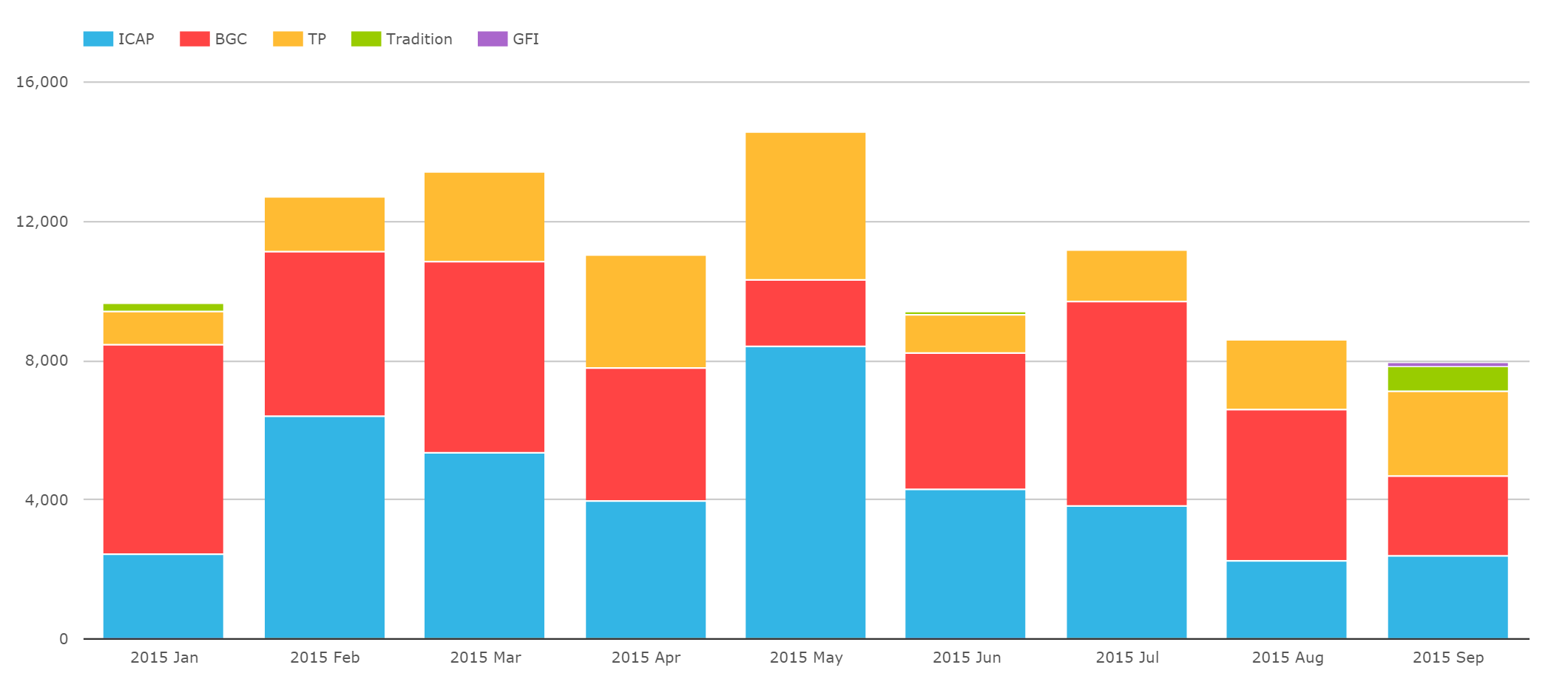
- Only the Dealer-to-Dealer platforms report any volumes in this product
- ICAP, BGC and Tulletts have sizable volume every month in 2015
- Total volumes on-SEF are higher than reported to the SDR (due to no capping of notionals). In May 2015, the on-SEF total notional traded was over 70% higher than reported to the SDR.
- Tradition have had activity in some months and not others.
And the same chart on a percentage share basis shows:
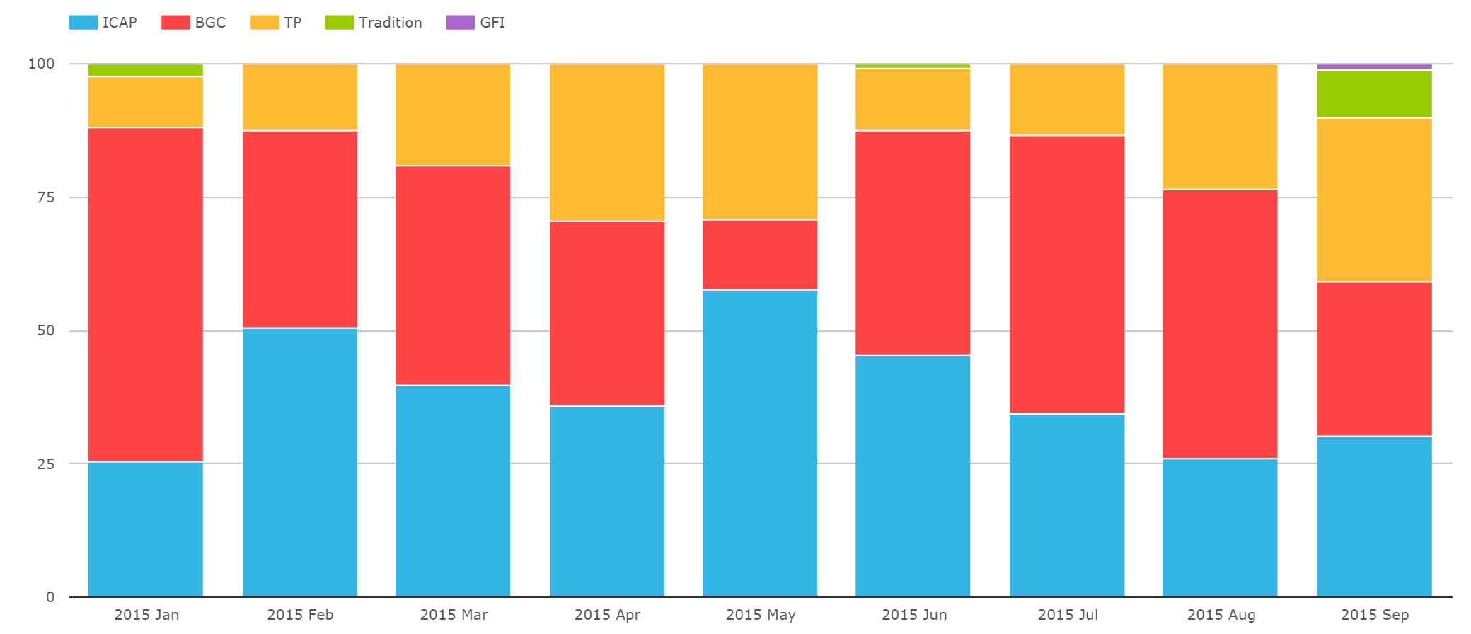
Giving us on a YTD basis:
- ICAP number one (just!) at 39.8% by notional.
- BGC a very close second at 39.1%, aided by some stellar months in July and August. This was seemingly driven by some large-notional, short-dated swaps.
- Tulletts are third with nearly 20%, and then there is the occasional Trads ticket.
- But remember that this is just a portion of the IDBs business, with the off-SEF market very important.
And in Summary
If you cast your mind back some 1000 words, we stated that the average daily volume in April 2013 for AUD/USD cross currency swaps was $6bn, of which $3bn were dealer-to-dealer flows (source: BIS). Even without any clearing or execution mandates around these swaps, we have trade-by-trade volume and price information for:
- An Average Daily Turnover of AUD$1.14bn in total
- Given that no Dealer-to-Customer SEFs have reported an AUD/USD cross currency swap, we can be confident that all of the On-SEF volume is dealer-to-dealer flow.
- We therefore see on-SEF data for around 20% of the total D2D market (taking an average on-SEF Daily Turnover of AUD$631m, a total dealer-to-dealer market of USD$3bn and using 2013 FX rates – which were at parity).
- Repeating the same analysis for the market as a whole (total USD$6bn, on- & off-SEF AUD$1.14bn) we see about 19% of total volumes being reported to an SDR.
- The BIS numbers serve as a great data benchmark!
- In reality, I am probably doing the Clarus numbers a disservice. We have only considered the plain vanilla “basis swap” in the SDR numbers – i.e. a floating 3m AUD BBSW vs floating USD 3m Libor swap. The BIS numbers will include Fixed/Fixed, Fixed/Float structures as well – although these would be rare in the D2D market.
The point of the blog? I know I would prefer to look at 20% of the trading landscape in real-time than 100% of the landscape with a 3 year time-lag. Couple in the fact that we know how it traded, when it traded and at what price it traded, and a market doesn’t have to have an execution mandate to yield valuable and timely data.