- The nature of swaps trading (RFQ to 1 participant for example) means that there can be a motivation to trade large-sized tickets in an old-school fashion – bilaterally.
- Therefore, unlike more mature electronic markets, these orders are not sliced’n’diced.
- This means that not only the performance of these large trades can be monitored in public data….
- …but we can also test whether these trades have any price-indicating or predictive properties on swap market prices.
We’re looking at the price dispersion around the time of block trades on different SEFs this week. This is just a limited initial analysis of 10 year trades, allowing us to present a simplified framework. But this framework can be extended to be maturity agnostic by using our DV01 statistics – or we could constrain this and use DV01 measures across a range of maturities – e.g. 7-13 years.
Block Trades Recap
Last week, we found that due to the Block Trade NARL, customers can choose to transact large trades on an RFQ basis and do not have to ask 3 market participants for a price. These trades cannot go through a SEF’s Order Book, so we know that D2D platforms do not report Block Trades. We therefore know that a Block Trade reported to BSDR was transacted on BSEF, a Block Trade reported to DTCC was transacted on Tradeweb and that all other capped trades reported to DTCC were probably executed on a D2D Order Book.
Given that we also know that the RFQ platforms (BBG and Tradeweb SEF’s) have seen significant volume growth this year, and that their reported block trading volumes have gone up, it is probably fair to say that many of their buy-side clients are happiest with this RFQ-to-a-limited-number-of-dealers. Or at least, they see this as the least worse/easiest choice under the current swap market structure.
Measuring Performance
So this opens a new field of analysis for us as neutral market observers. Our first port of call is to try to measure performance of these block trades by platform. For that, let’s try to create a benchmark for price impact.
Price Diffusion
In theory, prices should follow some kind of random walk/stochastic process. So if we look at price changes between consecutive (or systematically non-consecutive trades), and have a large enough population of trades, we might see a bell-curve reminiscent of a normal distribution for these price changes. So let’s start there today and develop these ideas over some coming blogs.
Trade Population
I’ve used a similar data-set to the one underlying “The Scariest Chart”. On-SEF, USD trades and for the purposes of illustration, 10 year tenors designated by the USSW10 Bloomberg ticker that we augment our data with. I’ve taken August 2015 as my time window.
I’ve collated a time-stamp ordered data set, and looked at the price change, in basis points, between trade T and trades T+1, 2, 3, 4, 5 – to identify the subsequent price impact across the next five trades.
I’ve also looked at the price impact to trades T-1, 2, 3, 4 and 5 just in case there are any nefarious tactics such as front-running evident in the data! I’d be surprised if this were the case, but it seemed a simple addition to the analysis – and (in the future) allows us to test the “T plus” data-set to verify if there are any structural differences versus the “T minus” data-set.
Results
Plotting the histograms for these data sets yields a series of bell-shaped curves. I’ve capped the price jumps at +4 and -4 b.p between trades – as these most likely represent end-of-day to start-of-day jumps. Charts below:
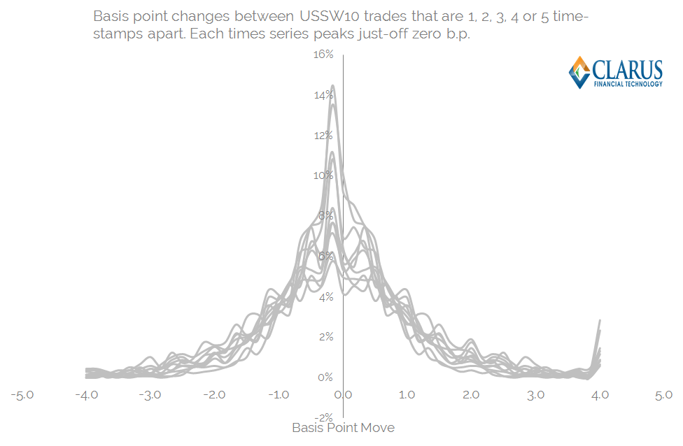
Some background statistics for this population of trades are:
- An average trade size of $47m
- An average “tic” size as per the previous blog of 0.69 b.p.
- The number of “USSW10” trades in sample period was 1,373.
And now we can drill-down deeply into the statistical properties of the above price distributions:
- Each time-series is slightly off-centre from zero – i.e. the tic-size is non-zero.
- Each time-series is remarkably symmetric. This is described by the “Skewness” of each time series. This explains the degree to which the RHS portion of the graph is different to the LHS. This could maybe even show if there are better platforms to pay or receive fixed on (very unlikely!).
- Each time-series has a slightly different shape – some are more “peaked”, whilst some are flat. This is measured by the “Kurtosis”. A perfect bell-curve would have an excess Kurtosis of zero – anything peaked will have a positive kurtosis, anything flat slightly negative.
- Each time-series has a slightly different width and height of distribution. Broadly speaking, the higher and narrower a distribution, the smaller the standard deviation – a measure that can explain the width of the chart encompassing 68% of the observations.
This background is all well and good, but what does it mean for markets? Essentially, we can use a number of statistical observations to programmatically measure the “score” for the predictive powers of a given trade. We can therefore assess the likelihood of any particular price action across a future time horizon. The uses are broad:
- Benchmark the performance of a dealer when hedging your transaction. This should be of particular interest if employing an “RFQ1” protocol when transacting block trades.
- Benchmark the general performance of a SEF. Do dealer’s generally hedge large trades occurring across a particular platform in the same manner?
- Maybe predict what will happen in markets if you miss an RFQ. Or use the SDR data to monitor large trades and their market impacts.
Measuring the 3 SEF Venues
So, having gone about this process, what do we actually see in the data for August 2015 for Tradeweb, Bloomberg and D2D SEFs handling large trades? Below I have reproduced the previous price distributions, but this time with the 3 platform’s individual price-series overlaid. Remember, these are only for trades of block size:
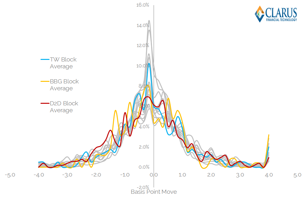
A couple of notes to first clarify this chart:
- I’ve just shown one time-series for each platform for the sake of graphical clarity (averaged T-5 through to T+5 time-series).
- The platforms obviously have different numbers of observations each – depending on how many trades of block size they have done. So this isn’t statistically rigorous just yet.
- The platforms have more “volatile” looking time-series due to this smaller number of observations.
But for the purposes of this blog I think that chart illustrates my point pretty well:
- You might think that the D2D chart above looks like it carries the most price impact – as it looks the lowest but appears to stay relatively wide.
- However, the descriptive statistics tell a different story. D2D block trades have a lower standard deviation than all other sample trades. Whilst the population as a whole has a Standard Deviation of 1.77 b.p, the price impact from large D2D block trades is 0.4 b.p lower. It is also the largest sample size at 520 trades. Of course, some of this will be explained by the existence of basis trades (CME vs LCH for example), but it’s interesting to note nonetheless.
- Bloomberg’s SEF actually performs the worst under these measures. It has a Standard Deviation that is 0.62 b.p higher than the overall sample, and a negatively skewed distribution. Were there more receivers on Bloomberg this month? It’s interesting that statistics suggest that to be the case….
- Tradeweb performed somewhere in the middle. An almost identical standard deviation and skew as to the population as a whole, albeit a markedly lower kurtosis, suggesting lower tails for these types of trade. That’s quite a positive for Tradeweb – suggesting that their RFQ model (and maybe even RFQ to 1) is paying dividends. The statistics suggest that there are less out-sized market moves associated with block trades done on Tradeweb than any other platform.
Increased Rigour
For the purposes of this blog, we’ve looked at a single month’s worth of data across a single Bloomberg ticker. The analysis can be improved by looking at:
- A longer time history.
- A DV01 measure for hedging and the subsequent price impact. This prevents picking up just 5 small trades around the time of trading.
- Maturity constrained DV01 measures of hedging and price impact. As we know, it’s not as if 10 year and 12 year swaps trade independently.
- Different time-stamp periods. If you have a trade that is ten times market size, you’ll want to be looking at price changes over more than 5 trades.
- Extended to look at typical hedging programmes, including PCA-weighting.
And when combined with your own private data, this stream of analysis becomes infinitely more powerful:
- If you have your publicly disseminated ID, you can identify your trade – which you know was a pay or receive.
- You can therefore look to see if the price impacts before and after were statistically different to “the norm”.
- If they were, you can then use this subset of data to infer subsequent price action to yield a probability as to whether any particular trade was a pay or receive – assuming the Street treats everyone equally of course!
The SEF Score-card
Bringing this back to the SEF state-of-play, it’s interesting what transparency this offers us as swap market participants.
Given your history of trading by dealer and venue, it is important to understand where your best quality of execution has occurred. In particular:
- Has RFQ1 paid dividends by restricting information leakage?
- Or has RFQ3+ increased competition and led to better execution?
- Or do dealers consistently get a better level of execution within their walled CLOBs?
The Clarus data gives you these answers. Just contact us for more information. And remember to subscribe to stay on top of these topics and more.
Nicely done Chris. It is interesting to see the lower tails on TradeWeb. My guess is that increased rigour will yield similar results. It will interesting to see. With regard to the score card particulars, I think the third bullet still carries a lot of weight. Thanks