- CDS indices trade in an almost continuous market
- This gives us a lot more price and volume data to analyse than for a tenor-specific Interest Rate Swap
- We briefly look at tick sizes and volume at price for the CDX:IG Index, but don’t find anything too compelling
- But we find an interesting representation in 3 dimensions when looking at price, tick size and volumes for this index…
- …which may suggest large stop-loss activity during the month.
Price Data
We’ve recently started looking in more detail at the price data in the SDR – after all, transparency for any market means seeing both size and price data. Last time, I used the price data to measure the performance of block trades in Interest Rate Swaps across the RFQ platforms vs interdealer markets. One of the limitations of that analysis was the relatively small number of block trades that we had to play with.
Therefore, I wanted to cast our price-data analysis a little wider. Ideally, we’d look at something that is more standardised, and trades predominantly across CLOBs. So, for the first time in a long time, let’s cast our gaze towards Credit.
CDX
I’ve not traded CDS, so this blog will be about pure price/volume metrics rather than identifying any specific flows. Best to get these disclaimers out of the way at the top of the article! I must admit, I read some basic pointers on price quotation conventions to make sure I wasn’t doing anything really stupid. Thankfully, SDRView Pro clearly defines the price as “TradedSpread” so it was all pretty clear.
To start with, I wanted to identify a “clean” price period. To my mind, this meant decent volumes with not much roll activity. Therefore, using CustomView in SDRView Researcher, I ran the Roll history for 2015. For the index with the largest volume (CDX:IG), we see the following history:
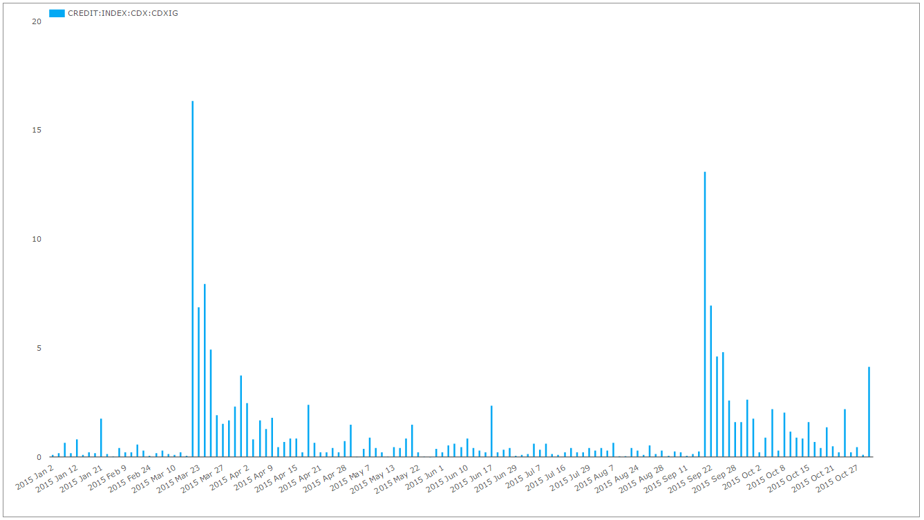
Therefore, to keep the price analysis as relevant as possible, I used August data for the CDX:IG Series 24 Index. This prevents us having to filter out much roll activity, therefore gives us the biggest Universe of trades possible.
CDX Prices
We’ve been able to look at price evolution in SDRView Pro for a couple of years. For those new to Clarus, here is what our intraday history looks like – including volumes, prices and clearly identified block trades (in pink):
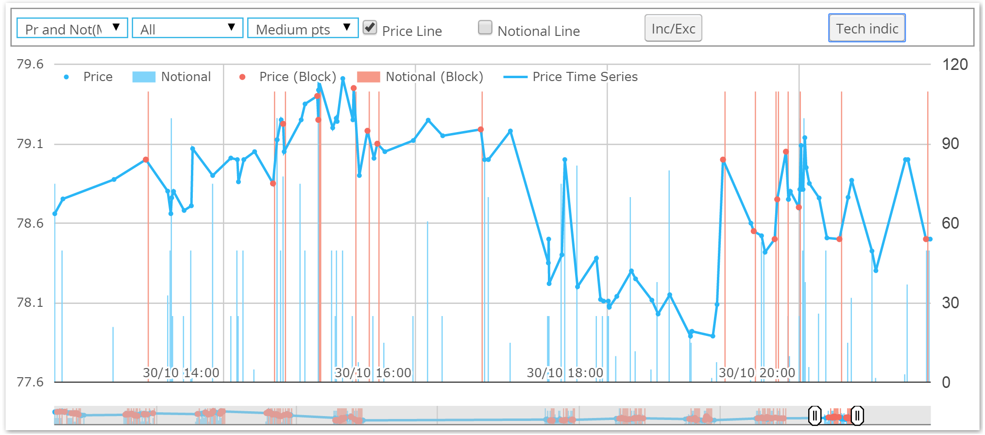
What I really wanted to do was slice-and-dice this history across a larger data-set- allowing me to look at volume-at-price and repeat the tick-size analysis we’ve been doing for Interest Rate Swaps.
Tick Sizes
Following up on my Rates articles about tick sizes, I’ve repeated the analysis for the CDX:IG Series 24 Index. The data is from August, and given the indices roll every six months, I didn’t think a 6 month time-series of tick-sizes would be quite so interesting.
Therefore, below I have plotted the frequency of tick-sizes during the month of August. I’ve used a time-stamp ordered data set, and looked at the price change, in basis points, between trade T and trades T+1, 2, 3, 4, 5 – to identify the subsequent price impact across the next five trades.
I’ve also looked at the price impact to trades T-1, 2, 3, 4 and 5 just in case there are any nefarious tactics such as front-running evident in the data! I’d be surprised if this was the case, but it seemed a simple addition to the analysis. This gives us 11 series of data:
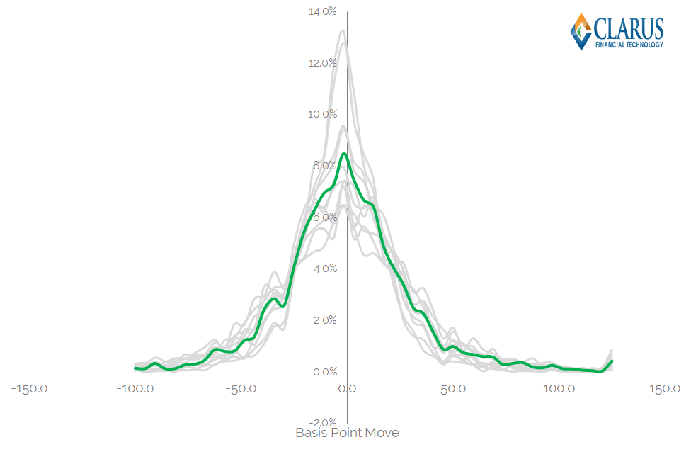
Some background statistics for this population of trades are:
- An average trade size of $56m
- An average “tick” size as per the previous blog of 0.155 b.p i.e. a Traded Spread move from 70 to 70.155 between consecutive trades.
- The number of trades in the sample period was 3,455 – nearly 2.5 times larger than we used for Rates.
As we can see, the shapes of the bell-curves are reminiscent to the ones we analysed for Interest Rate Swaps. I’ve also highlighted the distribution for Block Trades in green. What we can see from this distribution is that:
- Across the time series, the skew is exactly zero – so the tick sizes are remarkably symmetric, despite the fact that the trend was generally towards higher prices throughout the month.
- The standard deviation was 0.36 b.p. – so over two thirds of trades occur within roughly a third of a basis-point move.
- The distribution for the block trades was quite different to the standard trades. The standard deviation was tighter (0.24bp, which is surprising if you subscribe to the idea that large trades move markets). But it also had a (marginally) negative skew – possibly suggesting that the large trades were mainly sells in the month.
- We should do some statistical tests (e.g. t-tests) on the differences to see if they are significant. That is a more involved process that will benefit again from a larger data-set – so that’s the work for another day!
- However, we can incorporate volume data.
CDX Volumes and Price
For any trade, the price goes hand-in-hand with the volume. So let’s do the same with our tick analysis. Instead of charting the distribution of tick values by occurrence, let’s volume weight them. This gives us the below chart:
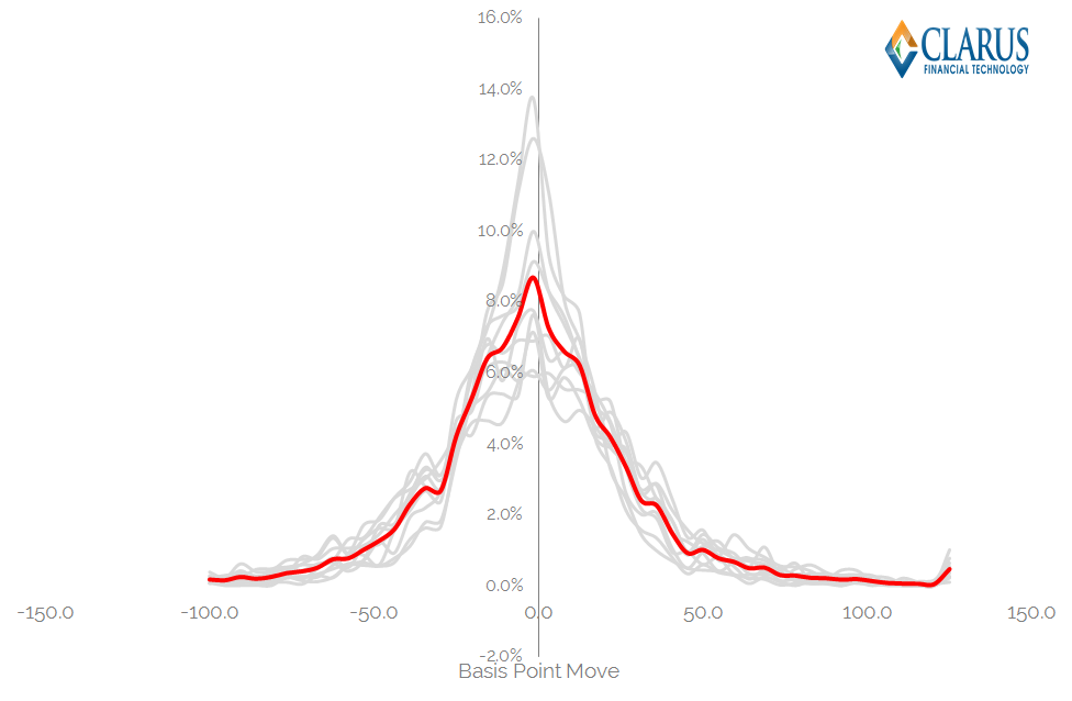
- I hope the similarity to the previous chart isn’t lost on our readers. It’s almost identical!
- Given the similarity, I decided to look at Price and Volume data with a more slice-and-dice approach.
Slicing And Dicing
The next chart is a simple Volume at Price chart – a concept that we’ve explored before:
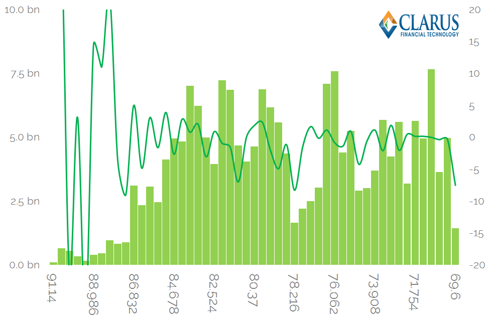
Showing;
- Peaks in volume around the 80-84 area.
- But, at the price extremes, we generally saw higher volumes at lower prices – i.e. the bars at the far right of the chart are larger than on the far left.
- The trending green line shows the average tick size for the volumes traded within each bar. The time-series suggests that trades at the upper price levels really were anomalies – given the erratic tick sizes compared to extremely stable levels elsewhere.
I wanted to explore this cut of the data even more, so I looked at the volume trading by price AND tick size. This yields a 3-D surface:
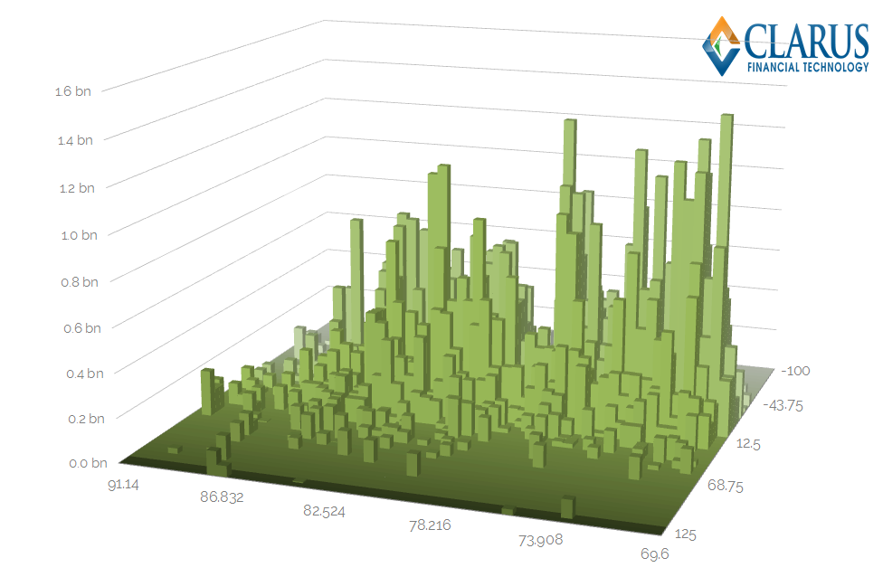
We have volume on the vertical axis, price along the horizontal axis and tick size on the z-axis. If we look at the peaks on the chart, we see that:
- The largest volumes were traded at a combination of large negative tick sizes AND lower prices than on average – i.e. “back-right” quadrant of the chart.
- That is somewhat surprising given we’ve seen pretty evenly distributed prices and volumes in the rest of our analysis. And these peaks seem at odds with a stable average tick size across prices (previous chart).
- Does this representation of the data therefore give us something new?
- A large tick size suggests reduced liquidity and a lack of continuity in trading conditions.
- A large volume coupled with a large tick size indicates a strong desire to get a trade done, irrespective of market impacts.
- Do those two things combined suggest this was stop-loss activity?
As I said at the top of this blog, it’s not my market, so I’m not going to suggest an answer to that last question.
But the data is certainly interesting. And I wouldn’t want to trade that market without access to at least this level of insight.
In Summary
- There is a lot of volume and price data to analyse for CDS indices
- The data shows that CDS Indices trade in a more continuous fashion than Interest Rate Swaps
- We can use a number of tools to identify market patterns in the data
- And some nice data-visualisation suggests that someone had been short at low levels in the CDX:IG S24 Index and got stopped-out during August’s volatility.
- With a Clarus data subscription, this would have been apparent as soon as the trades were reported.