- It’s been a volatile start to the year
- This has led to record volumes in benchmark swaps
- We explore the relationship between Volumes and Volatility in Swaps markets
- We find that there is a strong correlation worthy of investigation
Volatility Everywhere
Check this out from LPL Research via Advisor Perspectives – a six week change in 10y UST yields is quite rare:
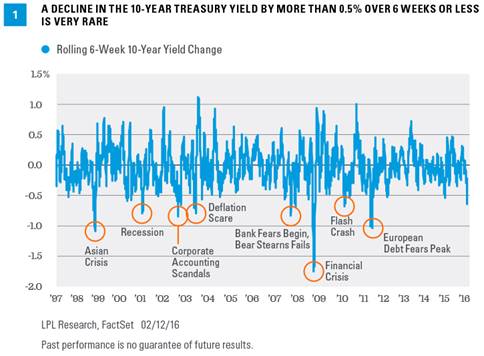
Link to article here.
With that in mind, I thought I’d look at a similar chart since SEF’s were introduced. Needless to say, something similar holds. We really are in unusually “volatile” times:
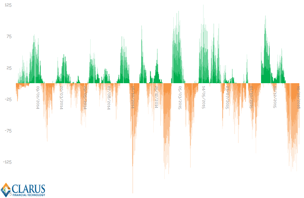
Showing:
- The rolling 20 day change in price for 2y, 5y, 10y and 30y swaps since 2013
- We are on quite a streak of exceptionally large drops in yield across the swaps complex
- We’ve now seen 31 days in a row of aggregate negative price drops on a 20-day rolling window
- To put this in perspective, the “average” length of a streak of directional price changes has been 8.75 days.
- We’ve seen prices drop for a sustained period before. But back in 2014, the average cumulative daily move was just 30 b.p. across the swaps complex. It is currently over 101 basis points.
I think it’s fair to say, that by any measure we choose to employ, 2016 has been quite the year so far. And it really was the turn of the year that saw this rally in US Fixed Income ignited.
2016 Volumes
What this means is that we are having a bumper start to the year. We know from experience (and our blogs, and swaps reviews and data..) that the start of the year is always the most active. Add-in the volatility, and we might expect to see record on-SEF volumes trading. However, as we reported in the January swaps review, this isn’t quite the case:
From both SEFView and CCPView, we see the following volumes;
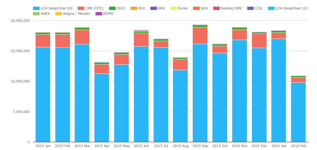
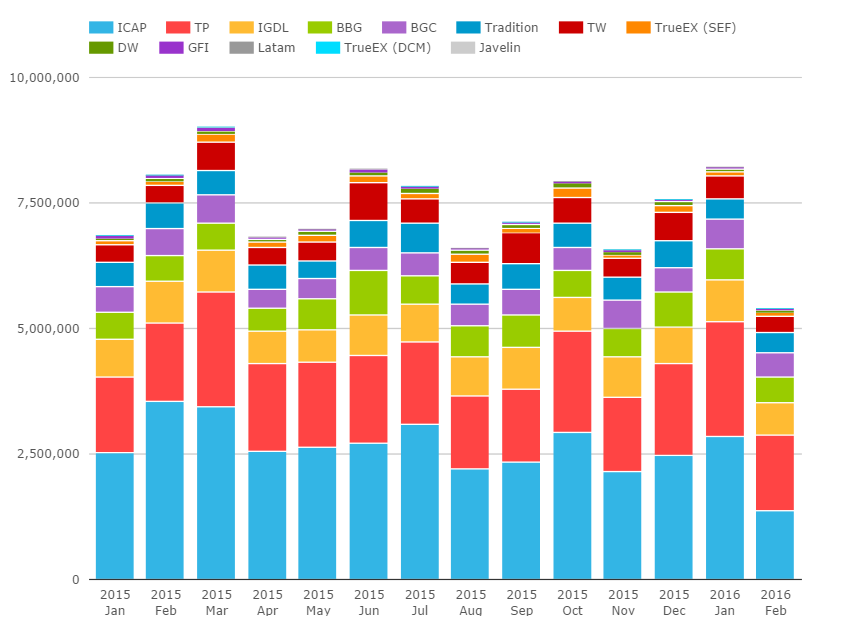
Showing;
- January 2016 is “up-there” in terms of volumes, but not breaking any records either for the Global cleared market (CCPView, left hand chart)…
- …or for the American market (SEFView, right hand chart).
Still, I wanted to explore this week whether we really should expect higher volumes with higher volatility.
Risky Volumes by Tenor
Let’s therefore turn to my newest favourite feature – Tenor analysis in SDRView. I’ve run a query on the SDR data that highlights the power of Clarus analytics. A per-Tenor view of DV01 traded per day both On and Off SEF. It’s a big chart!
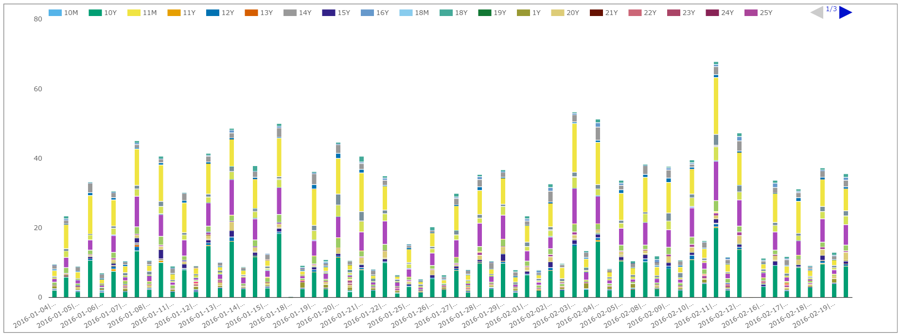
Showing;
- For USD Swaps, DV01 volumes traded per day
- The columns show either On-SEF or Off-SEF volumes
- The different colours within the stacks represent the tenors
This chart from SDRView doesn’t yield much – we need to go further back in time to have a look at trends. So, as with so many data-discovery exercises, I exported the data to Excel (via the API call here). This data yielded some nice results:
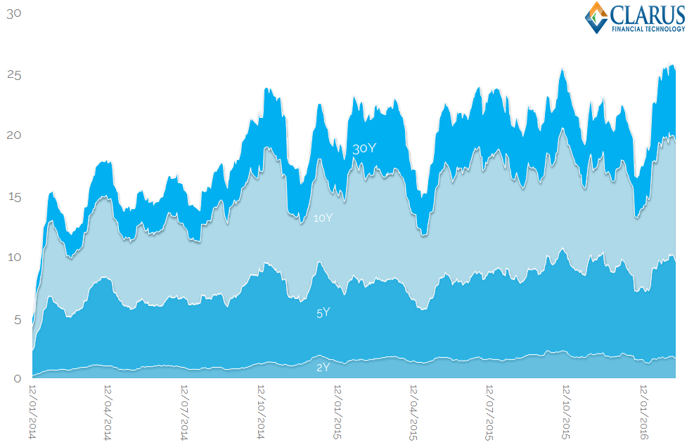
To be clear about what this charts shows:
- The rolling Average Daily Volume over the past 20 trading sessions per tenor.
- This is measured on a DV01 basis, to make it maturity-agnostic.
- We’ve focused on the benchmark tenors – here showing 2y, 5y, 10y and 30y.
- The current period of sustained volatility has increased ADVs….
- …and hence we are currently seeing record volumes in these benchmark tenors by this measure.
Optimisation anybody?
Then I asked myself a question. It seems that the elevated volatility this year has had an effect on volumes. But:
Over what time period is Volatility linked to Volumes?
I thought about whether a single day’s change in yield of, say, 100 b.p., would have the same effect on volumes as a 1 b.p. change in yield for 100 days in a row?
This led me to phase two of the analysis. If we are interested in Average Daily Volumes, then let’s also look at Average Daily Price changes (Δ) within that same time period. If I want to look at 20-day ADV, I should also look at 20-day ADΔ.
We also add that we doubt the price directionality should be relevant – because volumes cannot go negative. So let’s look at the relationship between Average Daily Volumes and Average Absolute Price changes (|ADΔ|).
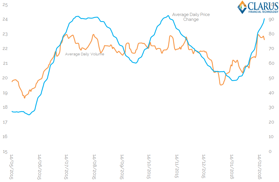
Showing;
- The ADV calculated on a rolling 55-day window versus the average daily price change (|ADΔ|) for that same 55-day window.
- We’ve got 200 observations in the above time-series, which is about 9 months of trading.
- The two time-series of data above exhibit an 80% R-squared.
- This shows that, recently, the effect of volatility has certainly been to increase volumes.
Caveat That
As the sub-title suggested, the chart above shows the best possible case – a 55-day averaging period, with around 200 observations. For a true relationship to hold, of course, we should be able to expand that sample period and see minimal effect on the R-squared value. However, once I expanded our time series to go all the way back to 2013, this wasn’t really the case. With 500 observations, our R-squared drops to 64% – still impressive for financial markets, but a lesson in sampling-bias in case anyone needs it!
Statistical Rigour
Finally, I built the optimisation in Excel to see what the “best” averaging period was to look at. Whilst doing that, I couldn’t really resist optimising the look-back sample period either! In the interests of full-disclosure, the results are below:
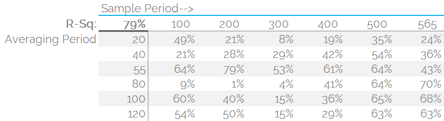
The results show that:
- For the full sample size (which is really the only one we care about), averaging by anything over about 45 days results in a fairly stable relationship.
- This suggests that the correlation is up at 80 % (square root of the R-squared at 65%) between Volatility and Volumes.
- This is an unusually strong relationship for financial markets (based, as they are, on human behaviour!).
- There are some unusual results here for sure. For example, why does an 80-day averaging period yield such trivial correlations between Volumes and Volatility in some periods?
- There is also a fair degree of heterogeneity between correlations for the total volumes and the individual time-series per tenor (i.e. if I run the data on just 10 year swaps, it is not quite as compelling).
- I think there are valid arguments that say the overall picture of price changes is more consistent with the market dynamic – people are not constrained to solely hedge 10 year swaps with 10 years after all!
- The implied “periodicity” for the averaging period could have repercussions for how long people hold trading positions for:
- Is a peak link between volumes and volatility of 55 days consistent with people holding positions across successive monthly investment rebalancing cycles?
- Is the dip in correlations at 80-days a result of falling in-between quarterly investment rebalancing? Or simply an interplay between averaging and sample size?
In Summary
- We look at the correlation between Volumes and Volatility
- The extended period of large price moves in 2016 has made this relationship much clearer in the data
- We are currently seeing record Average Daily Volumes across the benchmark tenors of 2y, 5y, 10y and 30y swaps trading on-SEF.
- These large volumes have gone hand-in-hand with an extended period of volatility in our markets.
- It is possible to run a number of averaging and sampling periods to assess how significant this relationship is.
- We don’t present “the answer” in this blog, but it is clear that volumes and volatility are inextricably linked in our markets – with some highly correlated time-series of data backing this up.
- Contact us to have a play around with this data yourselves.