

- Clarus price data has unique features that you cannot find elsewhere
- Categorising traded prices by package type reveals trends that you cannot see in a flat data series
- Our curation programme and augmentation of prices adds to our volume analysis in Swap markets
- A true picture of liquidity can be painted using prices, volumes and price dispersion measures.
10y USD Swap Prices
Our recent work on liquidity has highlighted the benefits of trading on-SEF. Liquidity is not the only market-variable that has benefited from these changes to the market infrastructure. The electronification of trade-execution also allows us to programmatically identify the type of trade. This means we are confident as to whether a trade has been executed as an Outright, a Spreadover, or part of a Curve or Butterfly package.
When we analyse the price of trades by package type, we see some compelling differences between the data sets.
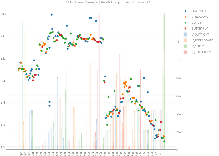
Below is a box-plot of all 10y Spot Starting USD swaps traded on-SEF during March 16th 2016 – the most recent “Fed day”. We plot separate series of data for the different trade types that we consider price-forming.


The chart shows;
- Outrights had a median average price of 1.802% on 16th March 2016
- Spreadovers had an average price of 1.806%
- Curve trades saw a large skew towards higher 10y coupons, with an average coupon of 1.8265%
- Butterfly trades were more in line with the rest of the market at 1.805%
- Only Outrights saw a symmetrical distribution of prices around the median, with the top and bottom whiskers roughly equal. Other packages saw much longer bottom whiskers than top.
- Outrights hence saw more trades at the higher end of the day’s price range.
- Butterfly trades saw a strange distribution of prices. Generally, they were all lower than the average price, except a cluster between 1.83-1.84%.
- Given the price distribution of Curve and Butterfly trades, we would suggest that end users were generally paying the 10y point as part of both Curve and Butterfly trades.
It is worth noting that we wouldn’t know that there was a paying interest in Curve and Butterflies without these tricks of data visualisation. If we just looked at the plain price action from 16th March, nothing really jumps out:
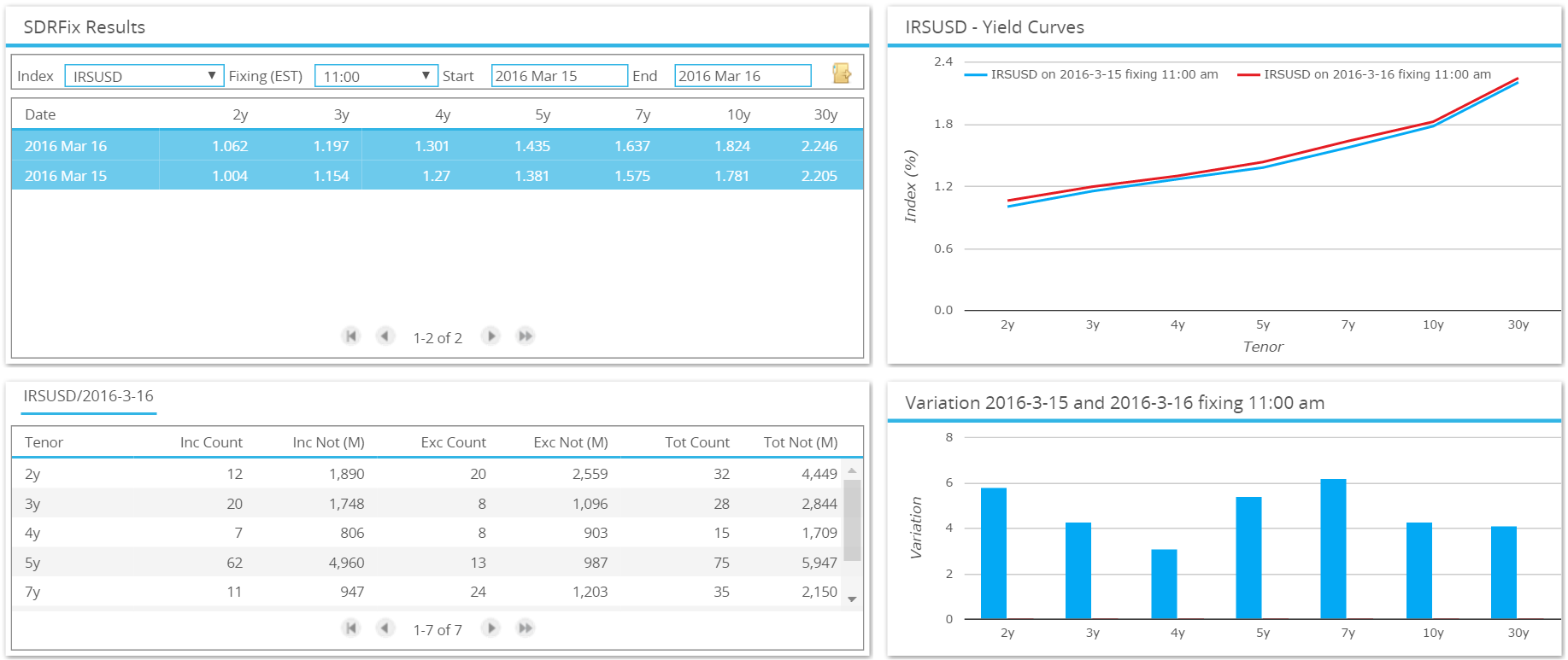
We can see that swap rates generally increased (these fixings are pre-Fed announcement) – but the paying is not particularly marked in any area of the curve. Now, there is an element of mixing LCH/CME trades together here. But do we really think that a cluster of both Curve and Butterfly trades were related to basis trading on the Fed day? More likely that these trades all occurred pre-Fed and at the higher rates of the day (see below).
10y USD Swap Volumes
The beauty of our data is that we don’t have to restrict ourselves to the price data. Volumes are just as important in these post-reform days. A successful franchise relies upon reliable two-way flows now more than ever. Equally, that franchise may be particularly strong – or particularly focussed – on a single package type. So it also pays to look at the distribution of volumes in a similar way as we do for prices. Taking all spot-starting, 10y USD Swaps traded on 16th March gives us the following box-plot:

Showing;
- Most trades above $100k DV01 in size were transacted as a package.
- Spreadovers have an outrageous concentration of volume – the vast majority occurring in $44k size – which I assume equates to a round number of 10y USTs at the moment (I’ve not checked).
- Butterfly trades see the widest distribution of sizes.
- Which is in stark contrast to Spreadover volumes, in which “large” trades above $50k are exceptionally rare.
- As we would expect, most “small” trades (<$20k) are transacted as Outrights.
- We see a generally increasing “average” trade size with
- Outrights and Spreadovers at just over $22k in DV01 terms
- Curve trades at $32k
- Butterfly trades at $45k
And As a Single Number
As we’ve said before, we are fans of simplifying to clarify the data. So we can also analyse the Liquidity for this trading day using a simple price-dispersion calculation. In a nut-shell, this involves calculating the volume weighted price difference per trade around the average price for that package type. Doing so shows that;
- Outrights saw the highest volume weighted Price Dispersion of the different trade types. At 3.4 basis points, this was also similar for Curve trades. This is consistent with the wide distributions of both prices and volumes on the above box plots for these two package types.
- Spreadovers saw a much lower price dispersion reading – hence implying they have much higher liquidity than other package types. At 2.6 basis points, the Spreadover market (on this day) was characterised by a narrow range of prices and tightly concentrated trade sizes around a “market” average size.
- Finally, as we might expect, Butterfly trades saw a Price Dispersion somewhere in the middle at 3.0 basis points. Now bear in mind, this is measuring their impact on the 10y outright price, not relative to the package in which they were traded. For Curve and Butterfly trades, a “better” measure of Liquidity would be to calculate this measure across different packages – e.g. 2y5y10y vs 5y10y30y to measure the relative liquidity of different butterflies. However, doing so for one particular day’s trading represents too small a sample size to give meaning to the analysis. Sounds like another blog beckons for that one….
Augmentation of a Typical Time-Series
As well as these alternative views of price and volumes, we can also augment the classic Price/Volume charts when presented as a time-series. This helps make further sense of the trading day;
- Prices as dots, volumes as bars.
- Each dot and bar is colour coded according to transaction type.
- The dovish Fed announcement at 18:00 (UTC) on March 16th is clearly evident – something we miss from our previous charts.
- The swathe of red butterfly related 10y trades just before this are clear.
- The initial price-forming trades immediately post-Fed were naturally in small size, and not necessarily all Outrights. This highlights the risk of running an “at-market” stop-loss over these types of announcements in any meaningful size.
- Volumes became larger as prices recovered higher.
- We can also see that the longest bars tend to be related to packages. Outright volumes are shown by the blue volume bars, which tend to be the shortest ones.
One interesting by-product of the above chart is to ask ourselves whether it makes sense to “join the dots” of all 10y trades when there are clearly different price-motivations behind the reason to trade the different packages? We intentionally leave them independent on the above chart.
In Summary
- OTC Swap markets have many different package types associated with them.
- The motivations for trading any given package are unique.
- The price impact, volume and/or liquidity associated with each package is unique to that particular package type at that point in time.
- It therefore makes sense to split our analysis of prices, volumes and liquidity by package type.
- Understanding this is key to understanding what is happening at any point in time in the Swaps markets.