- We analyse the liquidity on Bloomberg SEF….
- …by measuring the price dispersion of 10 Year USD Swaps using the methodology from a recent Bank of England staff paper.
- We compare these measures of liquidity versus the broader SEF market.
- We find that in the past 6 months, liquidity is higher on the Bloomberg SEF relative to the rest of the market.
Liquidity
In this third article in a series, we are back to the theme of liquidity, as we take a deep dive into some data analysis from SDRView Researcher.
After reviewing the previous post on liquidity measures, I realised that we can split our data not only by tenor but also source. This allows us to look at volumes traded in specific instruments, such as a 10 Year USD IRS, and compare volume and price metrics for trades reported to the Bloomberg SDR versus those reported to the DTCC. This therefore allows us to analyse trades done on the Bloomberg SEF versus those done in the broader, on-SEF market.
So whilst the last blog concluded that liquidity was much greater on-SEF than off-SEF, we also have the opportunity to assess liquidity on a particular SEF versus the rest of the on-SEF market.
Compelling stuff when trying to decide, pre-trade, which SEF to utilise.
Volumes
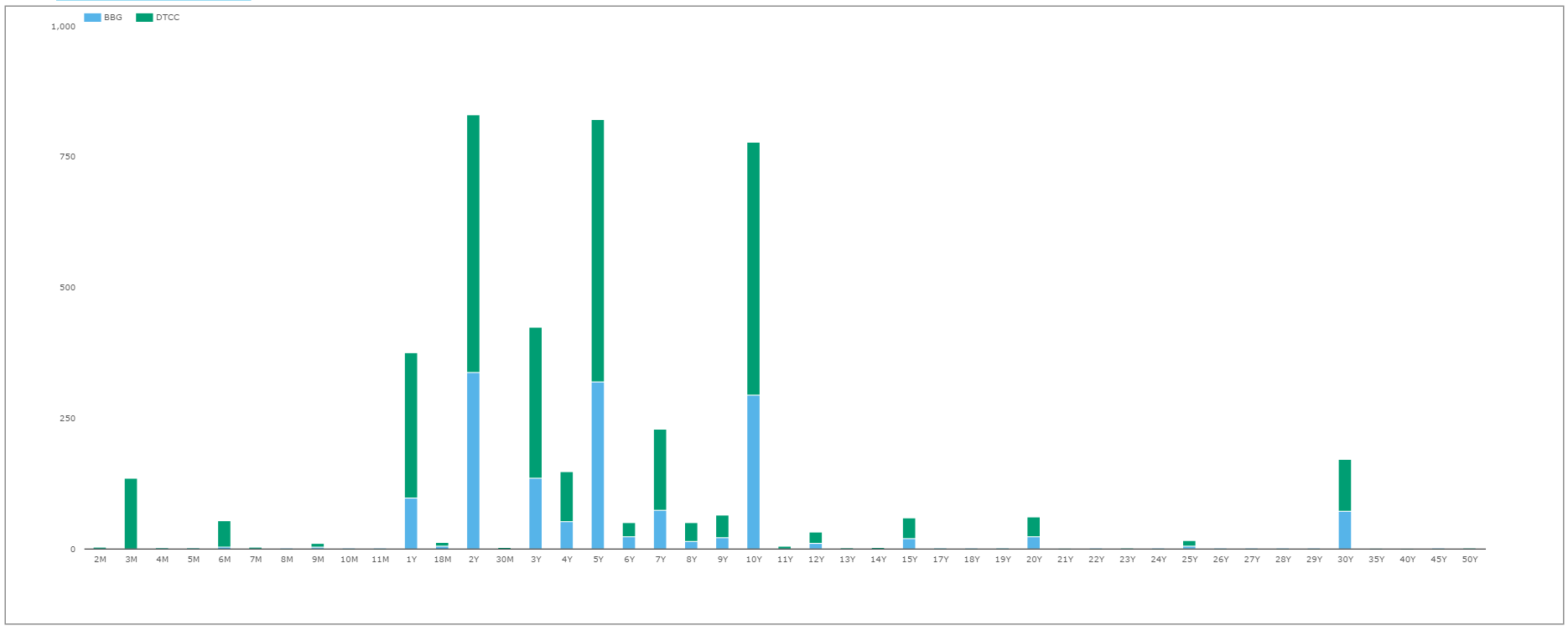
First off, we need to ensure we are looking at a valid data set. From SDRView Researcher, we can use the preset “Tenor” view and split it by source:
(API Call: sdrview.clarusft.com/rest/api/…. Requires a valid API key).
Showing;
- Notional amounts of Spot Starting, Outright USD swaps traded on-SEF since January 1st 2015.
- As always, volumes are heavily concentrated in 2y, 5y, 10y and 30y tenors.
- We have split the series by “Source” – i.e. which SDR these trades were reported to.
- Trades done on the Bloomberg SEF are reported to the Bloomberg SDR, therefore we can infer that all volumes in blue on the above chart were transacted on BSEF.
Market Share
And below we can quickly change this same query into Risk terms (changing the display from Notional to DV01) and take a look at the BSEF market share per tenor:
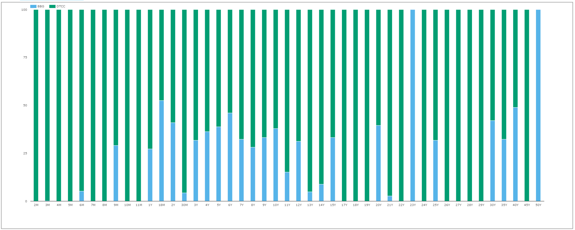
That chart is almost worth a blog unto itself, but the quick highlights are:
- BSEF has a 38% market share in 10y spot starting USD Swaps traded on an Outright basis since 1st January 2015.
- Some tenors, e.g. 23 years, have only traded on the BSEF.
- Whilst other tenors such as 3M and 26, 27, 28, 29 years do not trade on BSEF.
- For the major tenors,BSEF market share has been:
- 2y 41%
- 5y 39%
- 10y 38%
- 30y 42%
My gut take on those figures is that they may be over-stating the true market share of Bloomberg’s SEF – mainly because all volumes are capped at the reporting threshold, and conventional wisdom would state that the IDB SEFs see larger ticket sizes in these standardised instruments. We’ve talked about this previously in terms of block trades – but not looked at what percentage of those block trades are non-spot starting, tailored transactions. That might make an interesting follow-up next week….stay tuned.
Liquidity
Nit-picking details aside, I wanted to answer a simple question – does liquidity on the Bloomberg SEF warrant this impressive market share? To answer that, I leveraged the work we did previously when we looked at price dispersion measures, as per the recent BoE staff report on SEF liquidity. For those interested, the measures of liquidity we use are price dispersion indices, calculated as per the below:
\( \tag {1} DispVW_{i,t} = \sqrt{\sum\limits_{k=1}^{N_{i,t}}\frac{Vlm_{k,i,t}}{Vlm_{i,t}}(\frac {P_{k,i,t}-\bar{P_{i,t}}}{\bar{P_{i,t}}})^2}\)where;
\(N_{i,t}\) is the total number of trades executed for contract i on day t, e.g. how many 10y trades occurred on the 8th of January 2016?
\(P_{k,i,t}\) is the execution price of transaction k, i.e. the price of a particular 10y trade on the 8th January 2016.
\( \bar{P_{i,t}}\) is the average execution price on contract i and day t, e.g. what was the average price of all 10y trades done on 8th January 2016.
\( Vlm_{k,i,t}\) is the volume of transaction k e.g. the size of the 10 year trade we are looking at on 8th January and
\(Vlm_{i,t}=\sum_{k}Vlm_{k,i,t}\) is the total volume for contract i on day t. e.g. the total volume of 10 years traded on the 8th January.
We also calculated a second measure, replacing the 10 year average price with the 10 year closing mid-price as per the “JNS” measure from this original paper. We take our SDR fixings for the mid-price.
Generally speaking, we would like price dispersion to be as low as possible. This means that any particular trade has had a minimal impact on average prices that day, and seeing as we volume weight the contribution of each trade, larger trades have passed through the market without any meaningful impact.
A Quick Caveat
We acknowledge that there will be some deviation from true averages and true mids due to the mixture of CME-cleared and LCH-cleared swaps with the emergence of the CCP basis during 2015. However, for the purposes of this blog, let’s assume that the mixture of CME and LCH cleared swaps is broadly comparable between trades done on BSEF and the wider SEF market. (Feel free to comment below or contact us if you have a strong opinion (or data!) on that front).
Liquidity Results
Background in place, let’s look at some data and some charts. Generally speaking, when considering the numbers, we can say that “liquidity” was greater on BSEF when it had a lower price dispersion than the market as a whole.
Admittedly, this broad brush approach can play into the hands of a single SEF if it sees very little volume across a small number of tickets, and hence all trades occur close to its’ average price for the day.
However, as evidenced earlier – and because we are looking at 10 year USD swaps – this is not the case for our data sample.
Daily
So, let’s look at the daily histories of price dispersion on the BSEF vs the wider SEF market.
Click to enlarge:
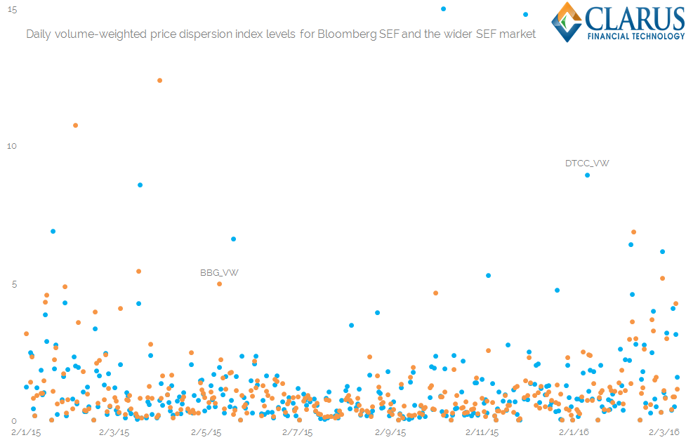
Showing;
- On the left, a dot plot of index levels, calculated per day, for the volume weighted price dispersion around the average price on each day (in basis points). The orange dots are the values for the Bloomberg SEF, and the blue dots are the index values for the broader SEF market – here denoted as “DTCC” as they are all reported to the DTCC’s SDR.
- On the right, a “win-loss” chart, showing the days (in Orange) that BSEF had a lower price dispersion then the wider SEF market. Bars in blue show when the BSEF had a higher price dispersion.
- Generally speaking, we can say that “liquidity” was greater on BSEF if it had a lower price dispersion than the market as a whole.
- These charts don’t suggest anything is untoward with the data sample – some days BSEF has beneficial liquidity conditions, otherwise it loses out to the broader market. That seems to fit with experience.
Monthly
Now, consistent with much of the industry – including our own Swaps’ reviews – let’s collate this data on a monthly basis. The left hand chart shows the cumulative Volume Weighted price dispersion (in basis points) per venue, whilst the right hand chart shows the JNS measure which takes price dispersion relative to the end of day “mid” price instead of a daily average price.
Click to enlarge:
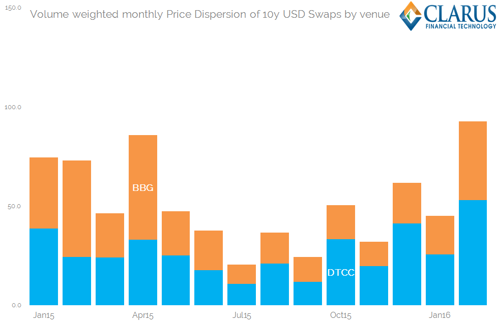
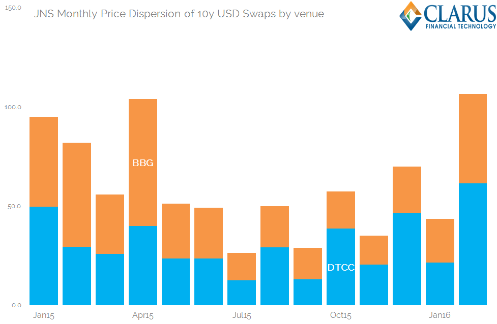
Showing;
- Broadly speaking, both the average price and the JNS measures tell similar stories.
- Price Dispersion is variable per month.
- BSEF contributes a variable amount to this price dispersion each month relative to the SEF market as a whole.
- Price Dispersion – and hence liquidity – saw some nice declines during 2015, until the final quarter saw an uptick.
- The highest Price Dispersion readings, and hence the “least” liquid conditions we have seen, were during February 2016.
Overall
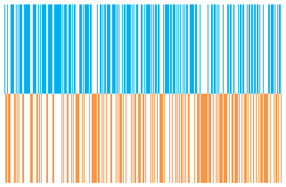
Finally, let’s take a look at the number of days, each month, that BSEF enjoyed a lower Price Dispersion reading, and hence beneficial liquidity conditions, compared to the rest of the SEF market:
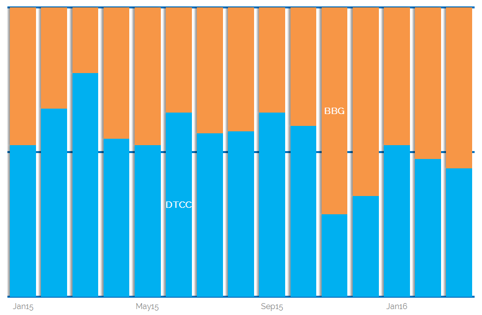
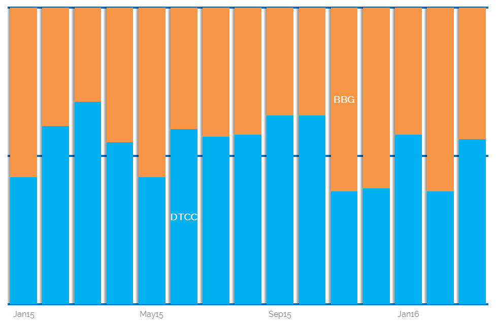
Showing;
- As a percentage each month, the split of days on which BSEF has had a lower price dispersion reading than the rest of the SEF market for 10y USD Swaps.
- The chart on the left is versus the average price and the chart on the right is the JNS-measure versus an end of day mid price.
- Given our previous charts, and a market share of around 40%, I expected BSEF to hover around the 50% mark – suggesting that on any given day you had a 50/50 chance that liquidity would be better in the overall market than on BSEF.
- However, interestingly, as liquidity conditions have worsened during Q4 2015 and Q1 2016, we are seeing beneficial liquidity conditions on BSEF relative to the rest of the market.
- This is more noticeable in the left hand chart, showing price dispersion around the average traded price each day. BSEF sees a greater number of days each month where the price dispersion around this average price is lower than for the broader market.
In Summary
It’s been one of the longer posts today, but I find the analysis particularly interesting:
- We can use the SDR data to analyse liquidity per venue.
- We can use the curated Clarus data set to analyse this data per product, per sub-type and even per tenor.
- Doing so for the broader SEF market shows that liquidity conditions have generally worsened since the middle of 2015.
- During this time, Bloomberg has seen a greater number of days where liquidity conditions have been better on the Bloomberg SEF than for the overall market than we would expect.
- These beneficial liquidity conditions may help to explain why Bloomberg enjoys such a high market share, even for standardised instruments such as 10 year, spot starting USD Swaps.