- Can we develop a way to understand and measure the execution of any trade?
- We look at the relationship between Tick Size and Trade Size.
- The price impact of a trade does vary with trade size….
- …therefore a quantitative measure for execution quality is the natural next step.
Revisiting the concept of Tick Sizes in USD Swaps, we are going to talk about what the post-trade data tells us about execution quality – and aim to answer the question “Is that a fair price?”
Market Depth and Trade Sizes
There has been some recent press about “pre-hedging” in Risk that makes for an interesting read. For us at Clarus, the key quote that we found interesting was (emphasis ours):
“I can’t make a seamless, costless exercise – I could try, but at the end of the day, I don’t know the depth of the market”
Ultimately, the article is talking about large trades that are above the block threshold. But even though we do not know the entire size of these trades in the data, we do still see their price impact relative to the trades around them. So I was surprised that this market participant is not using Clarus data to systematically look at market depth – most of them are! And let’s face it, a single large trade is hedged with a series of smaller, market sized trades.
Market Size
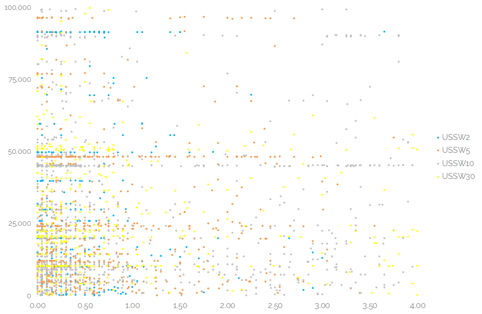
So – market size. As we’ve looked at before, the average trade size in Swaps has been remarkably stable, as the chart below for USD swaps across a number of maturities shows:


Showing;
- An increase in average trade size in 2 year USD Swaps (USSW2 using the Bloomberg tickers)
- A decrease in average trade size when looking across all tenors
- But the benchmark tenors – here shown as 5y, 10y and 30y – have all been remarkably stable.
Average Tick Size
So we can establish an average trade size, but we also need to get an idea of the average price impact of a trade. Do you have to cross a bid/offer to get a swap trade done, or can you enter a price in the “mid” of an order book and expect to transact? We introduced the concept of a “Tick Size” in swaps back in July, when we asked whether it was one of the scariest charts out there. That blog is well worth a read before ploughing on with this week’s analysis. But in short, we define tick size as:
The price change in a given swap between two consecutive trades.
This can be considered as the maximum bid-offer spread that may be captured by a market-maker. Or the degree of aggression needed to trade if you are a price-taker. Equally, if swaps were truly a continuous market, then we would expect this to average out at somewhere between 0.5 and one times the typical bid/offer spread in an order book. Recently, these tick sizes have once again been increasing, as shown in the interactive chart below (have a play, and you can always reset to the original perspective, by clicking ![]()

Showing;
- Across all tickers, the tick size (i.e. the average price change since the last trade) has been increasing throughout the time period.
- This is most pronounced for longer maturities, with 30 year swaps (USSW30) showing the largest increases, such that the tick size is now above 1 basis point.
- There was a contraction in these tick sizes in September of this year, and it has widened since.
- This is similar to what we have seen in the CCP CME-LCH basis as well…..
- ….so there is clearly some relationship between these tick sizes and the CME-LCH basis, as we noted in our first blog.
- However, given the low frequency of CCP basis trades, it is relatively unusual to see a CME trade adjacent (in time-stamp terms) to an LCH trade in the SDR data.
- Therefore due to the sheer sample size each month, this is only one driver to the increasing tick size.
- The more worrying thought is that liquidity is reducing – and that market participants have to either cross a larger bid/offer or be more aggressive to actually transact a trade.
Establishing an average trade size and an average tick size therefore gives us two benchmarks to play with. However, clients are probably unlikely to be overly worried about their average trades – so let’s look into the tricky question of trade size as well.
Does the Tick Size change with Trade Size?
The implication from the Risk article is that it is extremely difficult to transact large trade sizes in a seamless manner. I don’t think anyone would disagree with this! But is it getting more difficult with time, and can we “measure” the difficulty of a trade? I can’t see why not, particularly given the huge amounts of data we now have.
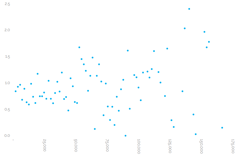
My thinking is to establish whether there is a relationship between Tick Size and Trade Size. It’s pretty natural to expect a larger trade to have a larger market impact and hence exhibit a larger Tick Size. So I looked at the DV01 of all USD outright swaps in November (for the benchmark maturities) and plotted the DV01 versus the tick size. It’s a bit of a mess!
Showing;
- Tick Size and DV01 of each individual trade in 2y, 5y, 10y and 30y swaps during November.
- I’ve zoomed in below $100k of DV01 to avoid the inevitable grouping of block trades around the thresholds at $170-250k.
- Nevertheless, the eye is still drawn to some perceived lines where market sizes e.g. $50k clearly trade frequently – but with a large dispersal of price impact.
- Overall, any trends are difficult to spot.
However, all is not lost. Looking at each individual trade is not what we necessarily care about. To create a benchmark, we really want to know the average cost of transacting a trade for a given size. So rather than look at every data point, let’s group the trades together into DV01 ranges and see how the average tick size within this range varies. Et voilà:
Showing;
- Average tick size within a DV01 range (e.g. $50-52,000) of all Benchmark trades done in November 2015.
- The relationship is weak, but the cloud that forms is roughly of the “bottom left to top right” kind of shape.
- Suggesting that as trade size increases, price impact increases.
Big Whoop….
Whilst this might seem like a lot of work/a roundabout way to prove the bleeding obvious, it is important to prove that the data shows what we would expect. This is a fundamental part of the scientific method afterall!
This data therefore lends considerable credence to the type of analysis that we are doing here. It shows that trade size does have a relationship with tick size – they are (weakly) positively correlated.
But it also goes further and shows that the quality of execution is inherently variable – just as we would expect. If every dealer could execute your trade just as well as the next, then we would have a dead straight line on the chart above!
So kudos goes to all those traders recording a bottom right print on the chart above, and thank goodness the top left quartile is empty…..
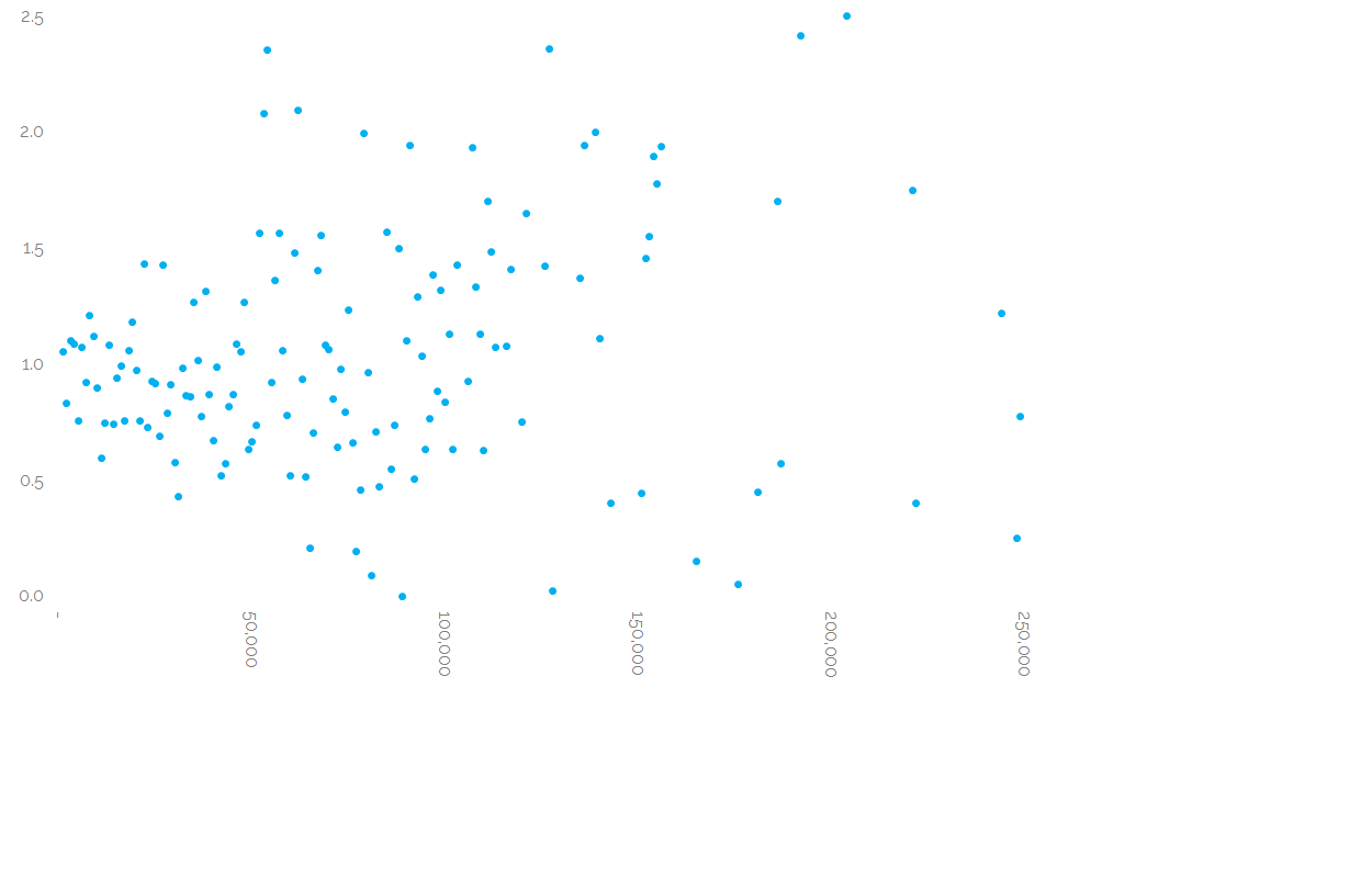
Indeed, when we extend the chart above to all maturities that were traded as an outright during November 2015, we see a more disbursed chart – again as we would expect:
Using this Data
I won’t go into the details this time, but this is the exact starting point that we need to asses the quality of execution:
- We can establish a benchmark tick size for a given trade size. We could go further and group in less granular buckets of DV01 to explore different relationships. The key is finding a relationship in the data that is relevant.
- This gives us what our expected tick size (or “margin to mid” in the old school bilateral negotiations) should be on average.
- We can then measure any dealers’ slippage to this expectation.
As a client, you may also bear in mind any information leakage before/during/after your RFQ process as well – to a certain extent, this information can be tailored accordingly. For example, if you are diligent enough to record the last print in the SDR before you start the RFQ process (which you’ll be doing for MiFID II anyway!), you can then change the frame of reference for “tick size” to be a different number of trades or a time-window.
In Summary
- We approach the age old question of whether a dealer’s margin to mid is “fair”
- The post-trade data shows us the average price gap between two time-consecutive trades, which we can then filter by size.
- This allows us to compare the Tick Size of a trade with Trade Size.
- We establish that there is a relationship between Tick Size and Trade Size.
- Therefore we can assess what the average Tick Size should be for a given Trade.
- Measuring a dealers slippage to this average is just one way of quantitatively assessing their performance.