Since European Rates made all-time lows on 17th April, we have seen an unprecedented sell-off in European fixed income. SDRFix shows the moves from 17th April to the close on 5th June 2015:
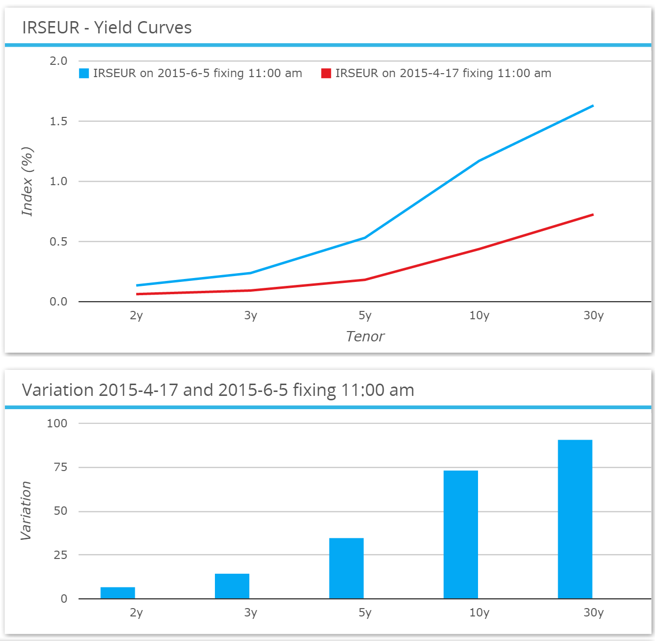
Showing:
- A huge steepening on the yield curve, with 30y rates 90bp higher (!), versus 2y higher by only 7.2bp.
- 5y are 35bp higher and 10y 73bp higher.
Contrast that to the price moves in 2015 before April 17th:
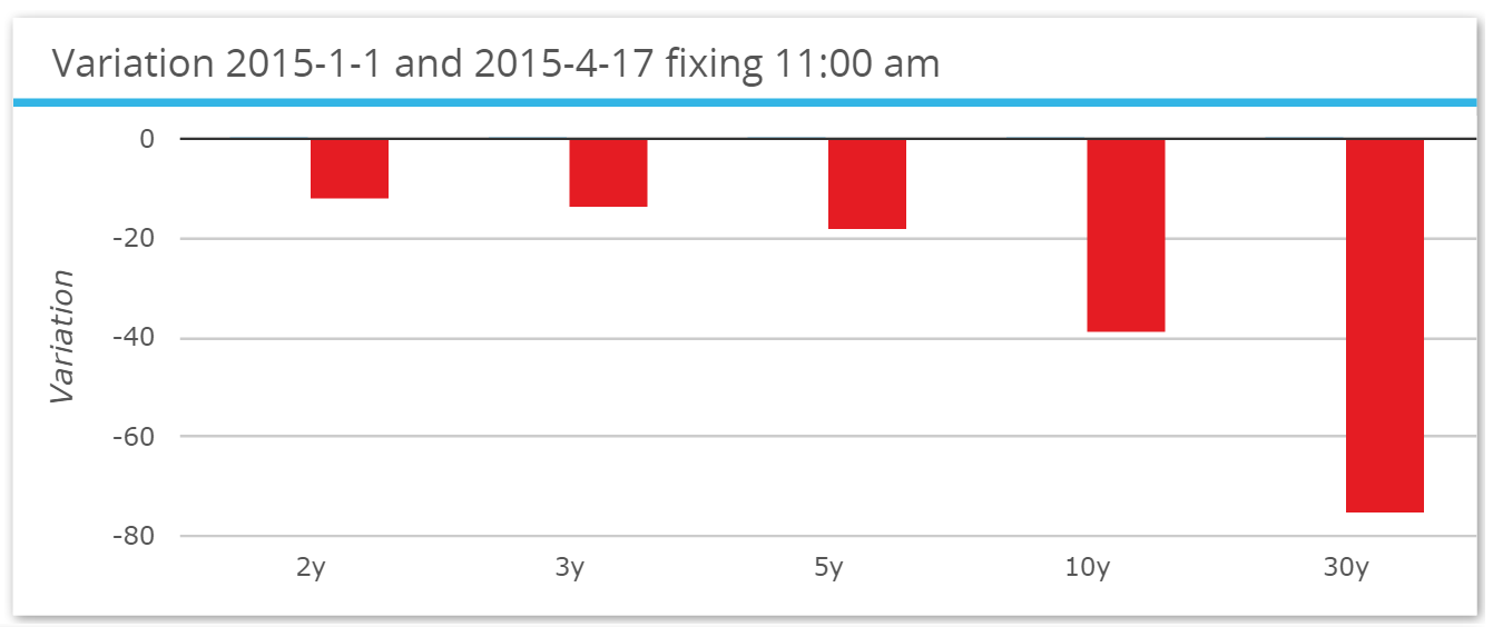
That is quite a reversal! Overall for 2015, 10 year rates are now 34bp higher and 30 years are up by 15bp.
The history of these moves yields some extraordinary price action:
- During the whole of 2014, 30 year rates moved by more than 10bp (between consecutive fixings) on a mere 5 occasions.
- In the 35 trading days since April 17th 2015, 30 year rates have moved by more than 10bp on 10 different days!
- Last week saw the bulk of the move, with rates moving higher by 12, 16 and 14bp on 3 consecutive trading days.
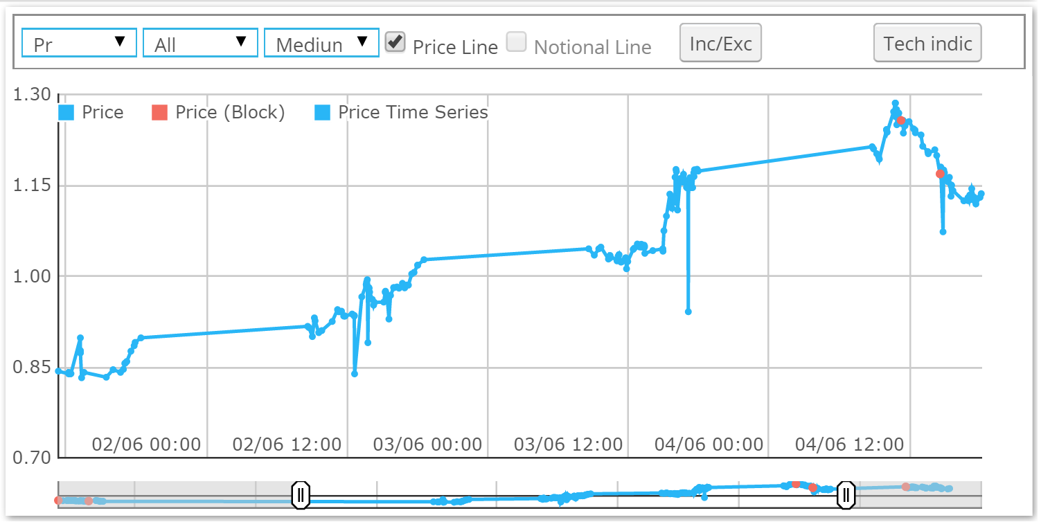
We can see that even this doesn’t tell the whole story, with SDRPro showing that rates hit an intraday high on Thursday. 10 years recorded a traded high of 1.286 during that move.
Volumes
Naturally, when we see moves of this magnitude our thoughts turn to the effect on volumes. With our newest product, CCPView, we have volumes for the entire cleared market, so we can clearly see whether these crazy price moves are motivating people to trade. First, let’s look at the time series of weekly volumes for EUR Swaps in CCPView:
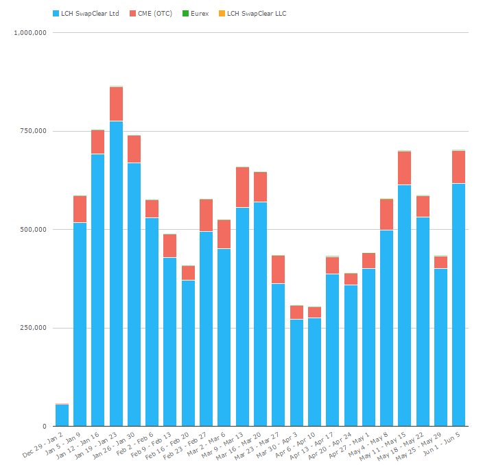
Showing;
- Volumes were generally greater back in January than we saw last week.
- Nevertheless, last week saw the 4th highest volume week for the year, at €702 billion in EUR Swaps.
Generally speaking, we can see it was a decent week, but we still didn’t reach the heady heights of January’s activity. That either means that all of the long positions in European Fixed Income haven’t quite been stopped out yet (!), or that the flood of seasonal January issuance is an even bigger driver of volumes than pure price action.
Volumes and Volatility
So that brings us once again to question the link between volumes and volatility. Let’s take a very simple measure of “volatility” during the month. All we do is sum the absolute values for the daily change in rates per week. If we compare those to the cleared volumes from CCPView in EUR Swaps we see:
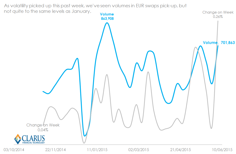
The chart confirms that last week was indeed the biggest week in terms of price changes. This has a degree of positive impact on volumes. However, the r-squared (a simple measure of “correlation” between two time-series) remains disappointingly low at 38%. This means that we cannot reliably use one time-series to predict the value of the other.
However, as we said previously, whilst the moves last week were violent, we don’t see massive changes on a year-to-date basis in yields. So what we could do is cycle through our CCPView history and look at a point in time when the yield curve looked very similar to today, and hence the change in yields up to now would be virtually zero.
Using this as a starting point (6th November 2014 is the closest to zero change compared to closing levels on the 5th June) we can then sum all volumes on “up” days versus all volumes on “down” days. This gives us some idea as to the participation levels for trading during the rollercoaster ride of much much lower yields followed by much much higher yields:
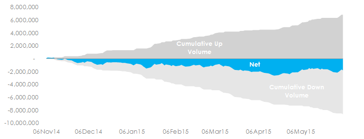
Whilst this can’t really be assumed to show “net open interest” or the such-like, the time-series does show several appealing properties:
- The start-date of 6th November also happens to be the date of the ECB meeting when Draghi first announced his staff were analysing additional measures.
- The largest negative position (i.e. maximum received position), also coincides with the low in yields on 17th April. Whilst prices may have back-tracked substantially from then, we have not seen a significant enough spike in volumes to suggest that positions have also back-tracked towards flat.
Of course, by its’ very nature, this is a crude form of position analysis. But it remains something that is worth monitoring to see at which point we do get back to a “neutral” position.
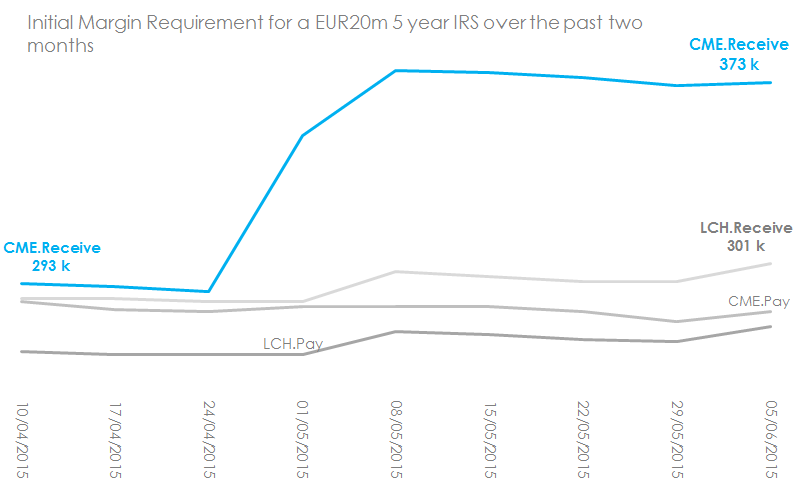
And Finally a word on Margins…..
Just quickly before we wrap up, as Amir has noted, margins do tend to have a pro-cyclical quality. Has this recent market volatility therefore caused a spike in IM requirements at the CCPs?
Actually, from my analysis it looks like the outright lows in yield back in April and May had a bigger effect. I’ll leave this chart here for you to draw your own conclusions. But you should subscribe to our newsletter for a follow-up blog shortly: