99Designs is a crowdsourcing platform for graphic designers. We were interested in a new logo for Clarus and also curious about the modern 99Designs platform, so we hosted a ‘competition’ for the design of a new logo.
We chose a ‘Silver’ competition (£339), received 219 entries from 64 different designers, and are very happy with the results. The competition took 10days from start to finish, and I spent about one hour each day reviewing and giving feedback. It was most definitely a positive experience, although there are some areas of the process where I think 99Designs could be improved.

The Competition
When hosting a competition you provide a design brief which consists of general preferences and colours, and specific details for your logo; for example, information about the organisation/company, the industry you are in, the values you want to convey and even sketches of your own ideas.
A competition is open to all 99Designs designers across the world, with two rounds. In the first round anyone can submit an entry, you then decide on up to 6 designers to proceed to the the second round. Then you work more closely with the chosen designers for a few days until you find a winning entry. It is a winner takes all competition, the runners up get nothing.
99Designs highlight the fact that there is a 100% money back guarantee, if you do not like any designs you do not pay. At face value that sounds very reassuring, especially if you are inexperienced and have not used the platform before, however to get good designers to participate in your competition it is probably best to simply guarantee the prize upfront which is exactly what we did.
There is a choice of 3 levels of prize, Bronze £199, Silver £339 and Gold £539, or you can explicitly choose a specific amount as your prize. We opted for Silver, but I suspect it would have been better to pick a specific prize, at say 5% or 10% above Silver to help distinguish us from other competitions; assuming most other competitions will be lazily chosen at either Bronze, Silver or Gold levels.
When setting up the competition, one can give a lot of detailed specification to the designers, including your own attempts at a logo. We did not give too much detail initially, in case it would inhibit the creativity of the designers. During the second round we revealed more of our initial ideas explicitly and implicitly by scoring the initial efforts. The scoring is the notorious 5-star system often found in pointless surveys. A binary system seems quite adequate to me, a simple ‘Like’ or ‘Dislike’, or possibly ternary choice of ‘Like’, ‘Not Bothered’ or ‘Dislike’.
Each stage of the competition has fixed lengths of time, 4 days for the first round, 3 days for the second round, and then up to a week to choose the winning design. There is a period of about two weeks to sort out the transfer of files and copyright with the winning designer. The use of fixed times is definitely a good idea, it can be quite hard to decide amongst designs, so time deadline helps force decisions.
Round One
When the competition was launched it was quite exciting to see to the format working and to review initial designs. The first few designs were most definitely disappointing, and I really wondered if we had made a mistake guaranteeing the prize. However, as time rolled on, the designs started to flood in, more than 40 designs from about 20 designers in the first two days, which was over a weekend.
After the second day of the first round we voted once per day on the entries, and gave general feedback to everyone and direct feedback to designers we thought had potential. Providing feedback is very important in the first round, it helped us distinguish designers, some were much more reactive to our feedback than others. I especially found it useful to have the logo shown on different backgrounds making it easy to imagine the logo used in different situations and requested all designers to do this.
One interesting thing happened just before the first round closed, a new designer appeared with a design incredibly similar to another design which we had said we liked. The designers can see each others entries, although there are various house rules and procedures for dealing with similar designs. We took a dim view of the unsporting nature of this designer, to what had been a fair competition so far, and quickly eliminated the designer.
Round Two
The second round was quite difficult, we had at least two designers with entries of such quality we really had a difficult time deciding which was the best, in all likelihood either would have worked for us. Part of our decision was related to how reactive the designer was to the finer points of our feedback.
At the end of the competition we had 219 entries from 64 different designers, when we crossed the 100 entries barrier I then realised why the site is called ‘99Designs’… It was quite remarkable the truly global nature of the designer pool; we had designers from Canada, Eastern Europe, Russia, Indonesia, and New Zealand. This seems like a huge practical benefit when one compares to the traditional approach where you might seek out perhaps one or two graphic designers in your local city, which in itself might not be straight forward if you are not familiar with the industry, 99Designs completely cuts through these issues in a remarkable way.
One interesting detail about the designers, you can see their winning designs, the number of competitions won and the total number of competitions entered. This was very interesting, we started to notice a pattern, the better designers had a strike rate of about 1:10 (meaning they won 1 out of 10 of all competitions they entered) or more. The winning designer has a strike rate of about 1:6. The stats on the designer also helped explain the initially disappointing designs, they were from new designers who had little experience on 99Designs, they had entered only a few competitions and had won few if any yet.
Winning Design
Having finally settled on a winning design, one has to transfer files and copyright. What files to ask for explicitly if you are inexperienced? I quickly became experienced. Many designers use Adobe Illustrator, it is important to get the original files for AI, and check that they work. I downloaded a trial of AI, and checked the files sent could be opened and worked. Not being very experienced with graphic file formats, I requested PNG for each size I knew I needed.
| Logo | Size (Pixels) |
|---|---|
| Favicon | 16×16, 32×32, 64×64 |
| Google+ | 250×250 |
| 128×128 | |
| 50×50, 100×60 | |
| Apple Bookmark Icon | 72×72 |
| SlideShare | 96×96 |
| Google Apps for Business | 143×59 |
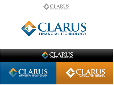
One point I did not appreciate at the start was the use of images with transparent backgrounds. Generally it is better to request logo with a transparent background, with likely two styles, one for a light background (often white) and one for a dark background (‘the negative’), this gives a lot more flexibility than a logo explicitly on a white background (or any other specific colour). We actually have two negatives, one with a coloured symbol and one with constant colour for symbol and text, which are shown below.


Also worth going to a local print shop and printing a large poster and check the quality of professional printing, using either an EPS or PDF file.
A favicon for the website can be created by using a PNG file size 16×16 and simply renaming to favicon.ico. However, a better effort can be made with the open source package GIMP, it will allow the favicon to be packed with images of different sizes, our includes 16×16, 32×32 and 64×64, see here.
I did struggle with this phase of the process, I think 99Designs could be improved with an ability to request a “web images package” from the designer, with images for many of the common cases, favicon for website, image for twitter, linkedin, facebook, google+ etc.
Another area 99Designs could improve upon is the use of fonts. Quite rightly they mention that designers cannot transfer font files to you, however when a font is used in a logo, the letters can be ‘outlined’ (converted to shapes with fills) and the font discarded. After searching online for several hours I still have no idea if I need to buy a license for an outlined font used in a logo. To be safe I will purchase the font as it is relatively inexpensive (less than $50), but it is hidden cost. For sure, 99Designs knows considerably more than I do in this area, so I think it could be part of the design brief with a choice of say ‘use free fonts’, ‘use free fonts + outlined fonts’, ‘use fonts from specific foundries’, ‘use any fonts’, with specific guidance on each choice including the definition of outlines.
One final point, the designer is only known by a user name until the very last step in the entire process which is the transfer of copyright and release of payment. There is no transparency about the designer such as a LinkedIn profile or url to their website. At times during the competition I felt uneasy about this aspect, not least because I knew we would be signing a legal document with this person whom we know very little about. Moreover, the copyright agreement is between the designer and the person who hosts the competition rather than the company the host of the competition is employed by, so a potential hidden expense to have this checked with a lawyer.