- Clarus Microservices make it very easy to create Dashboards
- Dashboards that perform new risk calculations (not just display old ones)
- Interest rate risk measures such as DV01 and IR Delta can be calculated
- Tables, Charts, Panels can be easily created with a single line of Python code
- Our Browser Sandbox allows you to try yourself
Introduction
Clarus Microservices allow you to calculate the sensitivity of a portfolio to changes in interest rates using a range of risk measures.
In this blog we will look at DV01 and IR Delta risk measures. DV01 is the profit or loss of a portfolio from a one basis point change in interest rates, It is the parallel shift in the yield curve, while IR Delta usually means shifting the curve by bumping by 1 bps at each tenor.
(Last week I covered Creating a Dashboard for Margin Attribution).
Example 1: DV01 Panel
response = clarus.risk.dv01(portfolios=clarus.read('FpMLSwap.xml')).total
alert_panel = ui.Alert(title='DV01', message='{:,.0f}'.format(response), icon='tachometer', iconColour='#d9534f')
dashboard = ui.Dashboard(alert_panel, style=ui.DarkStyle())

print(dashboard)
With just a single line of python code, we make an API call to calculate the total DV01 of a swap trade passed in through a FpML file.
All we do is pass in the method – clarus.read(‘FpMLSwap.xml’) to the risk.dv01 function, which generates the cash flows of the swap in the context of a market environment with Libor and OIS curves and calculates dv01.
In the next line we create a nice visual display by passing in the total DV01 to an alert panel. We set the title, the icon and the icon colour to the alert panel.
Lastly, we pass our alert panel to a dark themed dashboard, and Print.
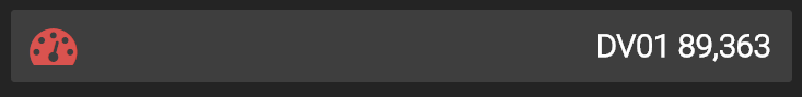
Simple as that.
Example 2: IR Delta Bar Chart
response = clarus.risk.irdelta(portfolios=clarus.read('MyTradesFPML.xml'))
bar_chart = ui.BarChart(response, excludeRows='Total', colFilter='Total', colour='darkseagreen', xlabel='Tenor Buckets', ylabel='Delta', title='IR Delta')
dashboard = ui.Dashboard(bar_chart, style=ui.DarkStyle(), header='Delta Ladder by Tenor')

print(dashboard)
The first line of Python code calls the method risk.irdelta on a portfolio of trades contained in the FpML file.
The second line creates a Bar chart to which we pass the result of the first line. We use parameters to label axis, set title and colour, and include/exclude rows/columns that we want to display in our chart.
The third line creates the Dashboard using a dark style and sets the dashboard header.
Printing the dashboard gives us the below :

We can see that 3Y has the largest positive delta, while 30Y has the largest negative.
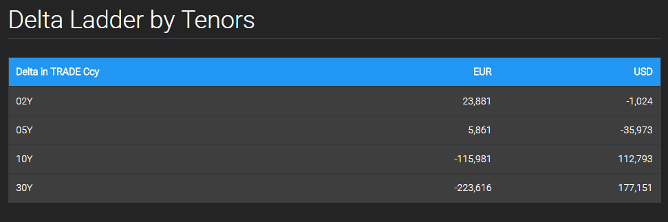
Example 3: IR Delta by Tenor and Currency
In this example we want a table and a chart that calculates delta on major tenors and displays in trade currency.
response = clarus.risk.irdelta(portfolios=clarus.read('MyTradesFPML.xml'), col='Currency', reportccy='TRADE', ladder='Major')
table = ui.Table(response, cssClass='table-inverse', headerColour='#2196F3')
dashboard = ui.Dashboard(table, style=ui.DarkStyle(), header='Delta Ladder by Tenors')

print(dashboard)
All that is required is to pass in a few additional parameters when calling the ir.delta function.
These include col, the column axis on the result grid, reportccy, to specify in what currency we would like to see the results, and ladder, the set of tenors to calculate risk on.
We pass this response into a Table, and set a style and header colour to it.
Lastly, the table is passed into a dark themed Dashboard which when printed displays the below:
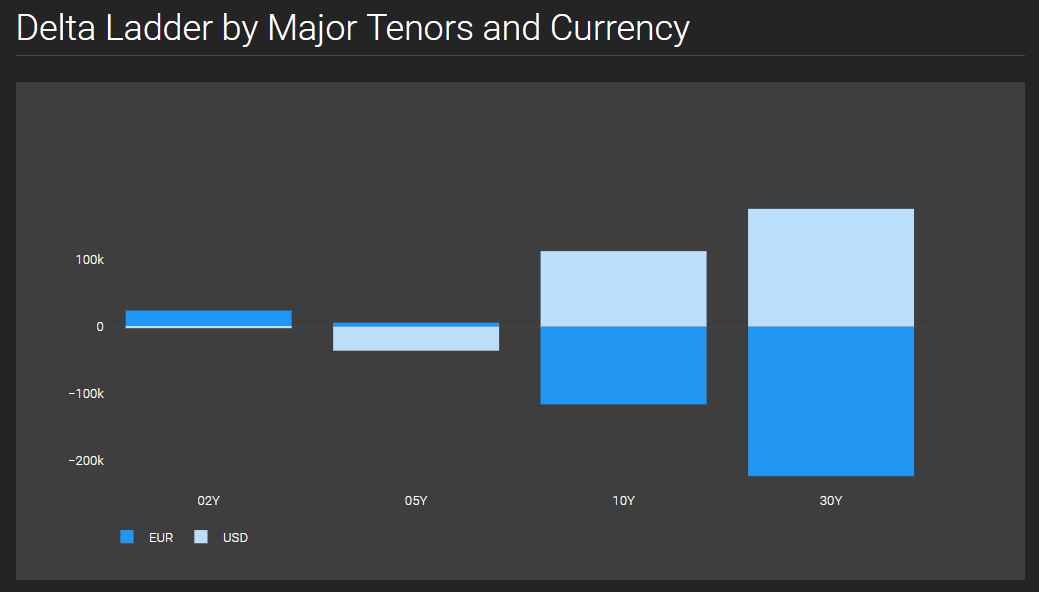
We can display the above output in a dashboard with a bar chart by using the same response that was used to create the Table.
bar_chart = ui.RelativeBarChart(response, excludeCols='Total', excludeRows='Total', colours='Blues')
dashboard = ui.Dashboard(bar_chart, style=ui.DarkStyle(), header='Delta Ladder by Major Tenors and Currency')

print(dashboard)
The above two lines of code will give us the below dashboard:
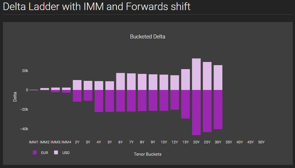
Example 4: IR Delta using Forward shifts
response = clarus.risk.irdelta(portfolios=clarus.read('MyTradesFPML.xml'), ladder='IMM', shift='Forwards', col='Currency')
relative_barchart = ui.RelativeBarChart(response, excludeRows='Total', excludeCols='Total', colours='Purples', xlabel='Tenor Buckets', ylabel='Delta', title='Bucketed Delta')
dashboard = ui.Dashboard(relative_barchart , style=ui.DarkStyle(), header='Delta Ladder with IMM and Forwards shift')

print(dashboard)
In this example we will calculate IR Delta not by shifting zeros but by shifting forwards and in this case it is natural to use a risk ladder with IMM dates. To do this we simply change the ladder and shift parameters in the risk.irdelta API function.
We pass the response to a Relative Bar chart, and set the parameters. In this example we change the colour gradient to ‘Purples’. We pass the chart to a dashboard to yield the result below:
Example 5: SwapEquivalents
An alternative way to look at interest rate risk to shifts in zero space or forwards space, is in par swap space, which has the advantage of leading more directly to hedge equivalents.
(For details of our methodology see: Swap Equivalents in Waves)
response = clarus.hedge.equivalents(portfolios=clarus.read('MyTradesFPML.xml'), reportccy='TRADE')
table = ui.Table(response, cssClass='table-inverse', headerColour='#2196F3')
dashboard = ui.Dashboard(table, style=ui.DarkStyle(), header='SwapEquivalents')
print(dashboard)
In the first line of python code we call the clarus swap equivalents function – hedge.equivalents.
And similar to the above examples, in the next two python lines, we pass our response to a table and the table to a dashboard.
This gives us the below output:

Showing the equivalent swap notionals in major tenors that have the same risk as the myTradesFpML portfolio.
It is really that simple.
Try it Yourself
It is really easy for you to try the above examples yourself.
First you need to register for a free trial account here.
(Only for potential customers, no vendors please).
When you have been authorised, login and try out the examples above.
More such examples are available in our Sandbox under the menu PythonUI.
And you can upload your own files in FpML, LCH, CME or SDR formats to create custom dashboards.
All in a few lines of code.