Over the last few years we have published many blogs on the AUD Swap market. Amir also includes an AUD summary in his monthly swaps review. The DTCC does publish some market info from the Australian SDR, but the aggregated nature of this data does not allow for a meaningful analysis of what is actually going on.
Cleared Volumes and SEFs
CCPView, allows us to get a complete view of the global cleared market, so where are AUD volumes versus other major currencies?
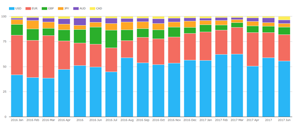
The graph above shows that AUD varies between 2% and 5% of the global market (competing with JPY for the position of 4th most cleared currency).
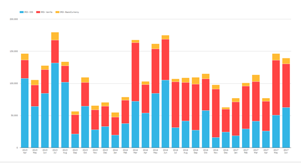
Now lets drill into AUD and look at the cleared volumes by product.
![]()
OIS Swap volumes stand out. LCH offered AUD OIS Swaps clearing late in 2015, and they were part of the mandated Aussie clearing rules from 1st April 2016. Since those two events, OIS swaps now make up a significant part of the AUD cleared market. LCH seem to have been the primary beneficiary of OIS Clearing. (Note ASX does not break out their OIS and IRS volumes).
In May 2016 and May 2017 the OIS volumes are double their previous months volume. There was a cash rate cut of 25 bps on 4th May 2016 (and again in August 2016) but no real indication of why there was such a volume increase in May 2017.
If we look at the same timeline for SEFView (to see the trades on a SEF) then the following volumes can be seen over the last 27 months:
Interestingly, for the AUD IRS market all SEF trades are cleared. If you therefore combine it with the cleared volumes from the first graph you get the percentage of cleared trades in the AUD Market that are executed on a SEF, by product type. 15 months of data is shown below:
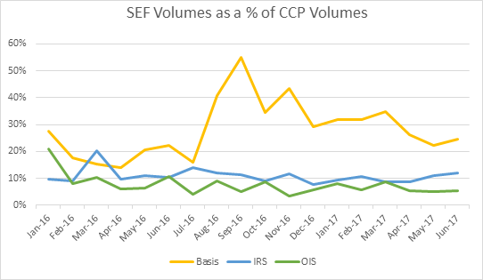
This shows that only a small volume of AUD trades are executed on-SEF (but then there is no mandate to execute).
SDR Data
Now let’s start to look at the SDR Data. For SDR data we are using US Persons data from SDRView – therefore we expect there to be coverage bias and data gaps.
At a first glance, it is interesting to note the almost complete lack of data on the AUD OIS and AUD Basis trades in the SDR data. This lack of data points to little involvement of non-Australian entities in these markets.
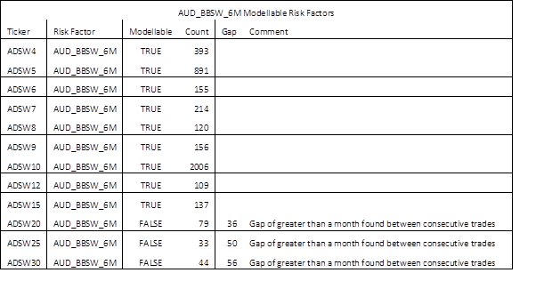
This scarcity of data poses a problem related to FRTB’s modellable risk factors. When looking for modellable risk factors, what source of data can actually be used (reliably) when the US SDR data does not contain enough data for AUD OIS trades to be considered “modellable”?!
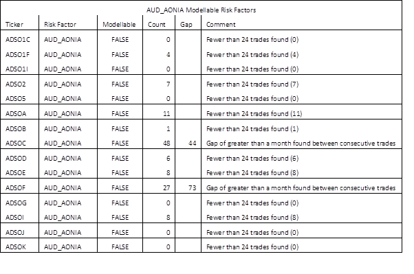
This is not the case for Vanilla Swaps as per the table below.
Now let’s look at the SDR data in a slightly different way. All SDR trade data is given a timestamp when reported. Given the drive to report as soon as possible, this timestamp should approximate the time the trade was executed.
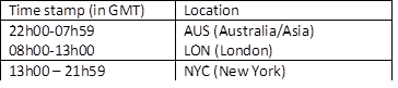
Using the timestamp we can therefore approximate the location of execution as follows. (All times GMT):
First, let’s look at the volumes by location for March 2017 to June 2017:
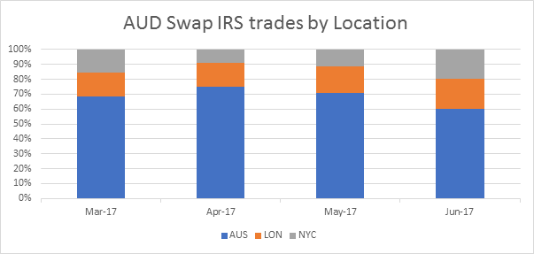
Showing that about 70% of the volume is in the Australian time-zone.
Now let’s see what is traded On- vs Off-SEF:
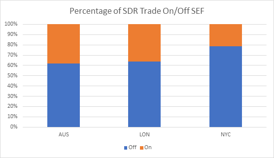
Showing that about 70% of these trades are Off-SEF. London seems to be the most active for AUD on-SEF (this could point to execution outside of their location).
Next, let’s look at the time of execution and graph the notional volume of trades executed per hour.
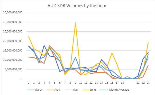
Clearly the most activity is just before and just after the Australian lunch (so most liquidity is in this time zone). However, given that this covers all US Reporting entities (and the Aussie Banks as well), it is interesting to note that there is some liquidity in London but very little in NYC.
Most trades are done before 7AM GMT and given that LCH SwapClear does not open for clearing until 6AM GMT it means that there are a fair number of AUD IRS trades waiting to be cleared when LCH opens. It can be assumed that there are also AUD OIS Swaps waiting to be cleared at 6AM at LCH. Is this an opportunity for ASX?
The outlier in the data above is June. Digging into the data it appears that the 14 June (IMM Date) is the single date that skews the whole month’s data. It is interesting to look at the dispersion of activity on this IMM expiry day. The time series for the 14th of June is below.
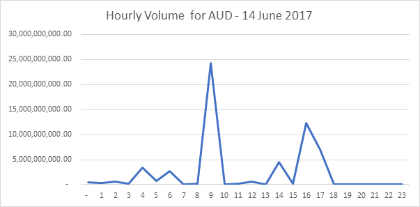
The volumes clearly spikes at 09h00 and at 16h00 GMT. We wonder if this is repeated across other IMM expiry dates? One for our users to investigate…..
JPY
For fun, given the time-zone similarity I thought that I would look at the hourly trade volumes in JPY.
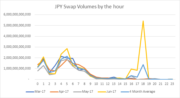
As can be seen in this graph, there are significantly fewer offshore trades than with AUD.
Compared to the Australians, the Japanese do less over lunch but more in the afternoon!