- Curve trades account for around 10% of volumes reported to US SDRs.
- We identify these package trades by matching timestamps and risk equivalence of the two legs.
- Benchmark curve switches trade every single day in decent size.
- We look at the USD Curve Trade market during 2017.
Curve Trading
Call them Curve Trades, Spreads or Switches. Or just call them swap packages if you want to. We’ve blogged about these in the past (Mechanics, Volumes, Liquidity are three popular examples). We are broadly talking about Package Trades where a swap is traded versus another swap of a different maturity.
When we describe a Curve Trade we mean a swap that is traded versus another swap with a different maturity.
These packages have certain characteristics, therefore we can identify Curve Trades in the SDR data. We do so by calculating the risk of each swap reported to the SDR in DV01 terms. We then look for pairs of trades that are matching in terms of risk equivalence and time-stamp.
Volumes in 2017
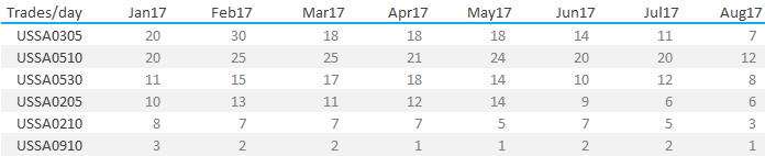
As with most aspects of the SDR data, there is a huge variety of Curve Trades reported. In January 2017, we saw 83 different combinations of maturities trade against each other. Eighty-three! I decided to therefore concentrate on pairs of maturities that trade more than once a day:
- We identify Curve Trades in the SDR data by tagging both legs with the bloomberg tickers.
- So a USD 3y vs 5y Curve Trade is tagged with the ticker “USSA0305”.
- The above shows that six packages have consistently traded more than once a day during 2017.
- This includes benchmark combinations that are familiar such as 5s10s, 2s5s and 5s30s.
- These are combinations of the most active spot-starting tenors.
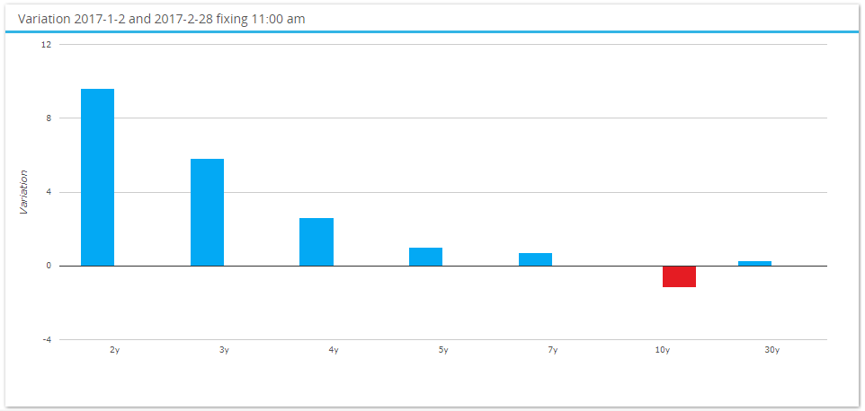
- It was somewhat of a surprise (to me) to see 3y vs 5y as the most active package at the beginning of this year. But then if we look at the curve moves from 1st Jan until end of Feb, we see that much of the move was in this area of the curve:
 Showing;
- The biggest curve move was in 2s10s during January and February 2017.
- Out of the 10+ basis points of flattening in 2s10s, half of it occurred in 3s5s.
- The combination of price moves and volumes is therefore particularly enlightening.
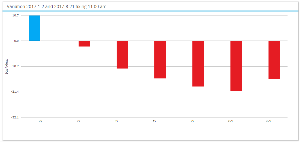 Whilst much of this may be “old news” it is useful to refresh memories. Afterall, the curve has flattened a lot more since January 2017 (see chart on the right). Mainly due to unwinding the Trump “reflation” trade that envisioned fiscal stimulus via infrastructure spending and ensuing higher long-end US rates to fund it all.
Finally, it is worth noting that closely related spreads also trade fairly frequently (nearly once a day). These are trades such as 3s10s, 7s30s. I decided to include 9y10y in the 2017 analysis because it was unusual to see a one year gap trade (more on this later).
Does Anything Change Month-on-Month?
We quickly learnt in the early days of Clarus that 5y, 10y and 30y spot starting swaps dominate volumes. The chart below shows that Curve Trading volumes vary, with the most active strategy changing month to month.
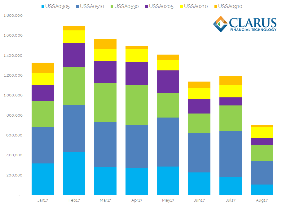
- The most active month of 2017 for curve trading was February.
- In most months, 5y vs 10y was the most active spread (dark blue bar).
- Volumes in 3s5s, 5s10s and 5s30s are large, suggesting these are the 3 “benchmark” curve trades to monitor.
- Since February Curve Trading volumes have begun to reduce. It will be interesting to see if they pick-up again after the current Summer lull.
- Given the overall large amount of curve flattening we have seen this year, curve spreads involving the 30 year tenor are not as active as I thought they might be.
- Since January and February, volumes in 3s5s and 2s5s have been broadly similar to each other. Maybe Jan and Feb were outliers this year? There is plenty of history in SDRView for our users to investigate.
What Tenor Gaps Trade?
It is refreshing to see quite a bit of variability in the activity of different curve packages throughout the year. Do the tenor gaps between two legs also vary month-on-month? For the next chart, we consider a 3y5y spread as a two-year tenor gap, and a 5y10y as a 5y gap etc.
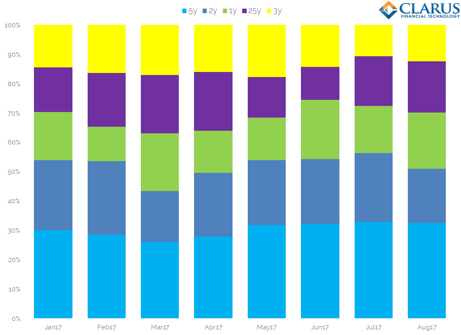
- By looking at tenor gaps, we reduce the number of possible combinations in the data.
- We therefore expect this data to look more homogeneous than Curve Trades.
- We take the top 5 tenor gaps and split the DV01 into percentage traded.
- We see that 5y tenor gaps consistently account for 30% of Curve Trading strategies.
- 2y gaps are the next most common, around 20-25%.
- Surprisingly, 1y tenor gaps are the next most common, which is not shown in our previous data – due to the large number of possible combinations. 1y gaps, which are typically risk management/portfolio management trades, account for 15% of volumes.
- Longer tenor gaps finally come to the fore, with 5s30s volumes large enough to make 25y tenor gaps the 4th most popular.
In Summary
- The most active Curve Trading strategies vary month-on-month.
- Four curve trades are consistently active every single trading day in USD swaps – 3s5s, 5s10s, 5s30s and 2s10s.
- Volumes in curve trades have tailed-off since the beginning of the year.
- Tenor gaps mostly consist of 5y, 2y and 1y gaps.