Guest Blog Series
Profile: Interest Rate Swaps trader. 12+ years’ experience, European and cross markets focused
Yes, that is principals not principles. We are not talking stop-losses or take-profit levels today, although you might be able to leverage a relative value strategy out of the findings.
With the first two blogs focussing on specific market events – an ECB Meeting and a Bond pricing – I wanted to take a wider view of the markets for this third blog. I certainly expected to see a distinct flavour to the EUR swaps market versus USD. For example, in general, EUR bond issues are priced relative to the EUR Swaps curve in absence of a European-wide benchmark Government bond curve. In the US, these bond issues are priced relative to US Treasuries.
However, the data does not clearly illustrate this. Instead, we see evidence that will be music to the ears of all exchanges hosting swap futures – liquidity is concentrated in the same 3 benchmark maturities, which highlights the use of a particular hedging strategy amongst liquidity providers themselves. It is worth keeping an eye on this over the coming months – as more counterparties report, this micro-hedging strategy may not always be apparent on such a macro scale.
Just looking at the month of June, the “raw” data can be misleading. Continuing my preference for DV01 metrics, I exported the data from SDRView for the month of June and determined that a total DV01 of $1,133m for USD Swaps was reported, versus just $321m for EUR Swaps.
From the simple semi-annual BIS statistics, we should expect the EUR Swaps market to be larger than its USD brethren. However, because we can only be guaranteed that “US Persons” are reporting, we see a larger USD swap market in the data due to this reporting bias.
The below graph shows the distribution of the DV01 traded as a percentage of the whole within each currency:
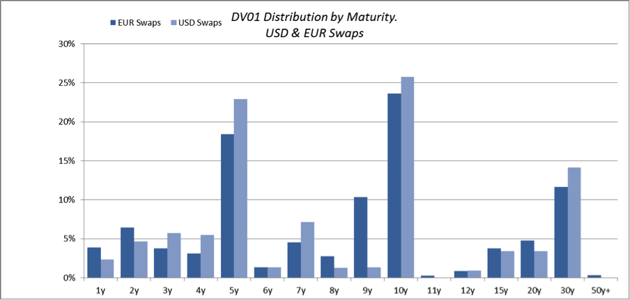
The similarities between the two markets are striking:
- 10y is the key maturity in both markets, seeing 23.6% of all EUR DV01 versus 25.7% in the USD Swaps market.
- 5y is a close second with 18.4% EUR versus 22.9% USD.
- There are only really 3 “benchmark” maturities in each market – 5y, 10y and 30y – making up 62-64% of each market.
- (I have included the 9y EUR DV01 in this figure as it relates to the Bund contract).
- Total DV01 below 5 years in both markets is small – only 17.2% for EUR and 18.2% for USD.
It will be fascinating to see over the coming months whether the relative inactivity at the short-end of the curves can really be sustained. With the ECB beyond the zero-bound, and continued repositioning around Fed exit strategies, there will be a break-out in short-end volatility at some point. (Just how many people in the past 5 years have predicted this …?!)
Whether the ensuing trading will be OTC- or Exchange-based is the subject for another day. (Where to start? Regulations, capital requirements, margin offsets…we could be here all day!).
To highlight the differences between the two markets, we can look at the relative percentage of DV01 traded in each maturity:
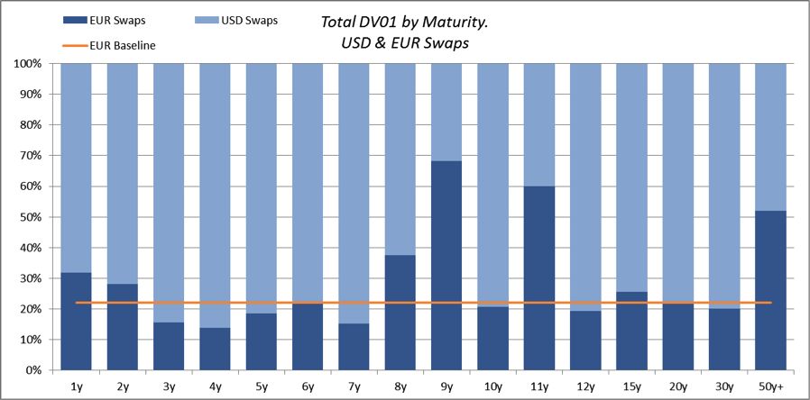
- If the distribution of DV01’s were identical, EUR Swaps should register a 22.1% DV01 share per maturity.
- EUR Swaps have considerably more activity in 8y and 9y – due to the Bund future contract. This is particularly elevated during June due to the contract roll.
- Ultra long-end EUR Swaps are far more active than the USD equivalent.
- 11y is likely distorted due to a tiny sample size – 19 EUR trades versus 8 USD trades.
Explaining the homogeneity
As I said, leaping out from the data are the similarities rather than the differences between the two markets. Working backwards, it looks like this is a one-two combination of:
- The types of counterparties reporting to the public data repositories
- Principal Components Analysis (PCA) as a hedging strategy
Tackling the two points separately:
First off, end-users can benefit from reporting exceptions, therefore the data is naturally skewed towards contracts traded by financial counterparties. Liquidity-begets-liquidity, therefore these naturally tend to be the most standardised contracts.
Leading on from this, liquidity providing Swaps desks employ Principal Components Analysis to weight their hedges across their portfolios. In a nutshell, this hedging methodology allows swaps traders to concentrate on 3 “benchmark” maturities that describe outright rates (10y), the slope of the curve (5y10y), and the curvature (5y10y30y). This further concentrates liquidity into the benchmark points seen above.
It is fascinating to see these PCA hedging strategies really shine through in the data. The exact components are not stationary – they will depend on the look-back period and included instruments for example. However, I still expected a stronger showing from the 2y area of the curve – if only acting as a proxy for the level of outright yields. However, the relative dearth of 2y volumes can be explained by:
- Euribor and Eurodollar future contracts – these are extremely liquid in this part of the curve, therefore attract the lions’ share of Libor-linked hedging requirements.
- The analysis excludes OIS exposures.
- Forward guidance from Central Banks crushes volatility in the 2y maturity, making this area of the curve a poor proxy for outright interest rate levels under current market conditions.
The use of PCA across both markets could also lead to somewhat arbitrary cross-market correlations. These correlations are not necessarily driven by “fundamentals” per-se, but can be considered facets of market behaviour – and being driven by previously “independent” mathematical analysis. Just as liquidity-begets-liquidity, it may be the case now that PCA-begets-PCA!
I will leave it to the users of SDRView to ascertain the natural question arising from all of this – if volumes are so closely linked between markets, what does this mean for prices?