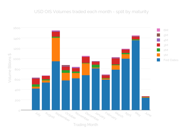
- Volumes in FOMC dated OIS swaps surged past $1.3 trillion last month
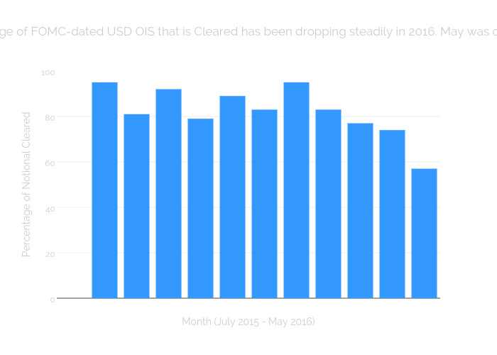
- Only 57% of this volume was cleared at a CCP, which is surprising
- We interpret the price action via the Clarus Fed Pulse Index
- Paying FOMC dated OIS structures now looks attractive
Amir last week highlighted the surge in USD OIS Volumes we are seeing. This increase in volumes is largely related to the structures I looked at during my series of blogs in January this year (here, here and here). These all focused on increased trading in Federal Reserve meeting dated OIS structures.
FOMC Dated OIS Volumes
Looking at the past year of OIS volumes, we can see that the change in volumes in OIS trading is down to Fed-dated trades:
Recall from our previous blog that;
- FOMC meeting dated OIS trades are the most commonly traded structure by trade count.
- These are trades that start on the final day of the FOMC meeting and end on the final day of the next FOMC meeting (dates are available here).
The chart above further shows that;
- FOMC meeting dated OIS trades are now the most traded OIS products by notional.
- The notional amount traded in these structures has increased month-by-month in 2016 (excepting February, let’s put it down to a short month shall we?).
- In May 2016, 86% of OIS volumes were traded in FOMC-dated products.
- May 2016 marked the first month that over one trillion dollars in notional traded in FOMC-dated products. And it blew that out of the water, with $1.35trn trading.
Interestingly, as volumes have grown in FOMC-dated products, the percentage of the market that has been Cleared has steadily been dropping:
Fed Rate Moves
Looking at the volumes that have traded, the market clearly believes the Fed rhetoric that all meeting dates are “live” – i.e. we could see a change in Rates at any of the future meeting dates.
How does this play out when trying to interpret recent price action though? How have Friday’s terrible jobs report and Yellen’s (apparently dovish) remarks yesterday affected the Rates outlook?
Pure Price Charts
If we take the price series of both the June 2016 meeting and the September 2016 meetings, you can see relatively wild gyrations in price since the beginning of February (when we last looked at OIS FOMC meetings):
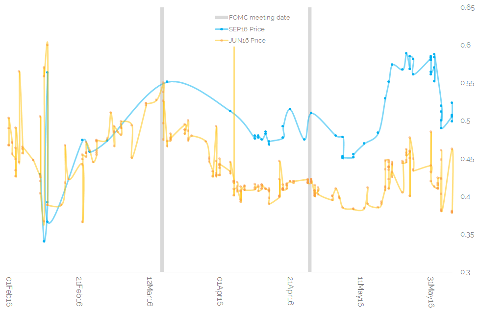
Bear in mind that the current Effective Federal Funds Rate is 0.37% (37 basis points), therefore for either of these contracts, a no-change decision on policy would (approximately) result in them settling at 0.37% (which is bang in the middle of the Fed’s current target range of 0.25-0.50%).
The chart shows;
- The June 2016 contract has traded with a high at 0.6% and a low at 0.37%
- The June 2016 contract has consistently fallen since the March FOMC meeting.
- Trading in June 2016 contract has been frequent, whilst trading in September 2016 has been more sporadic.
- As at midday on June 7th 2016, the September contract is still nearly 12 basis points higher than the June contract.
- This June-September spread represents either a 50/50 chance of the Fed hiking at or before the September meeting – or a tightening in short-end conditions that causes the EFFR to begin fixing at the top of its’ target range.
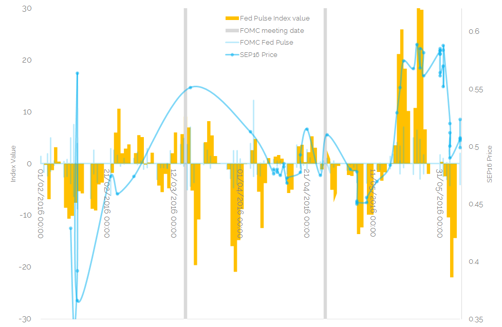
Fed Pulse Index
Why is the market trading these structures now? Obviously, the potential changes in monetary policy need to be hedged. But interpreting even simple price charts (such as the above) can be very confusing, as we typically need to monitor more than one meeting date to assess the likely path of rates in the future.
Therefore, I believe there is inherent value in assessing the change in rates across all of the FOMC-dated OIS trades at any point in time. This then gives us an idea of the cumulative changes across all of the meeting dates – not just one.
I also like to take that concept one step further and weight these changes in rates by their volumes. This gives us an idea of the conviction behind price changes. We should put more value on large trades that move the market than on small trades.
This approach leads to the Clarus Fed Pulse Index. And yields a nice simple chart :
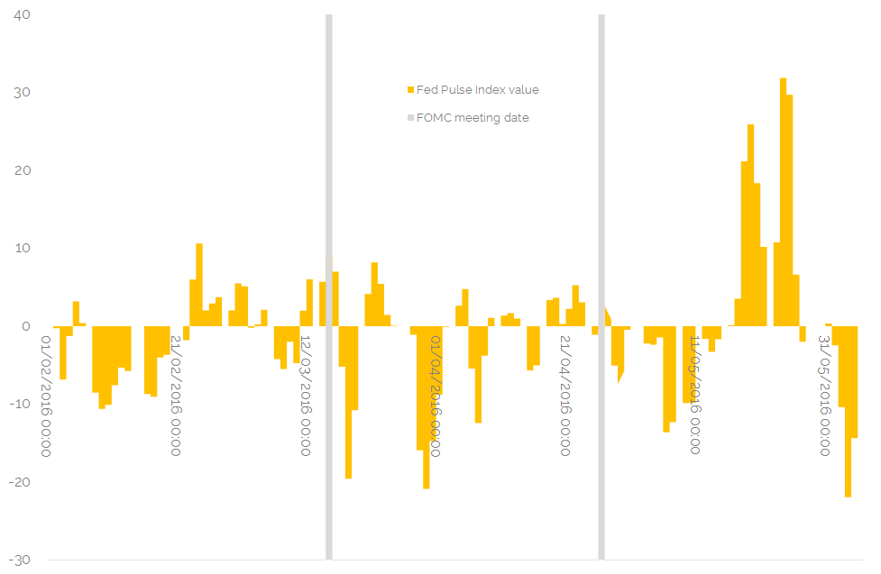
Showing;
- A single reading at each point in time for the Fed Pulse Index
- If Rates across the OIS complex are heading higher, the Fed Pulse Index has a positive value
- If Rates are headed lower, the Fed Pulse Index has a negative value
- The size of the reading is dictated by the sizes of the price changes plus the sizes of the trades themselves.
- The Index captures both parallel and curve moves across the OIS curve
- For the full Index methodology, please check out January’s blog.
We can therefore see that the OIS market is currently very dovish. We are at the extreme negatives of the Index readings. This has been in response to the weak NFP number on Friday, plus Yellen’s comments yesterday taking any June rate move off the table for now.
However, as we noted in the original blog, such extremes of the Index typically represent a turning point or reversal. Therefore I’ll leave you this week with both of the two charts above overlaid. It looks like prices are about to head higher again. That also ties-in nicely with the latest Bond Vigilantes blog over here.