- Clarus Microservices make it easy to get Swaps data
- Swap volumes can be retrieved from SDRs using simple Python
- This data can be displayed in Tables and Charts
- Our Sandbox allows you to try quickly in your Browser
Introduction
Under the Dodd-Frank Act, all swaps, whether cleared or uncleared, that are executed by US persons, need to be reported to a Swap Data Repository (SDR).
The SDR data is available via the Clarus Microservices API. It can be easily retrieved using simple Python programming language.
In this blog, I will demonstrate a few of the SDR functions available in the Clarus API. The functions take BBG tickers and return values such as notional and dv01, which can then be presented in charts and tables.
Volume and DV01 of Outright Trades
To start, I specify the BBG tickers for outright trades on six major tenors and then use the function sdr.volume to get notional and dv01 for each.
bbg_tickers = 'USSW2, USSW3, USSW5, USSW7, USSW10, USSW30'

notional = clarus.sdr.volume(ticker=bbg_tickers, volumeType='notional')
dv01 = clarus.sdr.volume(ticker=bbg_tickers, volumeType='dv01')
The output from the above two API calls is shown below:
Ticker     Period Start    Period End    Volume Type        Volume
USSW10       2018-08-03    2018-08-03       NOTIONAL    3231600000
USSW2        2018-08-03    2018-08-03       NOTIONAL    2768000000
USSW3        2018-08-03    2018-08-03       NOTIONAL     633000000
USSW30       2018-08-03    2018-08-03       NOTIONAL     973000000
USSW5        2018-08-03    2018-08-03       NOTIONAL    3104000000
USSW7        2018-08-03    2018-08-03       NOTIONAL     891000000

Ticker     Period Start    Period End    Volume Type     Volume
USSW10       2018-08-03    2018-08-03           DV01    2758311
USSW2        2018-08-03    2018-08-03           DV01     474617
USSW3        2018-08-03    2018-08-03           DV01     168557
USSW30       2018-08-03    2018-08-03           DV01    2013724
USSW5        2018-08-03    2018-08-03           DV01    1388505
USSW7        2018-08-03    2018-08-03           DV01     551946
In just a few lines of basic Python code I was able to get Notional and DV01 volumes for today , August 3, 2018 for these major tenors.
To collate the data in a table, I will use a popular data manipulation library in Python called Pandas.
From the above output data,Tickers, Notional, and DV01 are loaded into a new Pandas dataframe.
import pandas as pd

df = pd.DataFrame({'Ticker': notional['Ticker'], 'Notional': notional['Volume'], 'DV01': dv01['Volume']})
Next, I want to append more data to the above dataframe, which would include the Tenor, the Average DV01 for the prior 30 days, and its difference from the daily DV01.
df['Tenor'] = [int(i[4:]) for i in df['Ticker']]
df['Avg DV01'] = [clarus.sdr.volumeadv(ticker=i, volumeType='dv01').get_value(0,'ADV') for i in df['Ticker']]
df['%Deviation'] = df['DV01'].astype(float)/df['Avg DV01'].astype(float)*100

df = df[['Ticker', 'Tenor', 'Notional', 'DV01', 'Avg DV01', '%Deviation']].sort_values(by='Tenor', ascending=True)
In the above block of code, I first strip the Tenors from the Ticker symbols.
Next I call the clarus sdr.volumeadv API function to get the Average DV01 volumes for the prior 30 days for each Ticker independently.
I then calculate the difference between the daily DV01 with the Average DV01 for the last 30 days to get the %Deviation.
Lastly, I set the columns in order and the Tenors in ascending order to get the dataframe below:
   Ticker  Tenor    Notional     DV01    Avg DV01  %Deviation
1   USSW2      2  2768000000   474617   779729.23   60.869464
2   USSW3      3   633000000   168557   405415.54   41.576354
4   USSW5      5  3104000000  1388505  1560210.18   88.994740
5   USSW7      7   891000000   551946   469480.20  117.565341
0  USSW10     10  3231600000  2758311  2894384.05   95.298722
3  USSW30     30   973000000  2013724  1785639.48  112.773268
Creating a Dashboard
Next I will show you how to convert the above Dataframe into Tables and charts in a Dashboard in just a few lines of python code using the clarusui python library.
table = ui.Table(df, cssClass='table-inverse', headerColour='green')

bar_chart = ui.BarChart(df, colFilter='DV01')
line_chart = ui.LineChart(df, colFilter='Avg DV01')
combo_chart = ui.ComboChart(bar_chart, line_chart, yaxis='Tenor', xaxis='DV01 Volume', title='DV01 and Average DV01 by Tenor')

dashboard = ui.Dashboard(table, combo_chart, style=ui.DarkStyle(), header='IRS Volumes and DV01')
print(dashboard)
All I do is pass in the dataframe (df) to the Table, Bar chart and Line chart.
To best display the relationship between the daily DV01 and Average DV01, I pass the Bar and Line chart to a Combo chart.
I then input the Table and Combo chart to my dark themed dashboard to get the below:
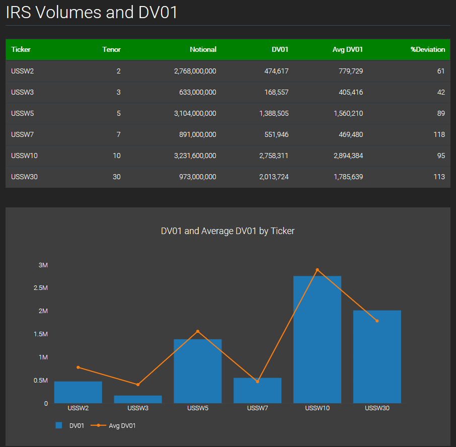
Hovering on the Bars and points in the Line chart displays the exact values at that point.
Once the dataframe was created, with a few lines of python code, all I had to do was pass it into the table and charts to get the above engaging Dashboard.
Try it Yourself
It is really easy for you to try the above examples yourself.
We provide Clarus python packages to make it convenient to call the Clarus API.
First you need to register for a free trial account here.
(Only for potential customers, no vendors please).
When you have been authorised, login and try out the examples above.
The Clarus API Reference Page allows you to try out the examples within a Browser Sandbox environment , before installing on your computer.
What could be easier?