- Inflation index values are decomposed into trend, seasonality and noise.
- Certain types of graph help identify seasonality.
- Graphs can be created simply and quickly in R.
- Simple graphs can be refined for stronger visual impact.
Recently, I have been looking at inflation indices and studying their seasonality. The best way to see the overall trend and seasonality in this data is to use graphs, so I turned to the statistical software R (namely, its “ggplot2” package). It wasn’t long before I was able to produce graphs which showed the trends in the data effectively, but with a bit more time and effort I could change them to make them look exactly as I wanted. In this post, I will present my first attempts at graphs in R and the scripts that produce them to show just how straightforward they are to make. Then I will show my edited ones to demonstrate how simple graphs can be improved and how much control R gives the user.
Basic Graphs
First of all, I wanted to draw a graph showing the inflation index values and the overall trend. I used centred moving averages to find the trend, then wrote a CSV file with the index values and centred averages. The file was in long format; that is, instead of having one column for index values and one for centred averages, I had one column with index values and centred averages. There was another column called “Series” in which I specified which values were the original values from the inflation index and which were the centred averages.
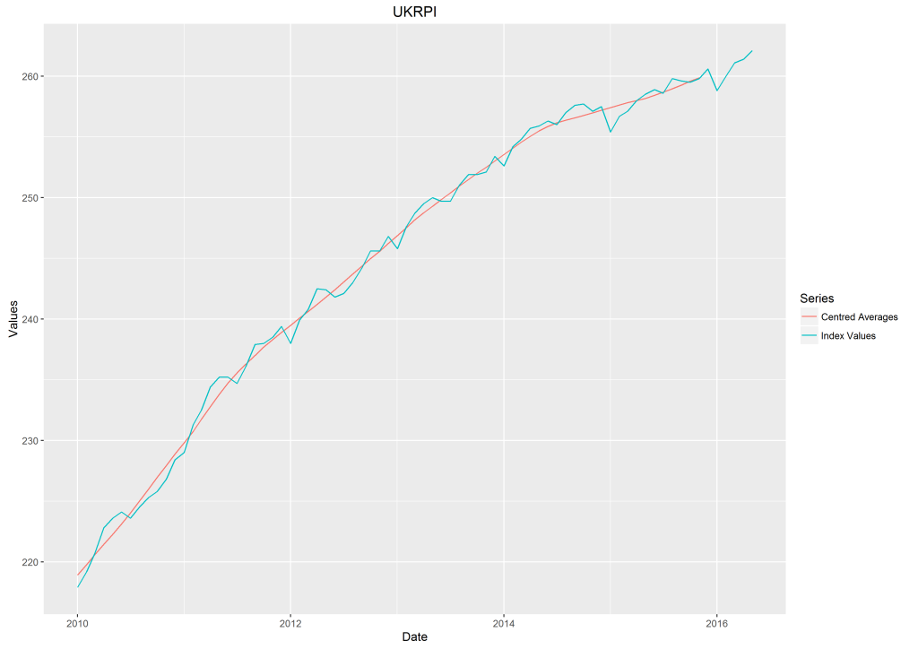
This is the graph I produced for the UK Retail Price Index, which I will use throughout this blog post. The R script for this graph is as follows.
library(ggplot2)
df <-read.csv(file="UK_CentredAvgsJava.csv", sep=",", head=TRUE, colClasses=c("Date"="Date"))
ggplot(df, aes(Date, Values, colour=Series)) + geom_line() + ggtitle("UKRPI")
First of all, the ggplot2 package is imported. Then the data from the CSV file is read as a data frame (a table of data, the top and bottom few entries of which are shown below). We use colClasses to make sure R reads the values in the Date column of my data frame as dates.
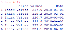
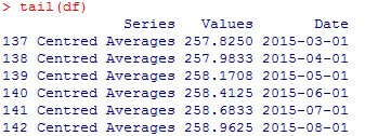
Then we start to plot the graph. The first part in the ggplot brackets says where the data is found. The term colour is misleading; we use colour=Series to distinguish between the types of value specified in the Series column (in this case, index values and centred averages). This produces two lines of different colours.
The geom_line() function states that we want a line graph and we write the title of the graph using ggtitle(). This is all that we need to produce the above graph.
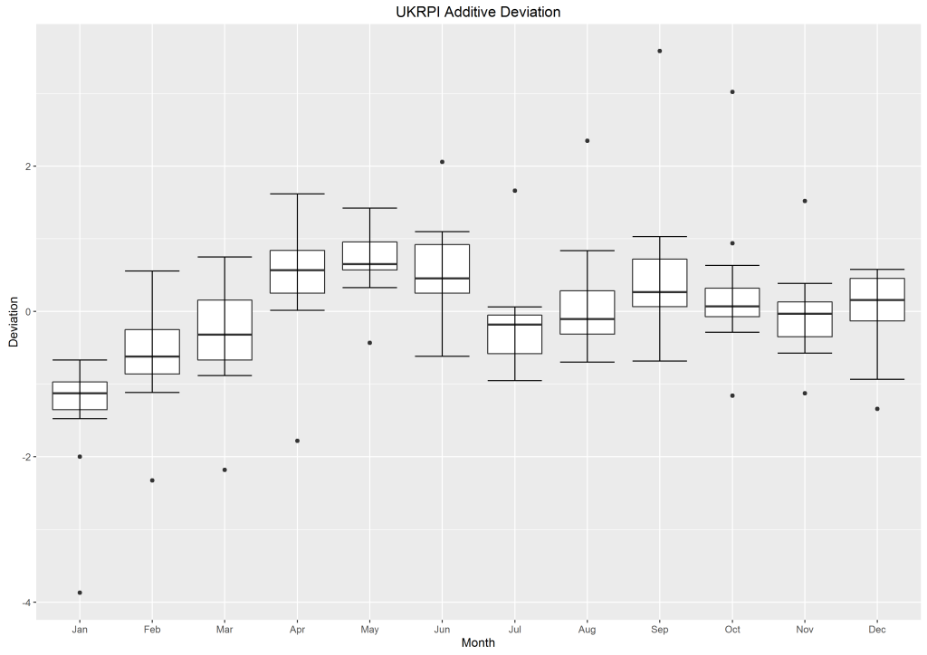
We can already see a pattern in the index values, but we can’t be certain that this is due to seasonality. So next, I plotted a box plot to study the deviation of the index values from the centred averages and sorted them into months, to see if there was any notable difference. The graph and its script can be found below.
monthOrder <- c('Jan', 'Feb', 'Mar', 'Apr', 'May', 'Jun', 'Jul', 'Aug', 'Sep', 'Oct', 'Nov', 'Dec')
df$Month <- factor(format(df$Date, "%b"), levels = monthOrder)
ggplot(df, aes(Month, Deviation)) + geom_boxplot() + stat_boxplot(geom ='errorbar') + ggtitle("UKRPI Additive Deviation")
This time I’m using a different CSV file with deviation values. The first six rows are below.

Since I wanted to consider the data by month, I made a new Month column in my data frame. I already have a Date column in this CSV file, so I take the month from the value in the Date column. I specify the order I want in a vector (entitled monthOrder) and apply this to the Month column using the factor() function (otherwise there may have been an ordering problem). The data frame now looks like this:

The box plot is drawn simply by using geom_boxplot(). I decided to add error bars to my graph which can be achieved using stat_boxplot().
This box plot suggests that there is seasonality in the data. In order to see how the deviation changes over time, I can produce a simple scatter graph of the deviation values in any month by using subsets as below.
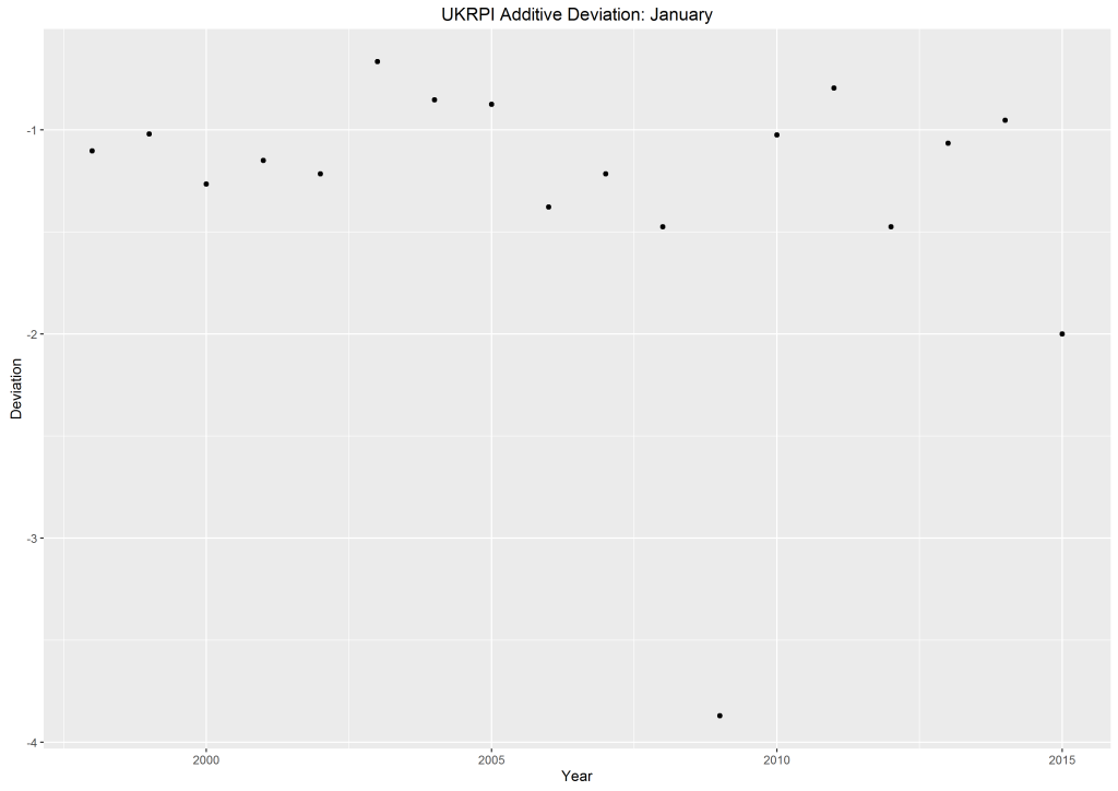
janData <-subset(df, Month=='Jan', select=c(Year, Deviation))
ggplot(janData,aes(Year,Deviation)) + geom_point() + ggtitle("UKRPI Additive Deviation: January")
To make a subset of a data frame, you just need to specify the data frame, the properties of the values you’re singling out, and the columns you need. In my case, I was taking my data from df, I wanted values for January and I selected the year and deviation values to plot. Now in the ggplot() function, I use my subset in the place of the data frame.
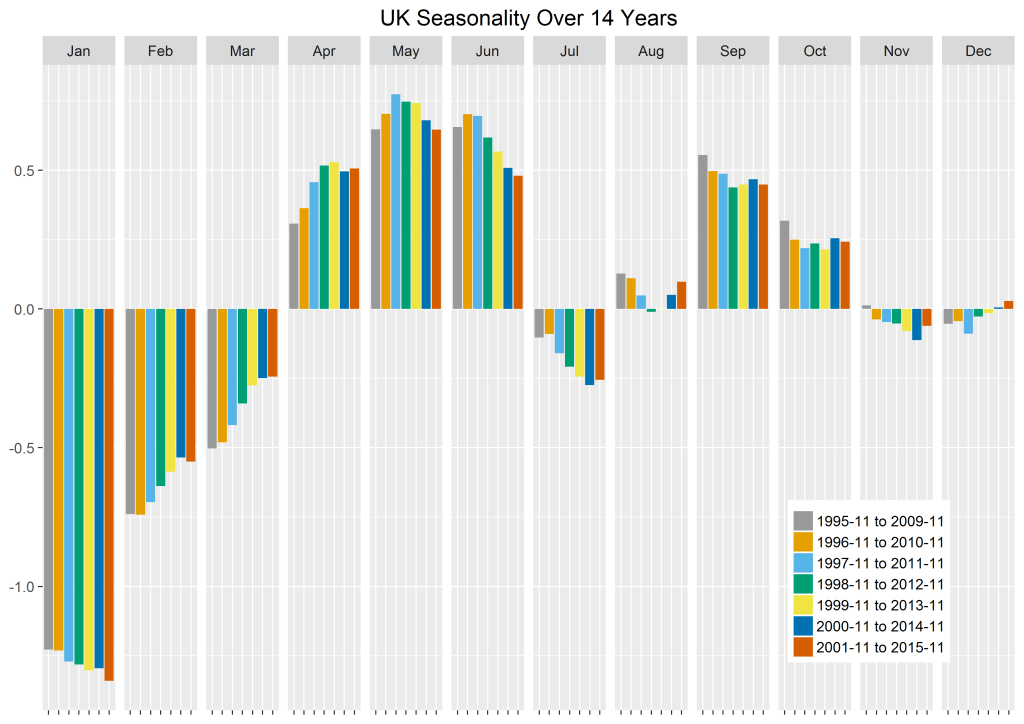
I now want to find the seasonal factors for each month. To look at the stability of these seasonal factors, I first found them using fourteen years’ worth of data (2001-2015). Then I used the data from 2000 to 2014 and calculated the seasonal factors over this time period. I repeated this until I had seven sets of seasonal factors evaluated from 2001-2015 through to 1995-2009. These seasonal factors could then be compared to study their stability, as in the graph below.
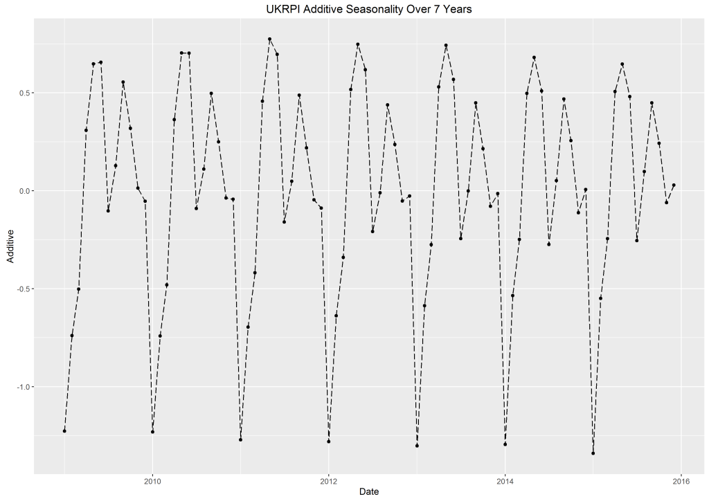
ggplot(df, aes(Date, Additive)) + geom_line(linetype="longdash") + geom_point() + ggtitle("UKRPI Additive Seasonality Over 7 Years")
Here, the seasonal trend is very clear. The points represent the seasonal factors. I decided on a dashed line because the line is only demonstrating how the seasonal factors differ from one another – it does not represent any extra data itself. The linetype is changed in the geom_line() function.
Finally, I can find the seasonal factors to use for pricing derivatives. I used a bar chart to plot these factors by month.
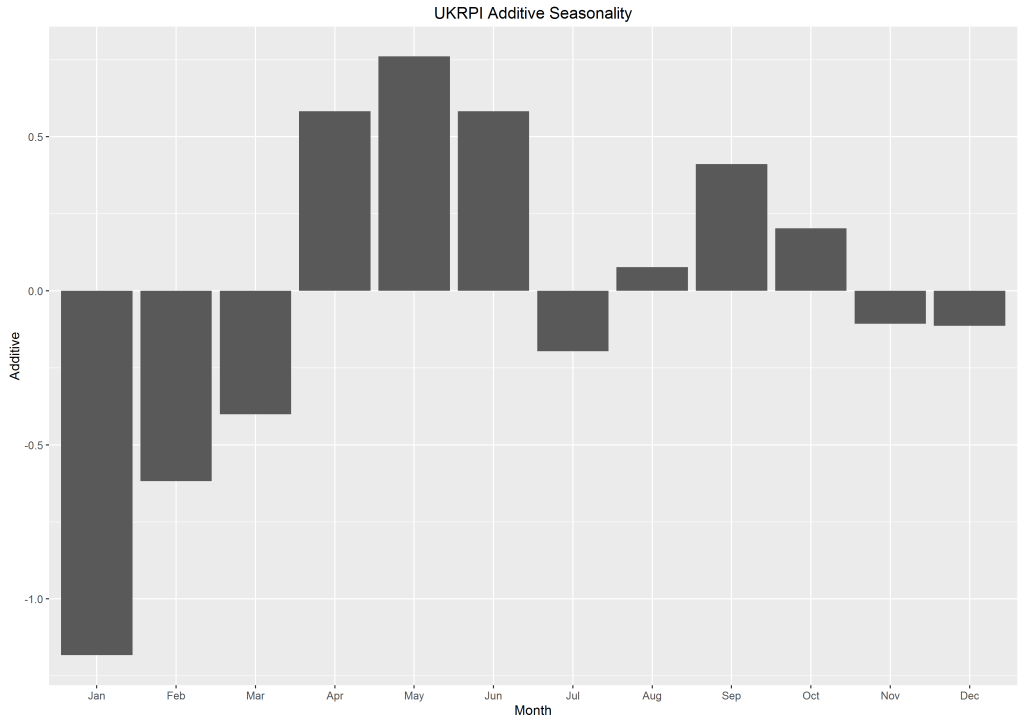
ggplot(df,aes(Month,Additive)) + geom_bar(stat = "identity") + ggtitle("UK Additive Seasonality")
To plot a bar chart, we use the geom_bar() function. Since this bar chart is plotting data values, we state stat= “identity”. By default, bar charts in R use stat= “count”, so that the height of the bar chart is determined by how many times a particular variable is counted in a data frame.
Refining the Graphs
These graphs were all quite simple, and while they presented the data well they weren’t exactly as I would like them. Since R allows us to control every detail of our graphs, this isn’t an issue – we can easily change the things we don’t like.
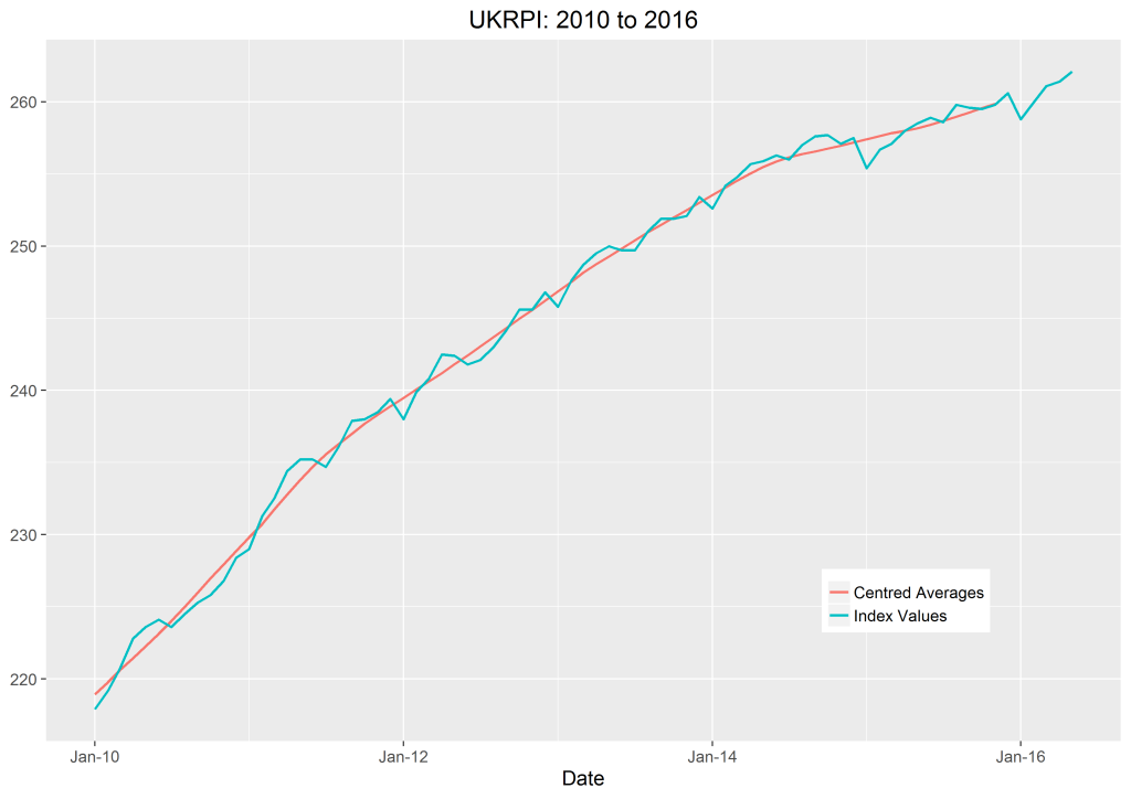
df$Year <- as.numeric(format(df$Date , "%Y"))
library(scales)
ggplot(df, aes(Date, Values, colour=Series)) + geom_line(size=.9) +
ggtitle(paste("UKRPI:",min(df$Year),"to", max(df$Year))) + theme_grey(base_size = 15) +
scale_x_date(labels=date_format("%b-%y")) +
theme(legend.title = element_blank(), legend.position=c(.8,.2),axis.title.y=element_blank())
Firstly, since I wanted to add the range of years to the title, I made a new Year column in my data frame. R reads these values as strings, so they need to be converted using the as.numeric() function. The minimum value in the column is found simply by using the min() function, and likewise with the max() function. We can then convert the year values into strings and concatenate them with the rest of the title. Thankfully, the paste() function does this for us.
The base_size part controls the font size. This is in the theme_grey function. You could also change the font here using base_family. I changed the thickness of the line by adding “size=” into the geom_line() function. Then I chose to use scale_x_date to write the x-axis values as months and years instead of just years. We need the scales package for this.
I thought the values on the y-axis were self-explanatory, so I removed the y-axis heading. I also removed the legend title. Finally, to remove any unnecessary white space, I moved the legend into an empty space in the plot using legend.position, where we need two values between 0 and 1 (the first measuring from left to right, the second from bottom to top) . This was all achieved with the theme() function.
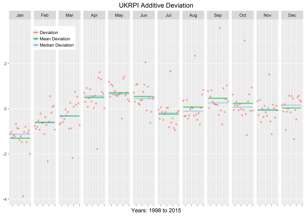
Now I wanted to see how all the deviation values changed over time, as I did in the graph showing January’s deviation values, but still group them together by month, as I did in the boxplot. I decided to use the facet_grid() function for this, as it allows us to plot several graphs beside each other which use the same x- and y-axes.
devData <- subset(df, Series=="Deviation", select=c(Series, Year, Month, Values))
meanDevData <- subset(df, Series=="Mean Deviation", select=c(Series, Year, Month, Values))
medDevData <- subset(df, Series=="Median Deviation", select=c(Series, Year, Month, Values))

ggplot(df,aes(Year,Values,colour=Series)) +
geom_point(data=devData,size=I(2),alpha=I(0.6)) +
geom_line(data=meanDevData,size=I(1.5),alpha=I(0.6)) +
geom_line(data=medDevData,size=I(1.5),alpha=I(0.4)) +
theme_grey(base_size=15) +
theme(legend.title = element_blank(), legend.position=c(.15,.9), axis.title.y=element_blank(),axis.text.x=element_blank()) +
ggtitle("UKRPI Additive Deviation") + facet_grid(. ~ Month) +
xlab(paste("Years:",min(df$Year),"to", max(df$Year)))
I made three subsets of the data frame to isolate the deviation values, the mean deviation per month and the median deviation per month which were all in my CSV file. I then used these subsets to plot the different graph elements, that is, the scatter graph of deviation values (geom_point()) and the two line graphs showing the mean and median (geom_line()).
In the line and point plots, alpha changes the opacity. The size and opacity of the points are enclosed in the I function so that they will not change as the values change.
In the theme() function, I erased the legend title, the y-axis title and the x-axis value labels to make the graph clearer. As before, I pasted the minimum and maximum years in the x-axis title to specify the year range.
The facet_grid() function is the one which enables us to draw several graphs side by side. If you wanted to have horizontal graphs rather than vertical ones, you would write facet_grid(Month ~ .).
We can use a similar script to produce a graph of seasonal factors by month.
cbPalette <- c("#999999", "#E69F00", "#56B4E9", "#009E73", "#F0E442", "#0072B2", "#D55E00", "#CC79A7")

ggplot(df,aes(Series,Additive,fill=Series)) + geom_bar(stat = "identity") + theme_grey(base_size=15) +
theme(axis.title.y=element_blank(), axis.title.x=element_blank(), axis.text.x=element_blank(), legend.title=element_blank(), legend.position=c(.85,.2)) +
ggtitle(paste("UK Seasonality Over",df[1,6],"Years")) + facet_grid(. ~ Month) +
xlab(paste("Seasonality")) + scale_fill_manual(values=cbPalette)
Here, I used facet_grid() to plot several graphs beside each other, as before. This shows exactly how the seasonal factors for each month differ over time. Bar charts work slightly differently in that fill is used to specify the fill colour of the bar and colour is used to specify the outline colour of the bar. Therefore, in the ggplot function, what is normally called colour is changed to fill. I specified the colours manually using a known set of good values for colour blindness (see here).
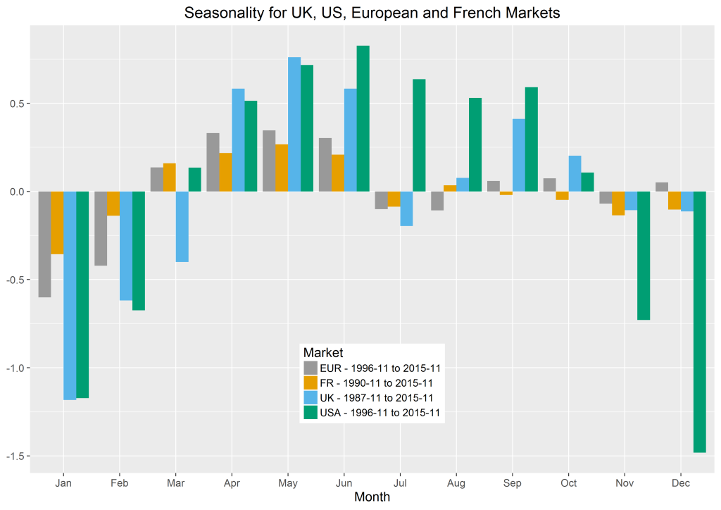
The last bar chart can be improved by adding the seasonal factors of different currencies.
ggplot(df,aes(Month,Additive,fill=Market)) + geom_bar(stat = "identity", position=position_dodge()) +
ggtitle("Seasonality for UK, US, European and French Markets") + theme_grey(base_size=15) +
theme(legend.position=c(.5,.2), axis.title.y=element_blank()) + scale_fill_manual(values=cbPalette)
Here, I have chosen to use position_dodge() so that the seasonal factors appear side by side instead of building on top of one another. I have calculated the seasonal factors using all the data I had available, which differed for each inflation index and which can be seen in the legend.
If you want to find out more about seasonality, see M. G. Kendall’s “Time-Series”, Kerkhof’s “Inflation Derivatives Explained” document from Lehman Brothers and Belgrade and Benhamou’s paper “Impact of Seasonality in Inflation Derivatives Pricing” (available here).
I came across a few websites which were very helpful when making these graphs, namely the Cookbook for R, the ggplot2 documentation and this ggplot2 cheatsheet. Hopefully they will be useful to you if you’re working with ggplot2.
This article is authored by Hannah McAleese.
