Clarus curate and augment a version of the SDR data that is unique. What does that tell us about the market that an ordinary SDR feed does not?
Curve Trades
Curve trades have a different price impact to outright trades. This is because they are delta-neutral. It is also common to manage risk across a trading book in terms of both outright delta and curve delta. Therefore, when looking at what has traded, it makes similar sense to separate outright risk from curve risk.
When doing this for USD Swaps traded during July, we find that around 30% of risk was traded as one leg of either a Spread or Butterfly trade, with 30% of risk traded as a spot starting Outright and 20% traded within a Compression package. For the purposes of this blog, we have excluded Spreadovers, but we hope to revisit these in a future blog.
Spreads
For the July data, I have extracted all of the spreads that were reported to the SDRs. These trades are not flagged as being “spread” trades, but we know from matching certain data criteria that these trades were transacted as part of a spread package.
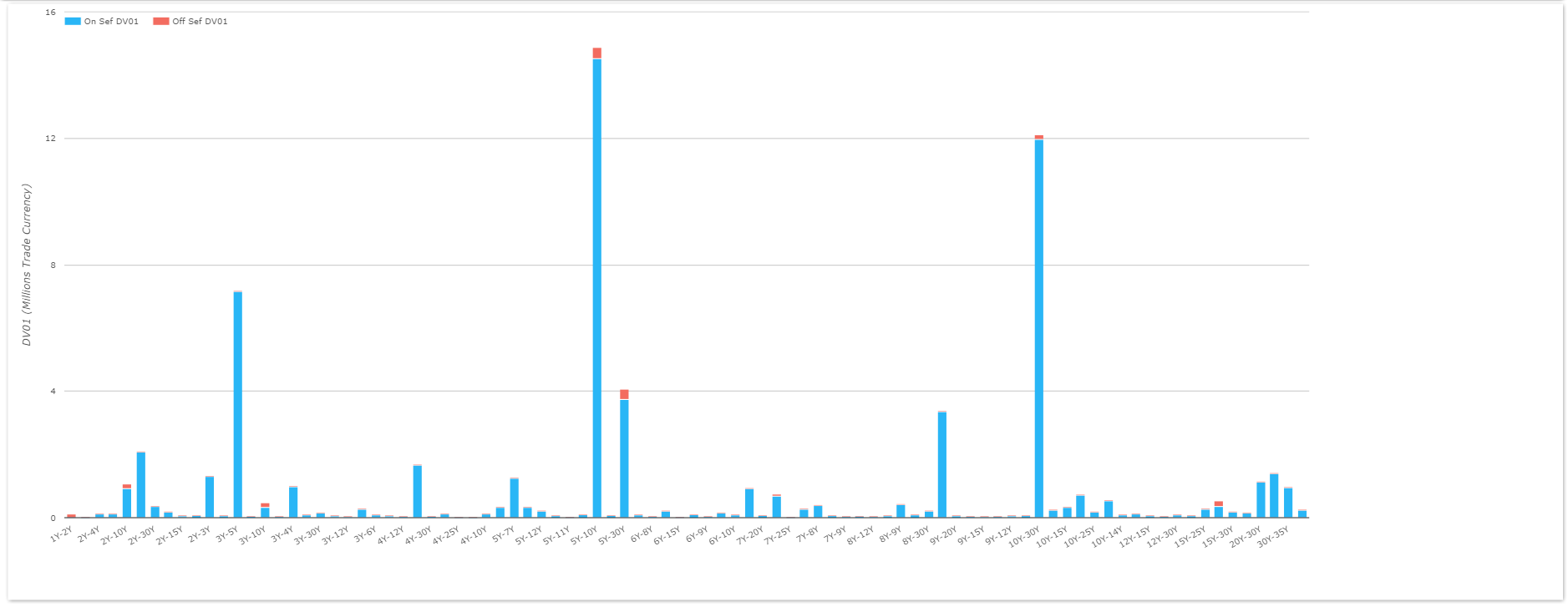
What we see is;
- 1567 trades during the month. These are package adjusted numbers, so that is equivalent to over 3100 legs.
- 90 different maturity switches!
- $65.2m in DV01 traded. Again, this is package adjusted, hence equal to over $130m DV01 across both legs.
- By trade count, the top three maturity switches were:
- 10y30y, trading 315 times in the month (around 15 times per day)
- 5y10y, trading 313 times (i.e. virtually the same as 10s30s)
- 3y5y, trading 263 times.
- It is a big drop in activity down to 88 times for 4th place (which happens to be 5y30y and hence a combination of the top 2!)
- By DV01 (i.e. the amount of risk traded), the top three maturity switches were the same. However, 5y10y traded nearly $15m in DV01, with more block trades reported than for 10y30y (which traded $12m in ‘01).
- Nearly 42% of the total risk in spread trades was transacted in either 5y10y or 10y30y.
Butterflies
Similarly, I wanted to look at the same chart for Butterfly trades:
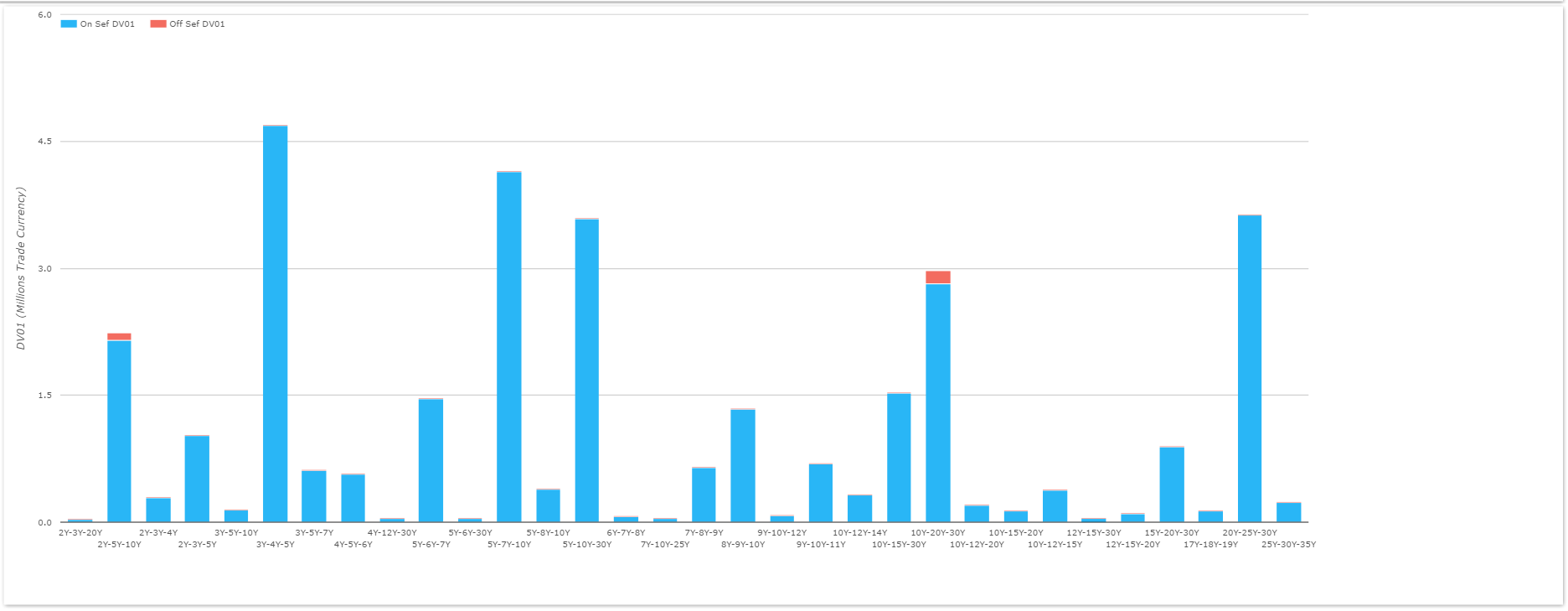
What we see is:
- Somewhat less diversity than for Spread trades, despite more theoretical combinations of maturity.
- 760 trades – about half as many as Spreads. Again, this is package adjusted, and hence equivalent to over 2200 legs.
- $32.7m in DV01. This is package adjusted, representing the DV01 of a single wing. Hence the total DV01 described by all legs of a butterfly is four times this amount, equating to over $130m.
- By trade count, the top three butterflies were
- 5y10y30y which traded 130 times. Maybe we shouldn’t be surprised that the most frequently traded butterfly is a combination of the most frequently traded spreads!
- A close second, trading 114 times, is 3y4y5y.
- In third, trading 90 times, is 5y7y10y.
- By DV01, the top three is surprising, with 3y4y5y, 5y7y10y and 20y25y30y showing at the top. However, it makes sense that the smaller the tenor gap between legs, the larger the trade will be (on average).
- Because of this, I would be inclined to use trade numbers (not DV01) to gauge market activity in butterflies.
- 44% of trades took place in the top 3 structures by trade count.
Comparing to the Rest of the Market
Let’s put some perspective on those descriptive statistics of ours. As we’ve looked at before, when we split the USD swap market into tenor buckets, we see heavily concentrated activity in the 5y, 10y and 30y maturities. Therefore, it’s no surprise that the most active tenors in Spreads and Butterflies correspond to these maturities.
We can also assess the differences in the maturity profile of different trade types. For example, are different tenors trading in Spot starting or IMM outright swaps compared to Butterflies?
For USD Swaps during July, we saw a total DV01 of $786m trade across all legs of Spreads, Butterflies, Outrights and Compressed trades. We summarise this by trade type below:
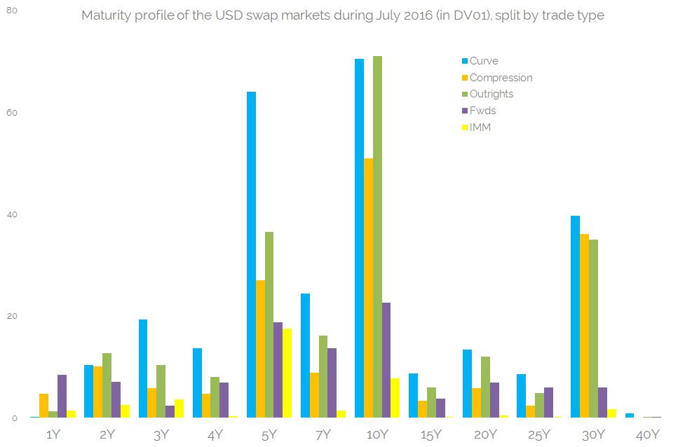
Showing;
- The DV01 profile of risk traded for each product type.
- We have combined Spreads and Butterflies together as they are both delta neutral, and called them “Curve” trades.
- But we’ve kept Curve trades apart from Compression trades, as Compression packages could have significantly less risk within them.
- We can see that in the major maturities – 5y, 10y and 30y – more risk is traded via Curve trades than any other package type – even spot-starting outright trades.
- And this tends to be true for all maturities. In 8 out of the 12 maturities, the most amount of risk traded was done so as part of a curve trade.
- Spot starting outright trades tend to be the next most traded instrument.
- Compression and Forwards are neck and neck in terms of which trade type sees the most activity per tenor. But overall, we saw $160m in DV01 compressed, versus only $102m traded as a forward.
- IMM swaps (in yellow above) are still a small part of the market, accounting for less than 5%. (MAC swaps remain even smaller).
That chart is worth taking a second look at. The maturity profile is strikingly similar across the different product types. It is not just the concentrated nature of activity in the major tenors (5y, 10y and 30y). Even when looking at the tenor of forward trades, it is still far more common to trade a 10y out of a forward date than any other tenor.
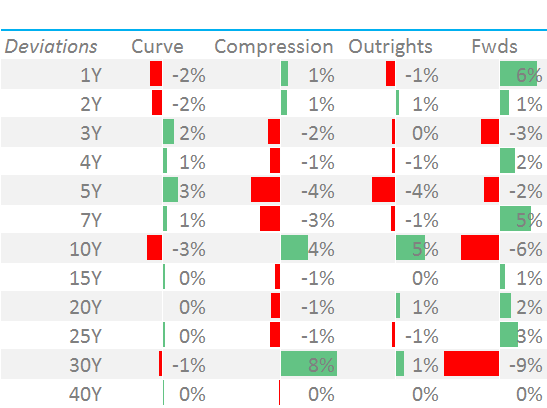 The similarity of these tenor profiles can be seen when looking at their relative deviations from the average for that tenor (see right). All deviations are less than 6% – aside from 30y forwards (which are limited by the maximum maturity possible).
What are the causes of this homogeneity?
To a certain extent it puzzles me. I traded cross currency swaps, and the stand out feature about that market was (is) the lack of standardisation. No two clients ever asked for the same end price.
But for vanilla Rates trading, it is not necessarily the clients who are driving these volumes in the SDR data. Or at least it is not the clients who are driving the resulting distribution of trades. Here are a few unstructured thoughts on what is going on:
- Liquidity begets liquidity. Dealers might provide custom structures to their clients, but they will hedge in the most liquid buckets. This makes a whole lot of intuitive sense, and it is consistent with the liquidity transformation role that dealers operating in CLOBs provide via RFQ to their clients.
- PCA hedging is a common strategy to reduce transaction costs and to hedge in a statistically efficient manner. The volume evidence suggests that 10y describes the 1st component of risk, 5y10y the second and 5y10y30y the third.
- Ignoring the hedging side of the equation for a moment, volumes are driven (in part) by primary issuance markets. These are also focused on benchmark maturities.
None of this is to say that having concentrated activity in only 3 tenors is a bad thing. But it means an 8y swap doesn’t have the same market dynamics as a 10y swap – despite their close relationship.
This data is likely telling us that dealers don’t hedge an 8y with an 8y in the market – it is far more likely to be hedged with a combination of 10y outright and 5y10y according to a (PCA) weighting. I’m comfortable with that behaviour.
But….
…..we all know what happens when the market adopts a single hedging strategy….eventually, a weakness is found, exploited or otherwise foiled. The next step is one we’ve looked at in the past – predictive analytics to spot auto-hedging in the order books.