Clearing Houses publish regular quantitative disclosures of great interest to clearing members and regulators, which provide regular insight into risk governance, ease of comparison and facilitate best practice.
From the approximately 200 data fields published for each Clearing Service, it is possible to derive composite metrics, the most well know of which is skin-in-the-game (SITG); the amount of a CCPs own capital in the default fund as a proportion of members funds.
In this article, I will look at SITG and other metrics and ratios available in CCPView.
SITG
We define SITG as the ratio of QD 4.1.1 Prefunded Own Capital Before divided by 4.1.4 Prefunded Aggregate Participant Contributions Required. Selecting this ratio in CCPView, to compare ten selected Futures and Options CCPs.
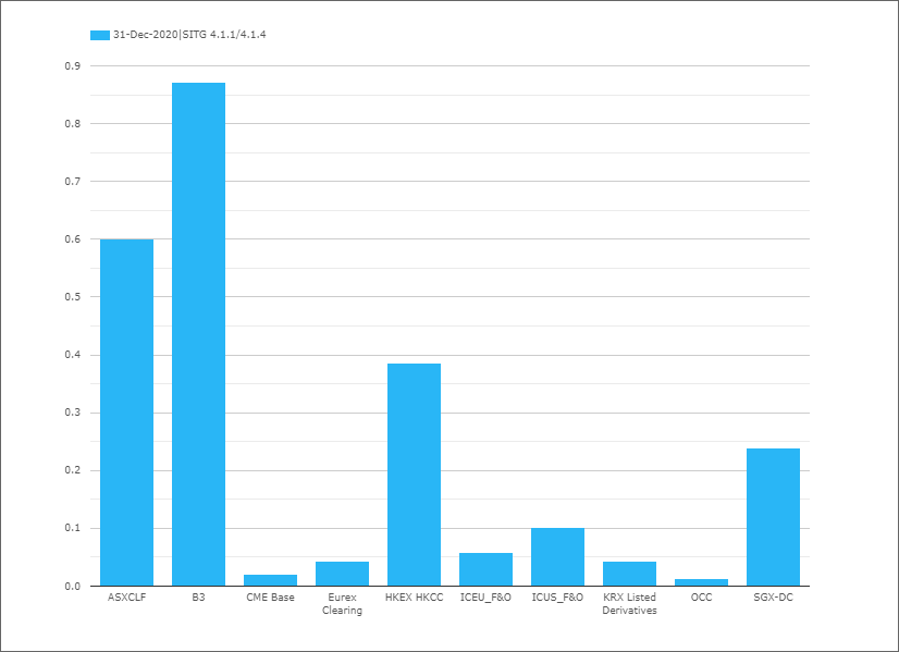
- B3 Bovespa, by far the highest at 0.87
- ASX CLF next with 0.6
- HKEX HKCC with 0.39
- SGX-DC with 0.24
- ICE US F&O with 0.10
- Skipping down to ….
- OCC with 0.013
Of-course all of these ratios are correct for each CCP, given the choices they have made on risk governance, policy, business model, default waterfall, membership, market volatility and other factors.
However the wide range of ratios is quite striking and there has been a lot of debate, discussion and policy moves on whether CCPs should have more of their own capital at risk. I am not going to cover all the literature on this topic, but the European Association of CCP Clearing Houses paper from Jan 2021, is a nice concise and recent read and covers the ESMA calibration of SITG as 25% of a CCP’s capital requirements.
(Note to self, see if a CCP’s Capital Requirement is published as one of the QD fields or if not, is it available elsewhere e.g. Financial Statements).
Prefunded Structure
Another interesting metric is to look at the composition of prefunded resources both DF and Initial Margin.
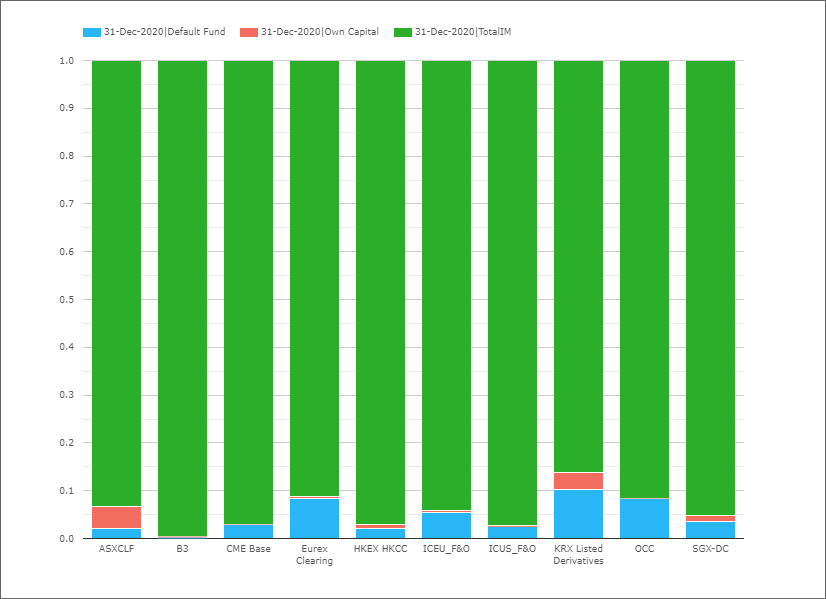
Showing IM is always by far the largest proportion, as any CCP will want the member that has the risk and could potentially default to contribute sufficient IM to cover it’s losses as much as possible, often referred to as defaulter pays.
The above ratios, do not tell us anything about the relative size of prefunded resources, to see that we can select a composite measure that aggregates the 4.1 DF QDs with 6.1.1. Total IM.
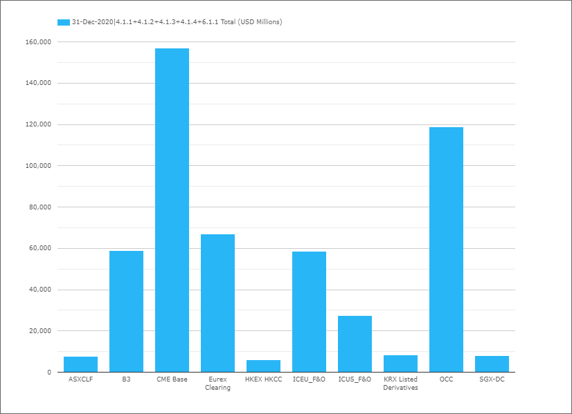
- CME the largest with $157 billion
- OCC next with $119 billion
- Eurex $67 billion
- B3 $59 billion
- ICEU F&O $59 billion
- …..
- HKEX HKCC $6 billion
Variation Margin
As well comparing different CCPs, we can see how metrics change quarter to quarter for the same CCP.
For VM, there are two interesting QDs, 6.6.1 Average Total VM paid to the CCP in the quarter and 6.7.1 Maximum total VM paid to the CCP on any business day in the quarter, so an interesting ratio that allows for comparisons is (6.7.1 – 6.6.1) / 6.6.1 , which can be selected as VMChange ratio in CCPView.
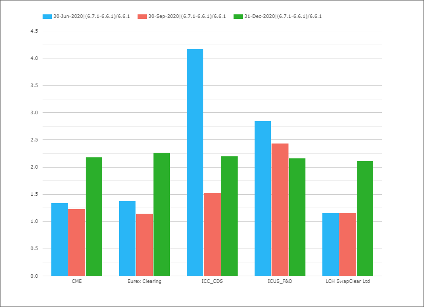
- ICE Credit Clear with the highest ratio of 4.2 in the quarter ending 30-Jun-20
- (meaning the highest VM day was 4 times the average in the quarter)
- The quarter ending 31-Dec-20 with ratios above 2.0 for each of CME, Eurex, ICE CDS and LCH SwapClear
- The quarter ending 30-Sep-20 with the lowest ratios from 1.15 to 1.5
- Except for ICE US F&O with 2.4
That’s It
While there are more ratios to show, my intention today was to introduce a select few.
And ask for feedback on others that we should add.
If you have ones you would like to see, please send us an email.
For those interested in using CCP Quant Disclosure Data.
Please contact us for a demonstration of CCPView.