- SOFR fixings have exhibited an elevated level of volatility in recent weeks.
- We look at the impact this may have on LIBOR fallback spreads for 1 month USD LIBOR.
- We use our IBOR Transition Management apps that we recently announced.
- The data shows that there are sustained periods where the realised spread has been negative, presenting an interesting data sample for the analysis.
Clarus have a number of tools to help you with IBOR Transition Management – see our Press Release and Amir’s recent blog.
Realistically, the most amount of publicity these tools receive is when something unusual happens in the underlying markets. And whilst this latest bout of volatility in the SOFR fixings isn’t exactly unexpected it is certainly worthy of analysis.
What Has Happened to SOFR?
The SOFR fixings have been on a somewhat wild-ride recently. This shouldn’t really be news to anyone reading this blog:
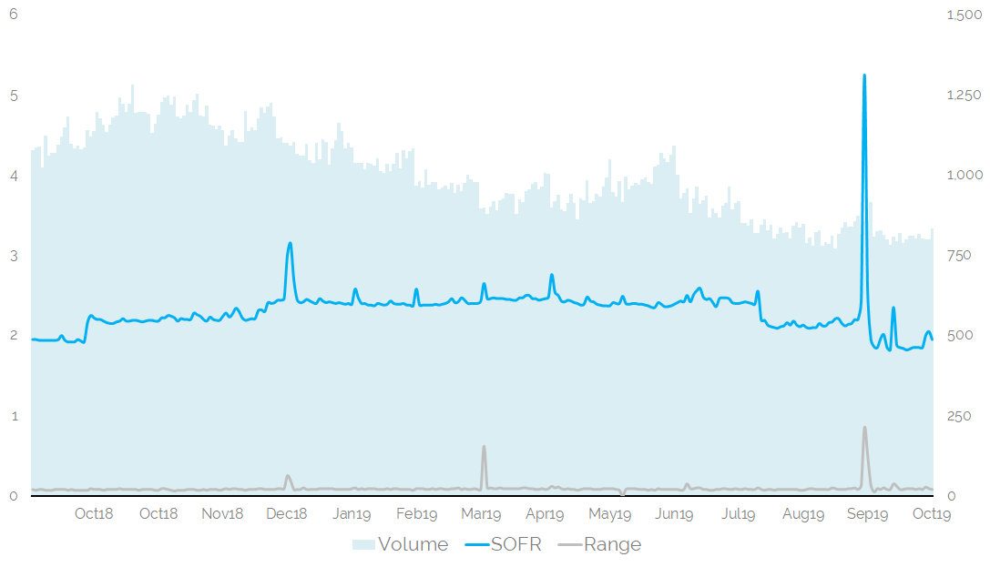
I’m sure everyone has seen this chart ad-nauseum in recent weeks, so I won’t dwell on it. Suffice to say, this chart shows;
- The daily SOFR fixing for the past year. It has ranged from 1.82% to 5.25%.
- The daily volumes that contribute to the SOFR fixing over the past year. These have ranged from $770bn to $1280bn.
- The range between the 25th and 75th Percentile of transactions. SOFR is a volume-weighted median rate. Whilst there are even more extreme values, the bottom 1% are excluded (to filter specials) and the median methodology is very good at dealing with tails (such as the infamous 9% 99th percentile on September 17th).
- During this time, the Fed has hiked rates twice (September 27th 2018, December 20th 2018) and cut rates twice (August 1st 2019, September 19th 2019).
In terms of how the 2018 rate hikes were transmitted in the SOFR fixing:
- The ten day moving average of SOFR moved by +24.5 basis points in September-October 2018.
- The ten day moving average of SOFR moved by +32.6 basis points in December 2018-January 2019, including a jump for Turn of the Year.
- The ten day moving average of SOFR moved by -29.2 basis points in July-August 2019.
- The ten day moving average of SOFR moved by -28.2 basis points from mid-August 2019 to October 2019.
Why dwell on this? Well, a few reasons:
- Yes, SOFR has been at elevated levels on particular dates.
- However, even with recently elevated fixings, the transmission of monetary policy is still crystal clear in SOFR.
- Volumes underlying the SOFR fixing have increased over the past year. And volumes haven’t dropped off a cliff, even with the recent Fed announcements to provide term repos to the market.
With an IBOR Transition hat on:
- SOFR looks to be just as efficient (more?) at reflecting monetary policy changes as LIBOR.
- A volatile SOFR fixing probably results in more volatile basis spreads between SOFR-Fed Funds and SOFR-LIBOR.
- With hikes and cuts from the Fed, the time-series of calibration data being used for LIBOR fallbacks will be particularly interesting.
LIBOR 1 month vs SOFR
It is that last point that I wanted to analyse this week using our Apps, as announced in our Press Release. There are also some nice tie-ins for anyone responding to the latest ISDA consultation on calibrating fallbacks.
Specifically, whilst there is lots of daily volatility around SOFR fixings themselves, it also means that the spreads between LIBOR vs SOFR move around. As we looked at for GBP markets, it is not unusual for these spreads to move negative when central banks are moving rates.
It is therefore a great time to use our IBOR Transition Management App to take a look at how the spread has moved recently:
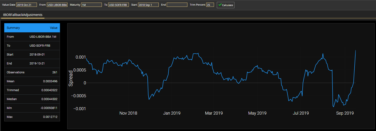
Showing;
- The realised one month spread between USD Libor 1 month fixings and SOFR has been volatile over the past year.
- There have been three periods of negative spreads, interspersed by two longer periods of positive spreads. The spread has just moved positive again this week.
- The minimum value was -9.4 basis points.
- The maximum (right now) is + 12.7 basis points.
For any averaging, we need to consider the distribution. An observation a year ago is just as valid as a current observation for the sake of historic calibration using simple averaging:
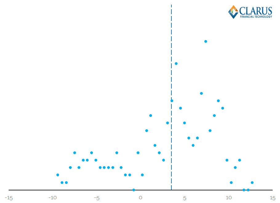
Showing;
- The distribution of observations for Realised SOFR vs One Month USD Libor for the past 12 months.
- The dotted line represents the mean. For information, the mean is at 3.5 basis points whilst the 25% trimmed mean is at 4.05 basis points. This is a bigger difference than we have seen previously, which is due to the use of a smaller sample size.
Now let’s compare this 2019 “vintage” of distribution versus the longer-term average. Let’s go back to 2015 to mimic the effect it might have on the ultimate calibrated value assuming LIBOR ceases in 2020 and we use a 5 year look-back:
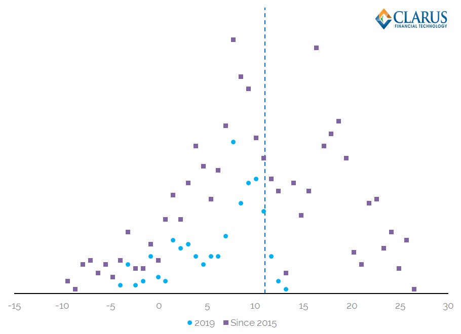
Histogram of Realised SOFR vs One Month USD Libor for the past 4 years
Showing;
- The distribution in 2019 (still the blue dots)
- The 4 year distribution since 2015 (the purple squares), which EXCLUDE the 2019 observations.
- The dotted line represents the mean, at 11 basis points. A 25% trimmed mean is 11.18 basis points.
What can we say? The 2019 observations don’t look very unusual when compared to the rest of history. In the period 2015-2018 there were plenty more observations in negative territory, probably because the Fed’s target rate moved higher by around ~200 basis points in this time!
It certainly makes for an interesting data sample for the likely calibration of USD IBOR fallbacks.
This is exactly why we developed our tools. As well as being “IBOR Geeks“. Contact us today to see them in action.
In Summary
- The realised spread of daily SOFR rates versus 1 month USD Libor is pretty volatile.
- The recent history of SOFR fixings doesn’t seem to be a particular outlier when compared to the previous five years.
- With multiple Fed rate moves in the data series, this makes for an interesting data sample for fallback calibration.
- Clarus offer the tools to understand, consume and analyse this data.